(wip) - destroyed city environment
hi everyone
Have been on working on this piece quite for a while.
right now modelling, uving and basic lighting are done,
and I've gotta texture (diffuse + spec, no normals)
and probably re-light it a bit.
Shots are post-processed here and there, I plan to render it out and replace one of the scenes in my reel;
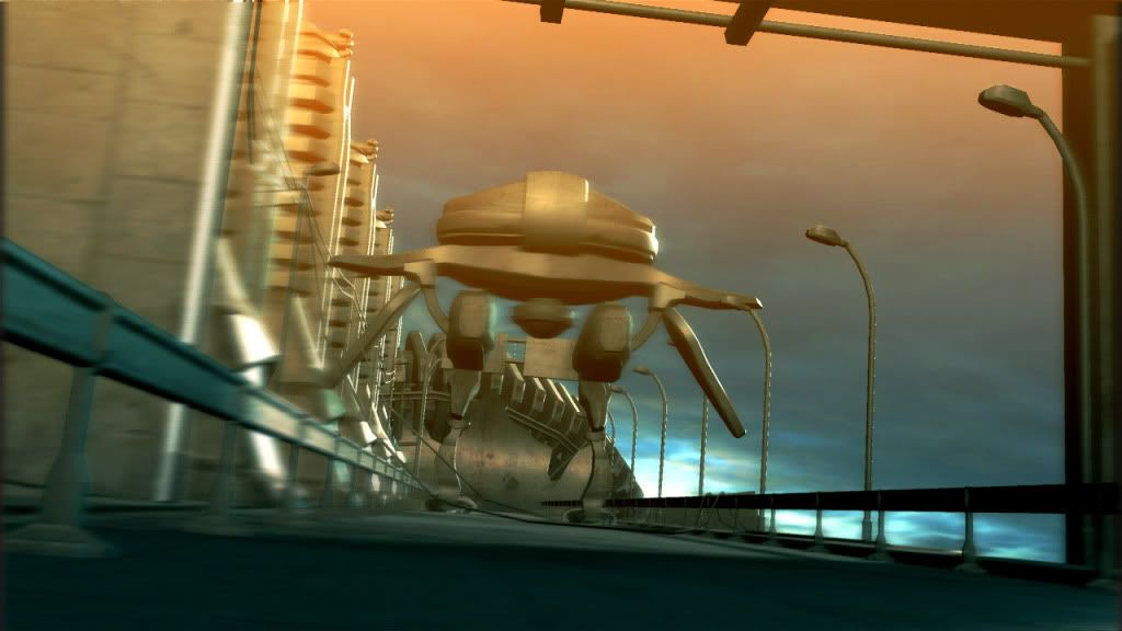
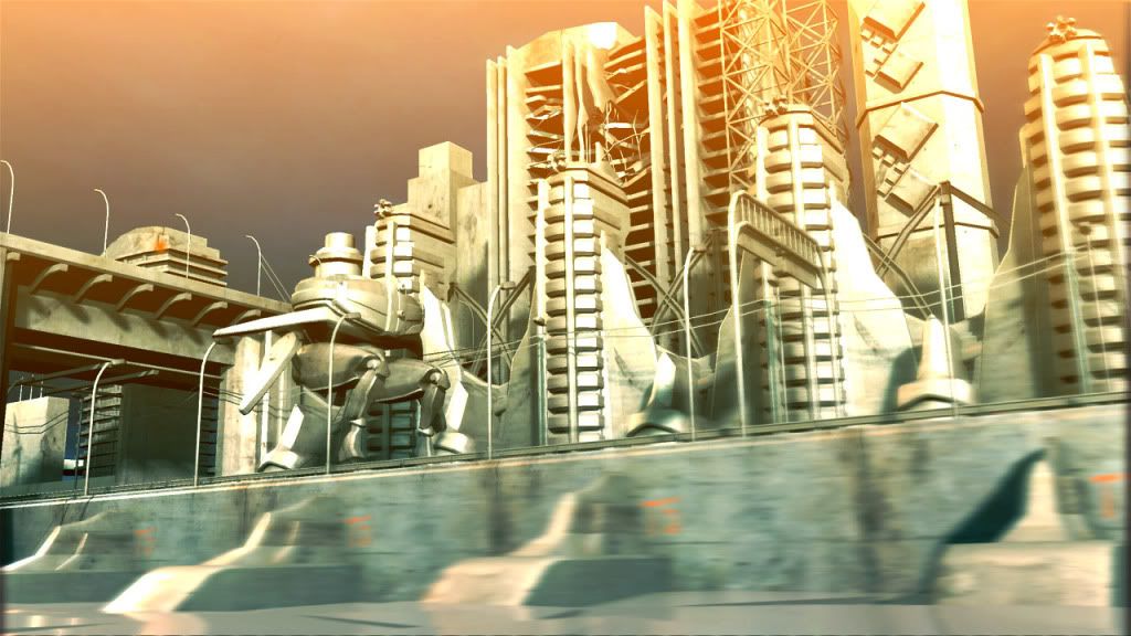
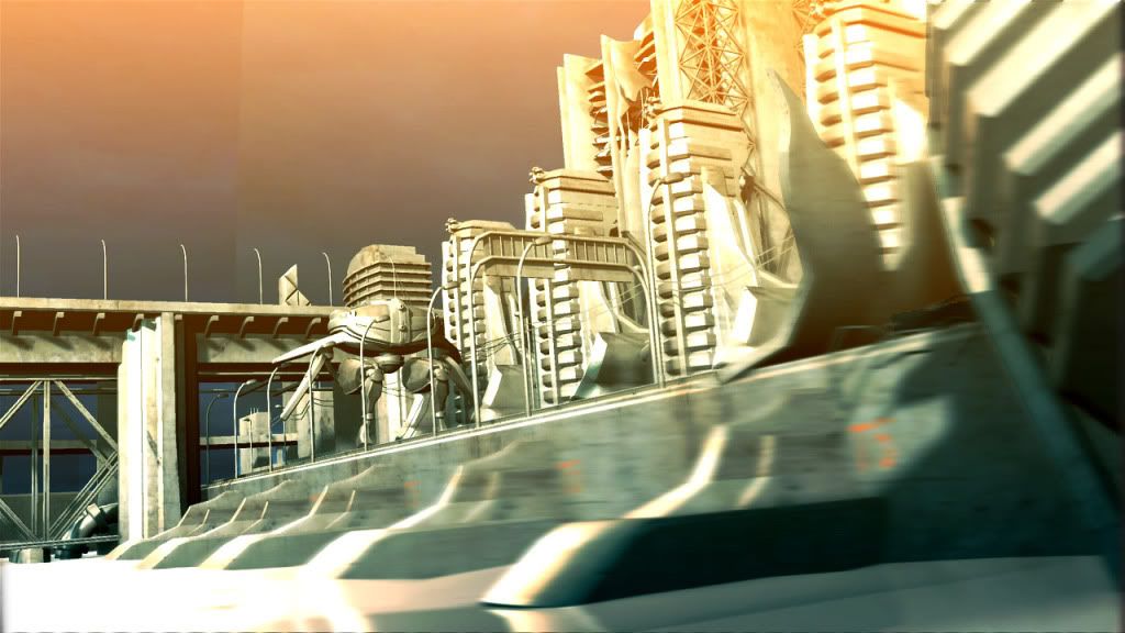
there's an ugly seam on the sky texture here, I'll get it fixed later
AO shot:
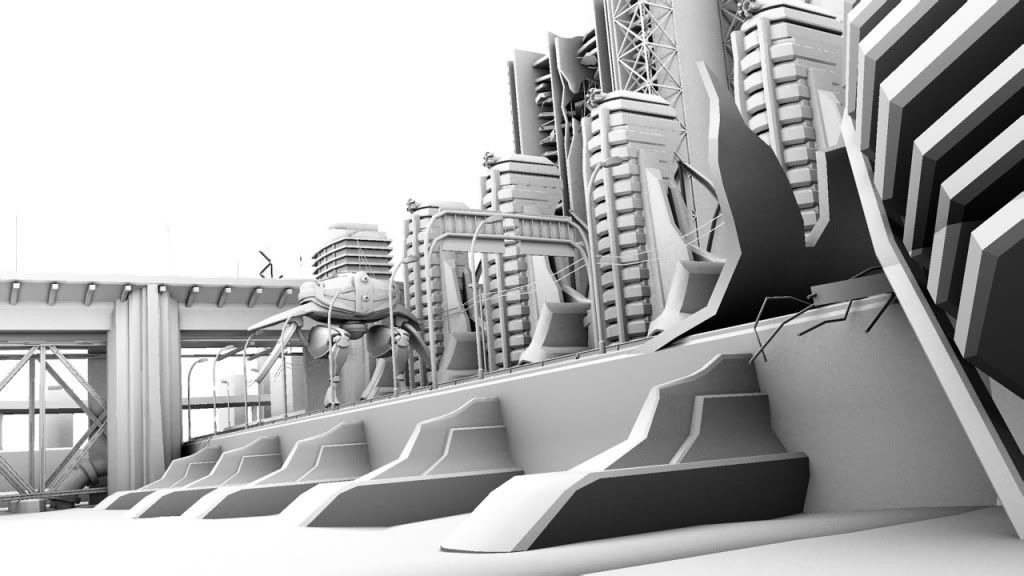
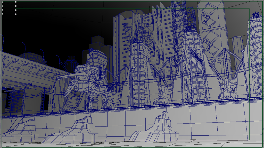
wires:
whole scene is around 70k tris (does anyone care about the numbers? )
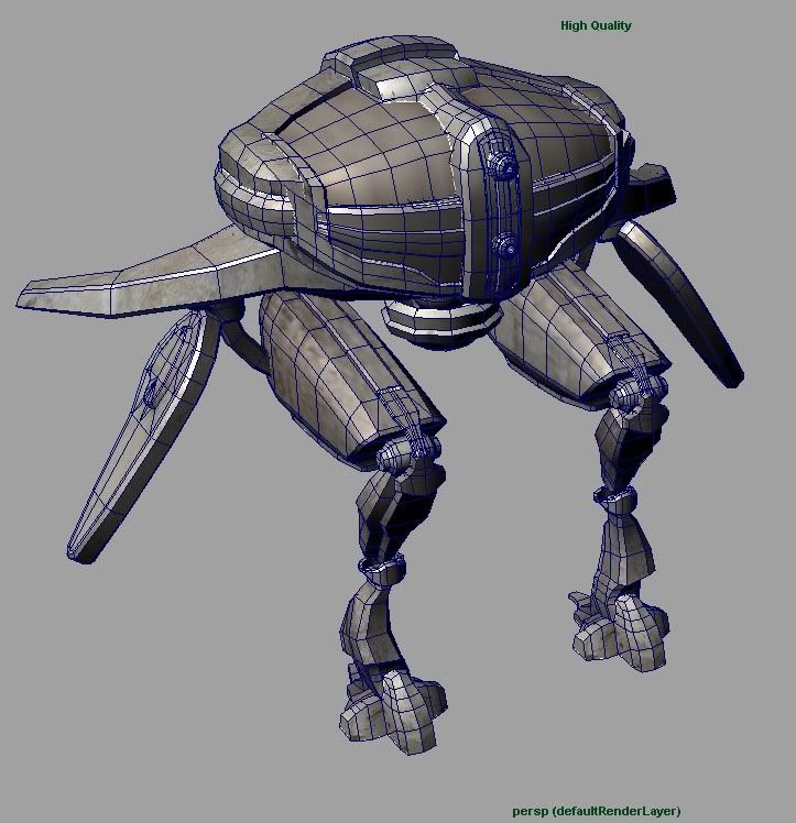
and the robot model is ~ 7,200:
Have been on working on this piece quite for a while.
right now modelling, uving and basic lighting are done,
and I've gotta texture (diffuse + spec, no normals)
and probably re-light it a bit.
Shots are post-processed here and there, I plan to render it out and replace one of the scenes in my reel;


there's an ugly seam on the sky texture here, I'll get it fixed later
AO shot:

wires:
whole scene is around 70k tris (does anyone care about the numbers? )

and the robot model is ~ 7,200:


Replies
If you want a critique, I feel that the current post process settings could robbing your scene of some detail. Can you post a scene w/o the blur? I'd be interested to see how that looks.
yep, I've attached the original render for one of the pics.
I like how the blurred ones look, but I'll remove blureness for the stills and will keep it for the video I guess.
2 vofff
It's a robot.
I think the parts look cool without being really connected, I'll see what I can do anyway.
The scene isn't textured, it's a placeholder diffuse right now.
2 bubbie
Could you elaborate on that? Like what parts exactly would counterbalance him?