Home 3D Art Showcase & Critiques

(WIP) WarHammer Weapon Shop

Very long time lurker, first time poster.

I am a bit apprehensive to post knowing that there are so many talented artists here, however I need to get some honest critiques so that I might improve.

My first project up for slaughter is a concept from Warhammer, a dwarven weapons shop.
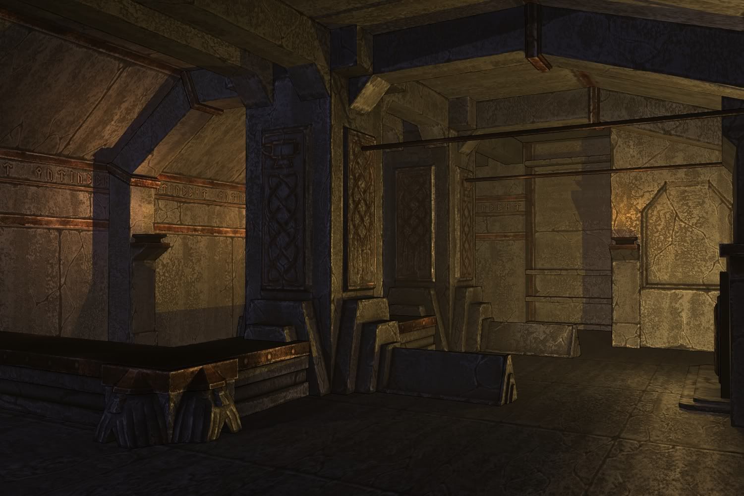


Warrhammer_Shop_WIP_01.jpg


Concept art:

full0002.jpg


Obviously some things aren't 100% true to the concept, which is intentional, however I am trying to achieve the same "feel."

Any feedback is welcome, so long as it is helpful. :thumbup:

Replies

  • Khalo
    Sadly, I don't have much in the way of criticism - personally, I think you've hit the feel of the concept spot on. The textures are very well done (in my opinion); they seem to capture plenty of detail without getting too noisy.
  • nullfed
    Offline / Send Message
    nullfed polycounter lvl 9
    I honestly thought that the first image was a concept as it loaded in. The feel of the textures and the illustrative outline work really well. Good stuff!
    Can't wait to see it populated with props. Care to share any more details about the process, what its rendered in and so on?
  • BradleyWascher
    Offline / Send Message
    BradleyWascher polycounter lvl 13
    I like were this piece is going its seems like it could be sharpened a little or have a little more contrast and pop but nothing crazy. I cant tell if that is like copper metal covering the stone is some places but maybe push that material for that a little more. Over all nice start. Keep up the good work!
  • vofff
    Offline / Send Message
    vofff polycounter lvl 10
    One thing I could give u critz is the metal table and the other parts with the orange colored, maybe you could add a highlight to it. It doesnt look metal-ish. Othwerwise gw
  • Mitchell Banks
    Hey this looks great! You really have the 'feel' of it down. The area feels very organized and clean. I'm impressed with the lighting as well attention to detail with all the objects in the scene. If I was to add anything, I would have misc. weapons displayed on the pillars. Paperwork and tools on the bar would add a nice touch as well. Maybe put some ornate pieces on the ceiling walls like you have on the side walls of the shop. Rugs spread out on the floor with some color would add a nice touch. Oh yeah, some fire wood piled by the fireplace would be great as well. There are not any doors visible, so maybe a light creeping from a 'door' from the left side of this place would add something extra to it. Sorry I don't have any feedback on your art style, as far as I can tell, you are on the right track. I hope this helps! :thumbup:
  • Purplepaint
    Offline / Send Message
    Purplepaint polycounter lvl 8
    Good work :D, but for me it feels a little more Dragon Age, less Warhammer. (even thou the theme is basically the same.) Great work thou!
  • almighty_gir
    Offline / Send Message
    almighty_gir ngon master
    just remember, Dwarves in warhammer are INSANELY proud of appearances and workmanship. if this is intended to be a functioning (read: currently occupied and regularly used) workshop, then the walls would literally be pristine outside of soot damage from the fire. dwarven rock carving is supposed to be unparalelled, to last centuries with very little upkeep. visible wear and tear would be minimal in an occupied workshop.
  • P442
    Offline / Send Message
    P442 polycounter lvl 8
    very nice. I'm just wondering how them dwarves are supposed to get those crossbows all the way up there! Maybe you can model them a stool ;)
  • Taylor Hood
    That's pretty cool, dude. It really has a Warhammer, stone feel to it =] Not much of a criticism but I'll definitely say keep going with it.
Sign In or Register to comment.