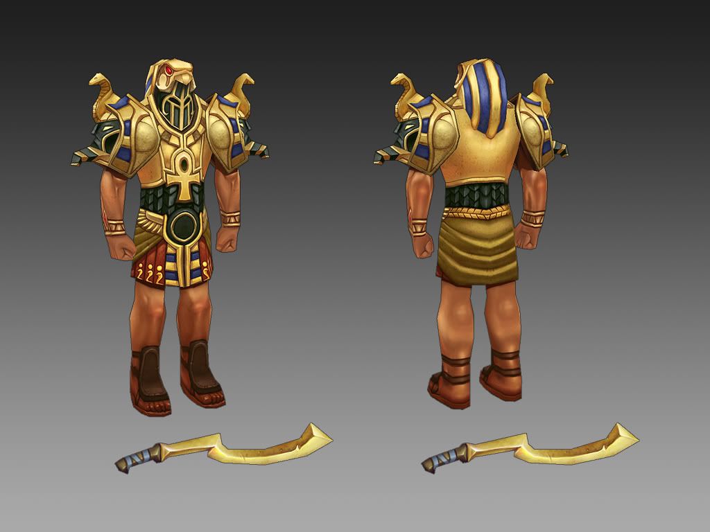
First character... in a while.
I've been in my bunker, couple last days, doing this thing, and now I'd like to hear some opinions. This is really first one in like 5 or 6 years, and before that.. well, I've made one or two. So this is almost new to me.
I'm not pretending to be original. World of Warcraft and whole ancient Egypt influenced this, although later I remembered original Stargate film also. Didn't look for references there, but I think Stargate could be an inspiration here as well.
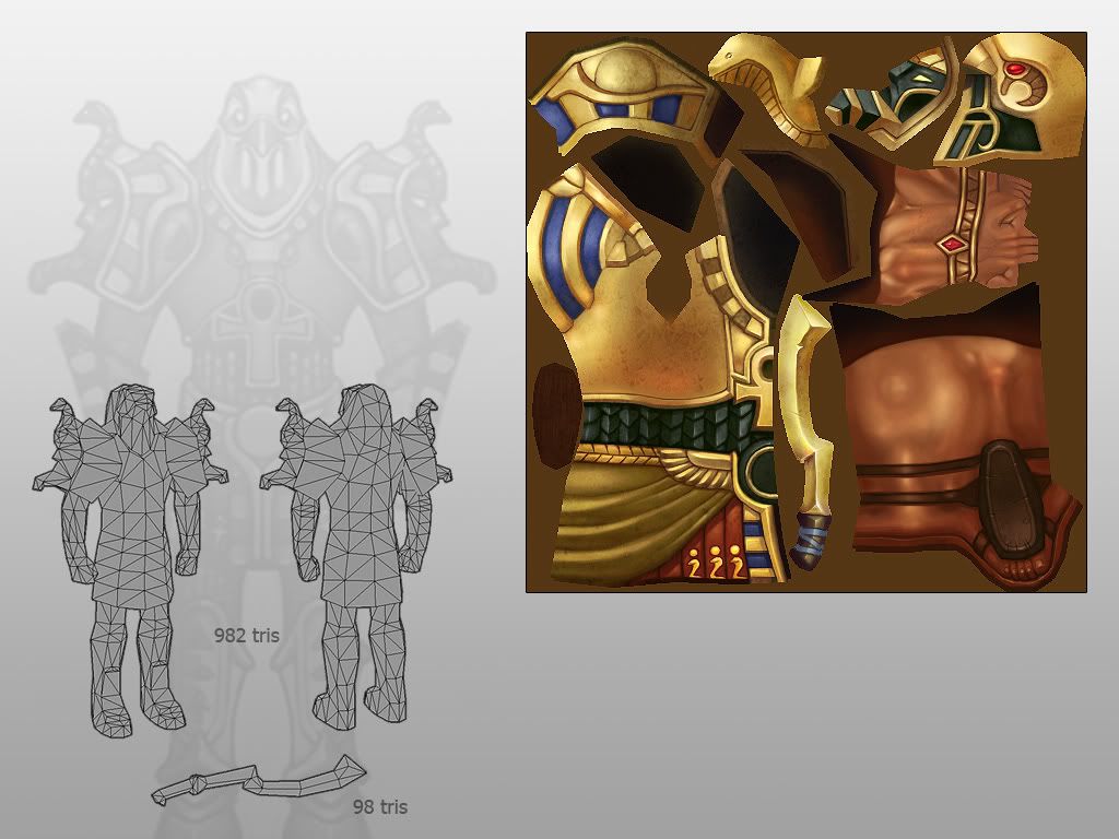
Tri count was limited by 1k from the beginning. Don't ask, its just how it is.


Don't be afraid to hurt my feelings, if necessary :poly142:
Thanks.
I'm not pretending to be original. World of Warcraft and whole ancient Egypt influenced this, although later I remembered original Stargate film also. Didn't look for references there, but I think Stargate could be an inspiration here as well.
Tri count was limited by 1k from the beginning. Don't ask, its just how it is.


Don't be afraid to hurt my feelings, if necessary :poly142:
Thanks.
Replies
Anyways, I really do love the textures, dude. =]
If anything it's closer to WoW, which is what the OP says he was inspired by.
Great job, very nice texturing.
Heh, interesting, yes I do mean Borderlands. Don't know why I said Borderlines... I guess I just haven't really been exposed that game much at all. =]
Looking forward to more work from you, OP.
for crits i would say definatly push your profile a little more the shilouette is pretty weak at the moment i think. also tie some of the red from the skirt in in the torso to break it up a little, maybe on the sides of the ankh, good work tho and definatly nice painting:thumbup:.
-Woog
I would agree with that on the back of the knee.
Something else looks a bit funky about the elbows to me as well.
I have to say though, the rest of the model is amazing. I especially love the way the textures were shaded. Would work really well for handheld games. (cellphones, psp, etc.)
I'm glad to hear that most problems are with his anatomy and silhouette, because that was quite predictable. I've been looking into some anatomy books, perhaps I'll do some more attemts to fix him.
edit:
Jonathan Marshall, yep it is meant for mobile devices, even though only as a test, which I probably failed by now. Took me too long to complete, and I need to make an enviroment for him. I intend to fully finish it, just because its fun.
The silhouette is quite good IMO - not too complex, but the shoulders make it recognizable and don't use the typical horns/spikes. Though I agree on reusing some of the colours over the entire model.
To me it looks like his head is actually in the neck, because of the black things looking like eyeholes. If this is true, the arms are a bit too short and stocky I think, just a quick stretch should fix that though.
You might want to work a bit more on the backview, because the skirt and especially the chest armor are very empty there.
Yep its a WoW character
More seriously, the textures are very good. Being Egypt-sen I can understand most of it being gold and blue but I can't help feeling a little bit of gray silver would help break it up a bit more, especially around the chest area as the chest and shoulder pads are visually blending into each other.
Nice low poly modeling, probably could be reduced even further if wanted around the skirt, shoes, and back areas without any visual difference.