Home 3D Art Showcase & Critiques

i plane old dont like it

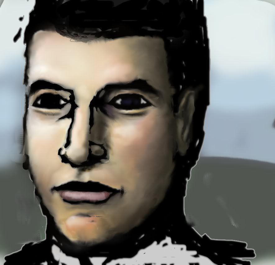
and i wanna know whats wrong with the shading in particular like the lighting look just wrong i wanna know whats bad about it im pretty sure anatomical its okish (even though it bit hard to tell what gender it is lol) so could some one maybe re-light it or tell us what is wrong like does it meed reflective light or what, thanks
dude.jpg

Replies

  • elementrix
    Offline / Send Message
    elementrix polycounter lvl 16
    Imo the shading on the skin itself doesn't look that bad, it's just the use of black with the inside glow? you smudged all over it. If you are going for realistic shading drop the black. The most important part of the face, the eyes, is just completely flat and not interesting at all, look at your own eyes and try to mimic that, eyes are very reflective so at least they should have some for of specular highlighting and yet I don't see any.

    Drop the black and get those parts to the same level as the skin.
  • Swizzle
    Offline / Send Message
    Swizzle polycounter lvl 15
    Filters are bad, mmmkay?

    In general, you shouldn't use black to shade skin unless it's just for some sort of stylistic reasons. Look at reference images of people and look at how other artists do their shading. Emulate their strategies for skin shading.
  • Pedro Amorim
    looks great! Keep going! Anatomy wise, looks great!
  • cycrasx
    yeah i didnt use any filters i just started out with a black n white like super high contrast type drawing then decided to colour it.. and yeah i dont like th result, ill try that later after i get some sleep and redo the eyes, but also the top left of his crown looks flat, should i make it darker less shined out or what, and nose looks blurry, but yeah i didnt use annyy refinance image, any yeah thats always a bad thing especially for lighting, especially at my stage of skill (where i cant just get perfect results from my imagination) but thanks plz keep up with the info for things to re-work, ill defenatly give it another go in the morning when i have another look at other things to do
  • Steve Schulze
    Offline / Send Message
    Steve Schulze polycounter lvl 18
    I quite like what you've got here, actually. The treatment isn't realistic in any way, but as an art style it works rather nicely, I think.
  • Arcanox
    cycrasx wrote: »
    yeah i didnt use any filters i just started out with a black n white like super high contrast type drawing then decided to colour it.. and yeah i dont like th result, ill try that later after i get some sleep and redo the eyes, but also the top left of his crown looks flat, should i make it darker less shined out or what, and nose looks blurry, but yeah i didnt use annyy refinance image, any yeah thats always a bad thing especially for lighting, especially at my stage of skill (where i cant just get perfect results from my imagination) but thanks plz keep up with the info for things to re-work, ill defenatly give it another go in the morning when i have another look at other things to do

    Some of the best work is done by keeping things simple and progressively working up to something more complex by the end of the composition.

    You rarely ever see professional artists use all sorts of big adjustments to their image in the middle of their workflow. It makes it difficult to maintain consistency in their style. It's especially difficult to work like this because if you want to go back and do manual edits, you essentially have to reverse any big contrast changes you just made.

    That's sort of why people are making this suggestion. I don't think it's particularly bad so don't get too down on yourself a bit.

    I'm not a huge drawn art guy, so I'm not going to give you all the breakdowns of what you should be doing. Probably the most important thing for you in order to improve the final result is figure out how you plan on going from start to finish in your workflow. Also, as others have said, use some good reference for the skin and lighting whenever you aren't sure of a particular feature.

    You may also find this speed painting really useful and enlightening: [ame]http://www.youtube.com/watch?v=8K_NQe57C-k[/ame]

    The guy has a few other great speedpaints as well. Best of luck.
Sign In or Register to comment.