Bertie... The Robot
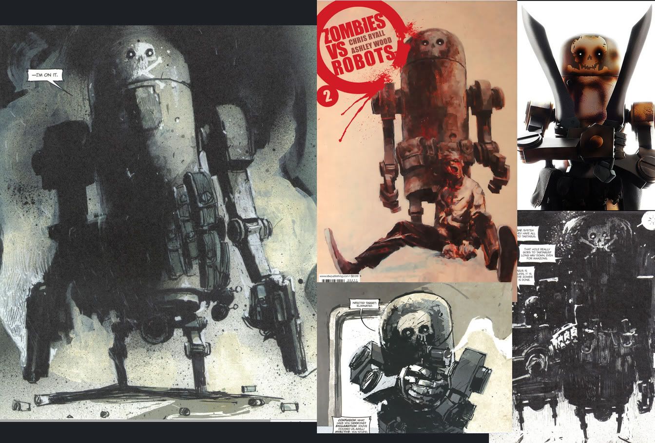
So Ashley Wood is one of my favorite artists (if you're not familiar with his work, do yourself a favour http://ashleybambaland.blogspot.com/ )
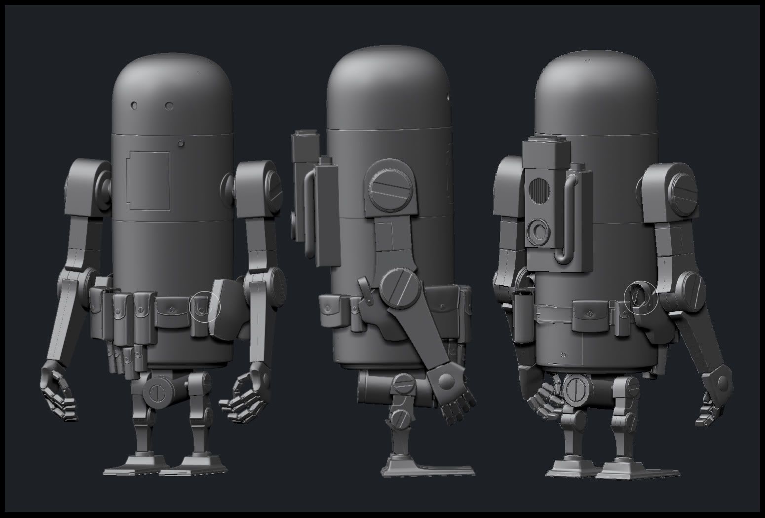
Anyways, I'm trying to create The saviour of the earth, Bertie.


I'm trying to base him off of his paintings and drawings, but Ashley can draw very loosely, so the proportions can vary. There are toys based off his art books, but I feel like those proportions are different form his books to keep them balanced. Anyways, Before I start Zbrushing scratches and working on the bake, I'd like opinions on the high! Thanks!
Anyways, I'm trying to create The saviour of the earth, Bertie.


I'm trying to base him off of his paintings and drawings, but Ashley can draw very loosely, so the proportions can vary. There are toys based off his art books, but I feel like those proportions are different form his books to keep them balanced. Anyways, Before I start Zbrushing scratches and working on the bake, I'd like opinions on the high! Thanks!
Replies
if you'd make the main body a bit taller then you could lengthen the upper arm a bit more.
And extrude the upper shoulder bolts a bit to fit the paintings, if thats what you're going after.
Elbow bolts should perhaps be even smaller. But that just be some other proportion causing that difference look less.
Bertie doesn't actually have feet - his shins just taper down and stop.
His hands should be a good bit bigger - or his fingers, at least. They look a little fragile compared to the rest of him.
I'd exaggerate the size and the size variation of the bags on his belt some more, too.
Perhaps move the elbow joint further down the arm and oversize the shoulder a tad.
@metal: Took all your advice, heightened the uppder body, fixed the shoulders and made the bolts more apparant.
@talon: You know, I couldn't figure out about his feet, I always thought it was Ashley's art style to...leave it out. There is a toy out there I used for reference that showed Bertie with feet, so it just confused me. But I looked at all my comics closely and realized you are right, I have no idea how physically he stands up...but he does look infinitely more bad ass without giant Kingdom Heart feet. I also fixed the sizing with his hands and fingers, but haven't messed much with the belt....yet.
I also took Deja's advice for the legs and thanks, Philip (i'll be using your metal & nDo tutorials ;-) )
The overall gun style is a bit beefier. Yours is not as stylized.
The cylinder should be a lot bigger / longer. Also falls into the same category as keeping it stylized.
The front sight is to low compared to the concept.
Overall, go through some revolver designs and see how you could caricature it.
Anyways, I fixed some stuff and added some stuff, I'm gonna start baking soon.. the gun and the robot..pondering if I should make a machete...
also...need to learn how to render kick ass renders in Maya Mental Ray..it always comes out subpar. Does anyone have any links to some good tutorials to render simple gray high poly models?
I can definitely see something in the top two that more suggests revolver.
I think you're dealing with two different guns.
Bertie shoots akimbo, give him one of each...
Dirty Deeds Bertie
Desert Commando Bertie
From all the action figures I've seen of Bertie he has two revolvers, though in the comic panels you have there it does appear that one is a slide action semi auto and the other is a revolver.
The revolver seems to have a full trigger guard and the slide action seems to have the broken trigger guard. Just some nit picks. Looking cool so far.
Edit: More Burtie Variants
Side of Revolver
Straight Pimpin'
The original idea was to make my own idea of his revolver (mixing in some Dan Wesson in the mix
But a lot of people seem to prefer if I go and shorten the barrel to keep up proportions of the toys.. I'll post an update soon.
At least thats how its portrayed. It adds some of that ... ftw ... damn that robot gunna kill me to it.
I think the direction you've taken with it would be cool, just maybe play up the exaggerated proportions a bit to help strike the right balance.
Also quickly did this one. I think this one is better
My suggestions. Bertie has a big finger. And the Placement of the pin/spring on the toy i think is probably about as good as it can get, it adds the illusion of size, but it isn't proportionally small.
Your current iteration is definitely stepping in the right direction, keep it up.:thumbup:
Oh, and thanks for pointing out the trigger guard. I just realized your paintover also covered the spring. I will fix it when i get back to the gun! Promise. ;-)
Also..to make sure the gun fits the hand.. free handed him holding it.
I know I got a few normal and AO issues, this is just one bake to show you guys! I'm pretty stoked on how its turning out.
..and a rad night time render..
And the textures!
But on second look through I've notice he is black with a bit of a red/orange accents. I want to stay away from the complete burnt yellow from that one toy because that is a totally different model, But I do see what you mean!
@Xoliul: I agree, the spec seems dull I need to work on that. When you say adding color, do you mean into the Diffuse?
@Enodmi: I need that as my new Gargoyle. haha.
This looks better than the last, you need small sensual feeling of AO added to it, goooooo !!!! enjoy life! ! do it!
Btw, I never comment here even though I'v been lurking around the past three years 40 times a day. So you need to understand that your art made me crawl out of the shadows. PeeeeewPeeww!
Heres the spec.
@Vig: Thank you!
Hopefully Bertie is almost done so I can get to work on his guns...and then the rig..and then the entire Scene. Oh man.
Crappy Maya print screen to show him holding it..
Hmm..upon looking at these screenshots..photobucket really blurs everything up. I need to fix that, apologies for the time being.
Old Brass 1
Much Older Brass
What I'd suggest for the Brass
Rework your brass! Seriously though, guns get beat up and old, bullets get used well before they get to that point, at least for a war time robot.
As for the gun itself, I'd try throwing a (very) light hint of dark navy blue for the gun frame/slide. Varyations in saturation and the tightness of the spec to show the damaging of the blueing from oil and heat (specifically heat damage towards the muzzle)
New Blued Nickle
Old and Worn Blued Nickle
Just a little wear and tear
If I still had my handgun I'd take some pictures of the muzzle for you so you could see the heat/powder discoloration that happens to towards there.
Now all that said, I do like the current texture you have, the wear is fine, just maybe blue it up a little
Oooh, a better display of why I'm suggesting a blued nickle
I'd like to see more color, like vibrant paint style, but I know that's not in the design, just something I'd like to see. Still, you're really kickin ass with this.
cheers!
Now take it with a grain of salt, because I consider the actual application of texturing my weakest link as far as my skillset is concerned soooo.
The brass/slug are the most obvious changes I threw in with a much bolder spec and such. though there were minor subtle changes in the dif/spec/gloss for the grip just to try and help sell a more textured -> worn look.
Edit: Also, the blueing :thumbup:
Gonna be gone for a few days to go on a mini tour, which kind of bums me out cause I am itching to get him rigged and looking awesome. In the mean time, It will get me thinking if I should create a scene like this (though more post apocalyptic) to surround Bertie in....