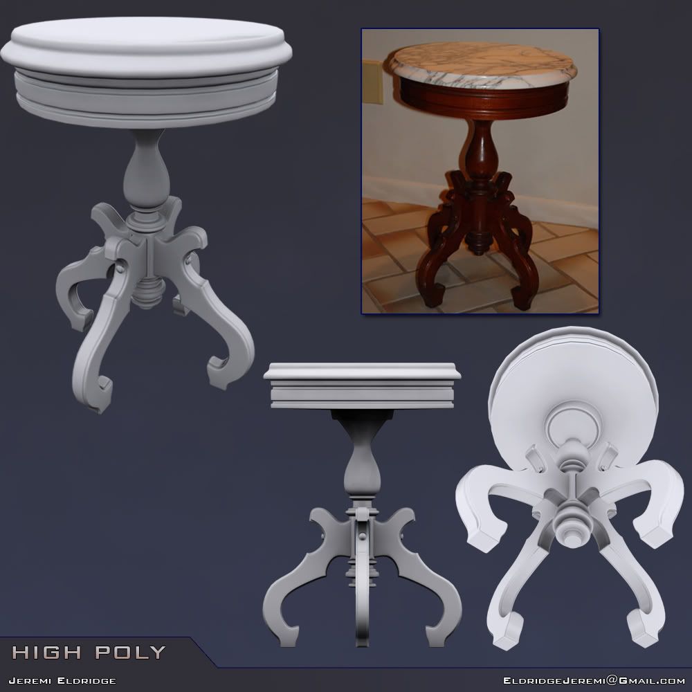
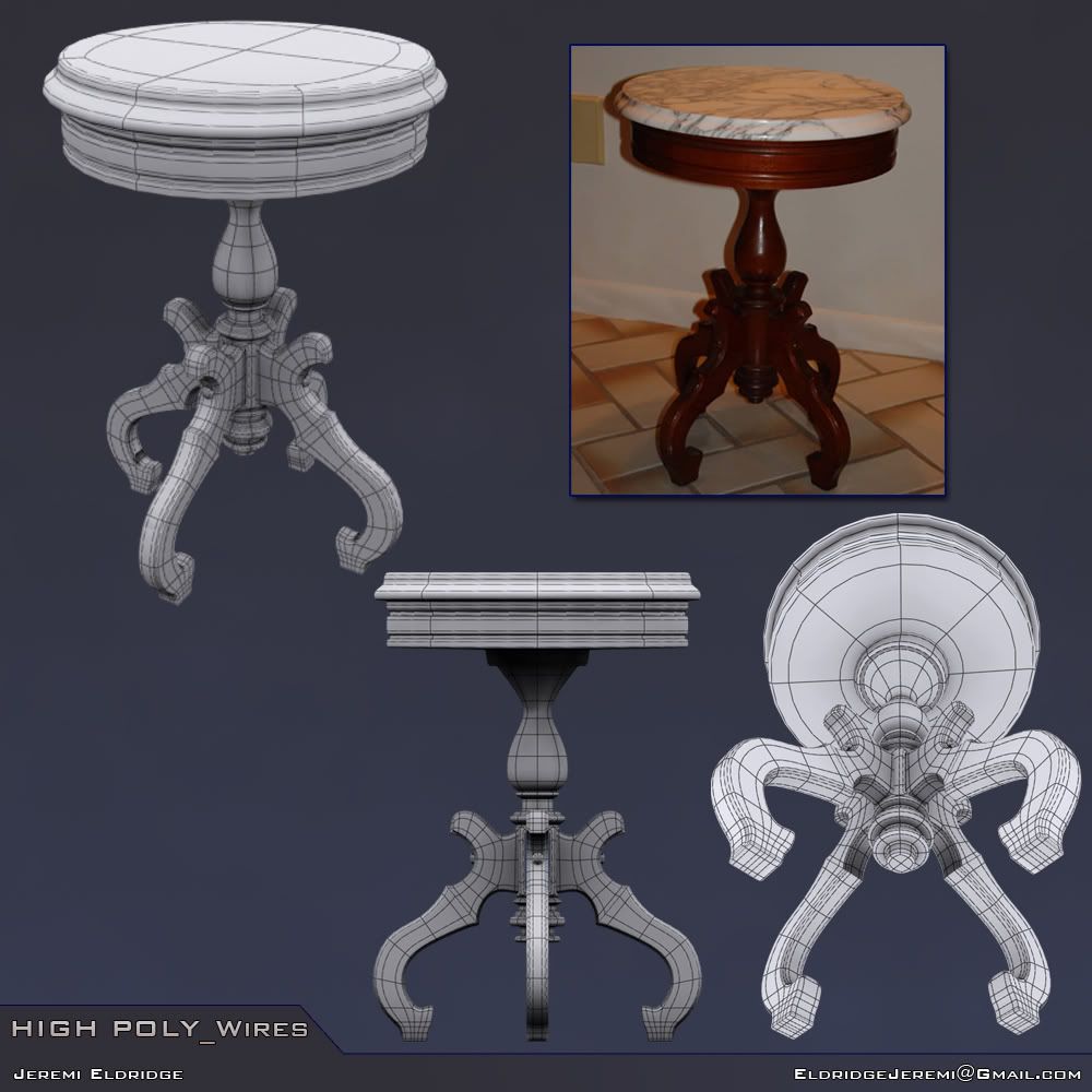
Self Improvement Thread - Props (High poly to low poly)
Hello! I currently attend the Art Institute and wanted to get some feedback on a table I'm working on.  I just recently became active on multiple forums and have less than a year left in classes, so I'm trying to improve as much as I can, start creating pieces worthy of a portfolio, and maybe help some other people too!
Any critique (including the model, presentation, or even the colors I picked, lol) is appreciated! I'll be creating the low poly (due next week) and then casting, texturing, and loading it into a game engine renderer or Marmoset from 8-MonkeyLabs
(EDIT: I apologize for my poor image linking abilities before, I was mistaken on how the images would be shown, and hopefully have them fixed now)


Replies
The presentation of the piece you have up right now could be easily condensed into one picture. You don't really need 3 points of view on a cylindrical object that is very symmetrical. I'd say make the final 3-4 pictures one one decently sized image. High poly, low, and wires for both (textures if you feel the need).
The second is a rendering test, I was wanting to get feedback and ideas as to which method worked better.
-Phil
Bash away please, and take it down, lol. I'd rather have brute honesty in an attempt to make me better than to delude myself by thinking this was a good job. I may sound too hard on myself but I really want this to look WAY better than this.