Home 3D Art Showcase & Critiques

Jedi Temple

polycounter lvl 7
Offline / Send Message
sakechi polycounter lvl 7
hi Polycount ppl,
this project done for school, when i want to take to next level.:poly142:


jedi_temple.jpg

final02.jpg

Replies

  • ErichWK
    Offline / Send Message
    ErichWK polycounter lvl 12
    Not bad! Your pillars have a pretty noticeable mirror crease in the middle, though. Tyler is right, your floors seem to be emitting an awful lot of violet.
  • ParoXum
    Offline / Send Message
    ParoXum polycounter lvl 9
    The pillars also dont match the ceiling like the concept, so it makes the whole hallway a bit less organized.

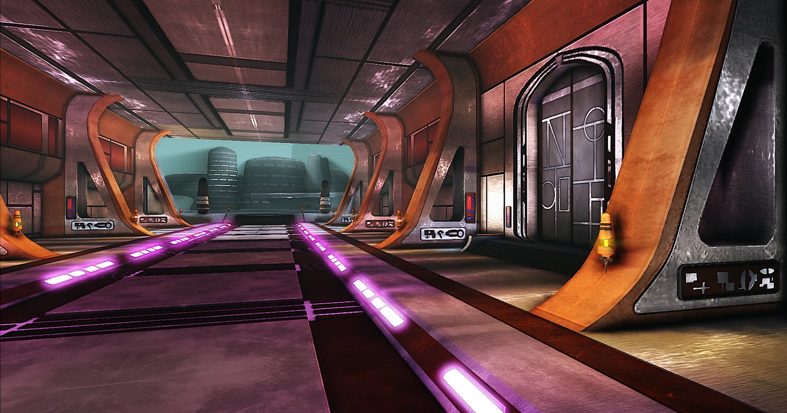
    You also used more glowing lights on the walk way than the concept, and as the others pointed out, too much violet where it should be a light red-orange.

    And in my opinion the texturing is too much noise for a SW universe like this one. I know it feels cool when your texture has grunge in it, but here, the texture should mostly only use reflection maps in place of the noise to convey the style IMHO.
  • snow
    Offline / Send Message
    snow polycounter lvl 8
    i love star wars! nice job, do more! :P
  • Slave_zero
    Offline / Send Message
    Slave_zero polycounter lvl 8
    I think your scene doesn't catch the scale of the hall very well. Maybe its because there are no humans in your scene to provide a reference for scale. Looking at your scene right now it doesn't give the feel of a huge clean hall.
  • wester
    Offline / Send Message
    wester polycounter lvl 13
    Yeah I agree with Slave. The concepts scale is alittle more successful than your environments scale because the artist put people in there as a point of reference. Without people your environment looks really small, because the door's so big.

    I would definitely desaturate using post processing, as well as reflective surfaces on parts like the floor and walls. follow the concept alittle closer if that's what you're going for. The panels on the walls and ceiling dont match that of the concept. The pixel density on those pillars/arches is very low as well.

    great piece though, with some work it could be amazing.
  • Rurouni Strife
    Offline / Send Message
    Rurouni Strife polycounter lvl 10
    Scale the walls up a little more, and definitely widen the floor. Wester is right, you should probably add a block or something that is the scale of a person.

    I also don't like what looks like a brushed metal overlay and normal map on most of the textures. I like what you are trying to go for, but I don't like what it looks like right now. Softening the grunge a lot, fixing your mirrored seems, and removing the brushed metal overlay/normal maps would make it look much better.

    Keep working on it, this could be outstanding.
  • Darkmaster
    Offline / Send Message
    Darkmaster polycounter lvl 11
    I feel like this is a good start so far to this environment, it is definitely capturing the star wars look. one thing that really sticks out to me is the spec maps on your wall and ceiling panels. they are really blown out and immediately draw the eye in. try to match the material in the concept better and give everything more of lambert style with low specularity and almost a plastic like feel. a lot of the star wars environments have this same material, so you shouldn't have any problem looking at more reference.

    Another thing that I am seeing, (and I'm not sure how far you are on lighting the scene) is that the concept focuses on the lighting as the focal aspects of the scene. the lights on the side of the columns are what should be catching my eye, so really make those pop! looks great though, I am excited to see some updates for this thread
  • brandoom
    Offline / Send Message
    brandoom polycounter lvl 15
    Not a bad start.

    couple things I noticed;

    -The lights on the pillars look a little small. Just scale those up a bit.
    -Too much purple/violet/pink in the floor lights.
    -Lastly, take a closer look at the ceiling, shapes, scale and colors are off.

    Not bad though.

    Keep working :)
  • achillesian
    I think this is headed down the right track, mess with colors, and post processing and I think you can get even closer to the concept.
Sign In or Register to comment.