The BRAWL² Tournament Challenge has been announced!
It starts May 12, and ends Sept 12. Let's see what you got!
https://polycount.com/discussion/237047/the-brawl²-tournament
It starts May 12, and ends Sept 12. Let's see what you got!
https://polycount.com/discussion/237047/the-brawl²-tournament
Alien Female Character and Scene
Hellooo. My name's Kate, and I'm new to polycount. I made this account a little while ago but this is my first "real" post. I'm currently in college for game development, so all of my posts untill April will probably be school assignments unless I start some of my own stuff over the holiday :]
For modelling we have to create a character that matches a scene from our level design class. My character and level are inspired by mass effect.
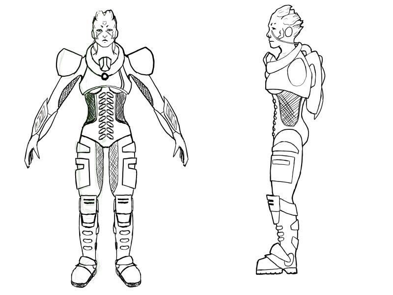
This is the drawing I submitted which I've been modelling from. I don't have too much of a back story for her. She has bark like hair and thin nostrils that close up in environments she's not used to (that's why she has tubey things). I know her lower back/butt/upper theigh is messed up in the side view, but I think I fixed that up in bit in the actual model.
We're using the male rig from UDK, so my character needs a chunky shoulder.

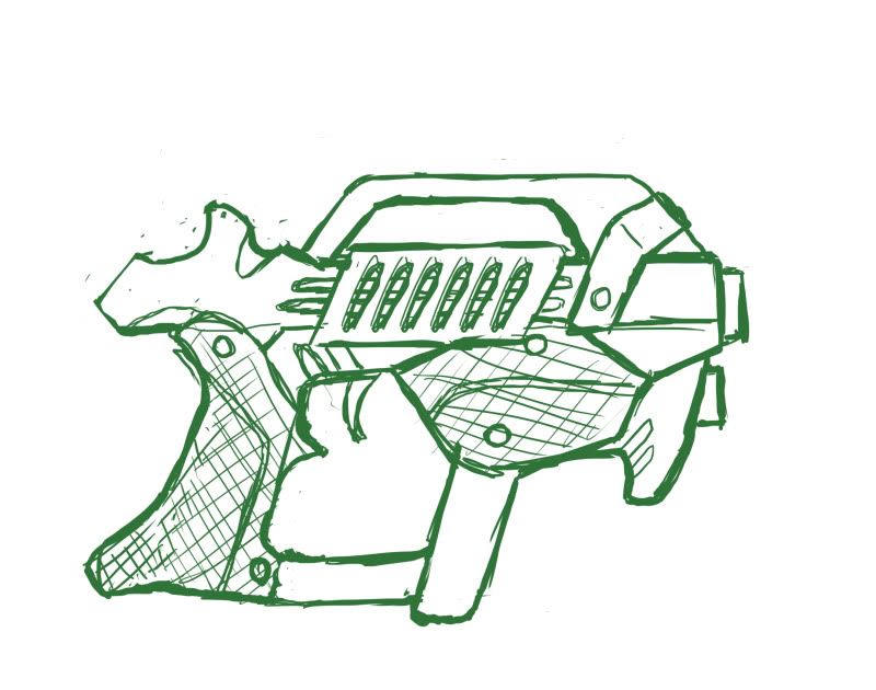
We also had to design a weapon for our character, though I don't believe we'll be modelling it. I've never felt comfortable drawing/designing something when I don't fully understand how it functions

I'll post my models and scene a bit later since I don't have those files on me right now.
For modelling we have to create a character that matches a scene from our level design class. My character and level are inspired by mass effect.
This is the drawing I submitted which I've been modelling from. I don't have too much of a back story for her. She has bark like hair and thin nostrils that close up in environments she's not used to (that's why she has tubey things). I know her lower back/butt/upper theigh is messed up in the side view, but I think I fixed that up in bit in the actual model.
We're using the male rig from UDK, so my character needs a chunky shoulder.

We also had to design a weapon for our character, though I don't believe we'll be modelling it. I've never felt comfortable drawing/designing something when I don't fully understand how it functions

I'll post my models and scene a bit later since I don't have those files on me right now.
Replies
Say that to Bioware and the Asari dude. Geez. And look up the word "Alien" okay?
Hey Kate, good start you might want to spend some more time on the proportions right now they look a bit weird, it'll be worth to spend more time in the concepting-stages before you start modeling. Mainly because in the end most 3d-work is all about planning and workflow.
Thanks. I would have liked to work on the concept more the concept too. My teachers tend to preach about how important preproduction is, but it doesn't show in the amount of time they give to us for it. I'll be redrawing this when I have some extra time :]
To be fair to the program I do have a bad habit of either drawing something once, or sticking to my original Idea
and sssuuuuper ugly wrist. Because I made the hand seperately it ended up being more dense and im having a hard time cleaning it up and making it purdy.
Also, she's going to tip over backwards.
You want a more S shaped curve going her body.
I'm a bit stressed for time so I couldn't find a good ref for you.
But this image has some of this going on.
http://msis.jsc.nasa.gov/images/Section03/Image66.gif
Only one crit I'd like to make: be careful about having the arms come straight out as they are, now. If this were a character that would be rigged/skinned/animated, getting a flexing shoulder-elbow-wrist skeletal system going in arms that are straight out like they are now...would not end well.
Put a *subtle*, slightly relaxed bend in, at the elbow. ^^
Yeah, I usually start out with the arms straight out so modelling's easier and then move them later. I've never put a bend in the elbow though, so I'll make sure to this time :]
I don't like bioware
The second part of your statement doesn't really make sense anyway.
A quick'n'dirty way to do it would be to grab all of your vertices that make up the forearm and hand, change to your rotate tool, place your pivot point to (roughly) the center of your shoulder/deltoid region, and give it a slight rotation.
A few individual verts at the elbow-forearm region may need some tweaking from there, but it'll go fast. ^^
Thanks :}
Well, an alien can look however the artist want it to look, it's an alien. They don't have to look that different from humans at all and can still be alien. You coming in saying that it needs change without valid reason or actually suggesting anything valuable is not really the way of good crit.
The body still looks a bit stiff, you might want to move some vertices around to make her look more flexible. Here is a image of want I mean
Another thing, for me her leg is kinda too big..usually female will have skinnier and longer leg, but if you intended to give her a thick armor, well that's a different story..heheh
From the side view you can't really tell from the silhouette whether its a male or female, boobs doesn't help either cus you have the collar thingy, for a second it looks she has flat-chest.
_Revel
Thanks chrisradsby and Revel :}
Still working on the head
If you have the money buy the book The Art of Mass Effect, brilliant stuff in there
EDIT: Oh yeah, and remember to get some shape in for the muscles under the armpits. It looks a bit weird but you''re on your way! xD Good luck!
I'll have to look into it then. Thanks a bunch :}
Thanks
On the first image, notice the muscle that chrisradsby told you before. And the second one, your model looks hunchback at the moment, push it in a little bit and you're good to go!
_Revel
first, welcome aboard. It's always nice when folks come out of the woodwork.
second, you mentioned that this is a school assignment, so how long do you have to work on it? 6000 tris means you can cram a lot of detail in there if you have time and patience for it, so giving us a time frame will help properly gauge our feedback. I'm not going to harp on the abdominal muscles if you only have 10 hours to finish
So, starting from scratch-- creating a concept and going all the way to finished model-- is a difficult task, especially the first couple times around, but there are some tricks that'll help you avoid a lot of pitfalls, and in the end make the project more fruitful.
First off, you never want to concept from an orthographic perspective. It seems easier, but the results tend to be far less dynamic, and you miss out on opportunities to explore the character (developing personality is extremely difficult when they're stuck spread eagle
Make time to read these.
Right now, your character suffers from the fact that she's readily interchangeable with a dozen other sci-fi lady-aliens. If you're going to stick with human anatomy then have some fun with the armor, and get out of your comfort zone. Look at the Tank from Monday Night Combat; he's basically wearing a banana suit. It's ridiculous but is immediately recognizable and reads well from a distance. You don't have to go that extreme but you get the idea. Mass Effect did a similar thing in designing the Krogans. In fact if you look at any of the Mass Effect species you'll notice how they all have distinct silhouettes. If you're using the ME universe as a point of departure, make sure your profile is distinct from the rest.
And what's the deal with the underboob? There's no reason for it. If this armor serves some kind of hazmat function as you're indicating with the breathing tubes, then make it functional and comfortable; she's probably wearing it all the time. When designing imaginary materials it's important to start from a knowledge of real-world objects. This helps ground your ideas and encourage originality.
Take for example your breathing tubes-- the technical term is a nasal cannula, and there's a reason why the lines always run over the ears before entering the nose-- it's less obtrusive than up the front and the lines are more secure that way. The nose plugs from Battlefield Earth, while visually interesting, are hilariously impractical, constantly flopping around on the actors' mouths, and basically look like giant lines of snot. There are other interesting ways of doing a nasal cannula that are still functional, and you can use these as a point of departure when designing your character.
This may all seem on the nit-picky side of things, but it's this kind of attention to detail that helps separate good designers from great ones. Cultivating a strong understanding of real world objects and materials will take your concepts and models miles further than they would normally have gone.
You've already improved your model's anatomy significantly, but there are still some issues. Admittedly it's an early stage, so that may account for part of it, but it's good to talk through everything regardless.
The neck is too robust; right now it looks like the muscles are flexing, creating more of a triangular shape instead of a cylinder. When constructing that area it helps to think of the neck as a cylinder plugging into the ribcage with the trapezius lining the back side (that's what forms those pits above the clavicle).
The arms and torso are missing a lot of muscular structure, particularly along the shoulder and breast area. The deltoid is what forms the 'lump' of the shoulder, with the pectoral muscle feeding into it from the front and the latissimus dorsi feeding into it from the back. Right now you have the upper arm just socketing into the ribcage without any indication of that connective tissue.
As Revel indicated you're accentuating the spinal curvature too much and consequently giving your female an extremely deep chest. This model (NSFW) is leaning forward a bit and has a pretty flat spine, but should still give you a better idea of what to work from. Note also how the breasts actually curve outward and don't simply project straight out of the chest.
Another point is that you're shortchanging both the ribcage and the ilium/iliac crest, resulting in an exaggerated corridor between the bottom of the cage and the top of the pelvis. The 'hourglass' of the female figure is neither as smooth nor as elongate as you have it in your model-- the pinch happens in the space between the ribcage and the pelvis (though this image is a bit off as the model is bending her arms somewhat), which is a surprisingly narrow band of a few inches(notice how if you bend sideways above the hip you can actually feel your ribs hitting the top of your pelvis). In relaxed, standing posture the elbow joint, navel and top of the ilium will be roughly along the same line, above which you'll find the hourglass pinch and then the ribcage.
Last, take some time to look at the structure of the thigh-- there's a lot more complexity there than a simple ovoid shape, though you've got a pretty decent start on the side profile. Having even a cursory knowledge of the muscle and bone structure will make a big difference, and is something to cultivate over the course of your career.
Oh, and I did a couple quick doodles to help emphasize the point about silhouettes and changing up the armor shape, though it was more oriented around the head/helmet.
Whew. I realize this a pretty lengthy post, for which I apologize, but there's a lot to cram in for you and anyone else at this stage. I hope this helps, and good luck.
Cheers!
_Revel
I'm currently at 5786 tris.
Weop weop, each update is getting better and better Kate
@Revel - Thanks for the paintover ;D
Here's my changes after reading both posts
Thanks Jay :}
I'm still open to crits in my model. Even though I'm "done" with it now, I'm pretty sure I have a portfolio class next semester where we have to fix up our older work.
Here's my base sculpt for the head
Top row has perspective on
Question, why did you make the skin color on her head and her hand/ legs is different?..and the armor piece that cover her breast is also a skin color, which from far people might mistakenly think that she actually "show off", no? And currently the quality of the texture in the lower body seems like not as good as the upper body.
But overall nice update!
..and..
...you might want to fix the texture seams on her hand before post an image that BIG hehehh :poly124:
_Revel
Yuh, my UV map could have been better, I noticed it too, so I might redo all my texturing in my Portfolio class. The brown is not skin, it's armor, I guess I just made it a little too close to the color of her hair.
And yus, it's realtime viewport
Very Mass Effect though. Good representation of the style, you're aiming really high, so don't be surprised that people could crit. you more harshly because they're going to hold it to one of the highest standards in the business.
All crits are welcome here, whether they're harsh or not :]