Home 3D Art Showcase & Critiques

WIP: Sci Fi Scene

polycounter lvl 9
Offline / Send Message
glottis8 polycounter lvl 9
So I decided to do a sci fi scene... i did a quick sketch of the composition and just to give me an idea on the space in general. Its going to be like old school alien with its grunge and dark feeling. Everything is abandoned and destroyed. I will add some lights in the concept to give you and idea of what else I want to do with it. Right now I just had that down for shapes. Nothing detailed. I might take that sketch and polish it out to have an idea of color... but i am not sure yet. Maybe blow a hole on the right side to see some debris floating around.

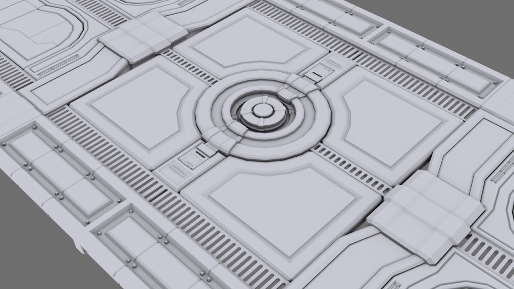
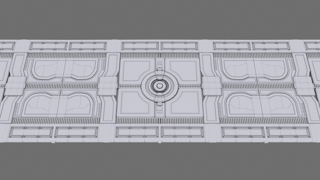
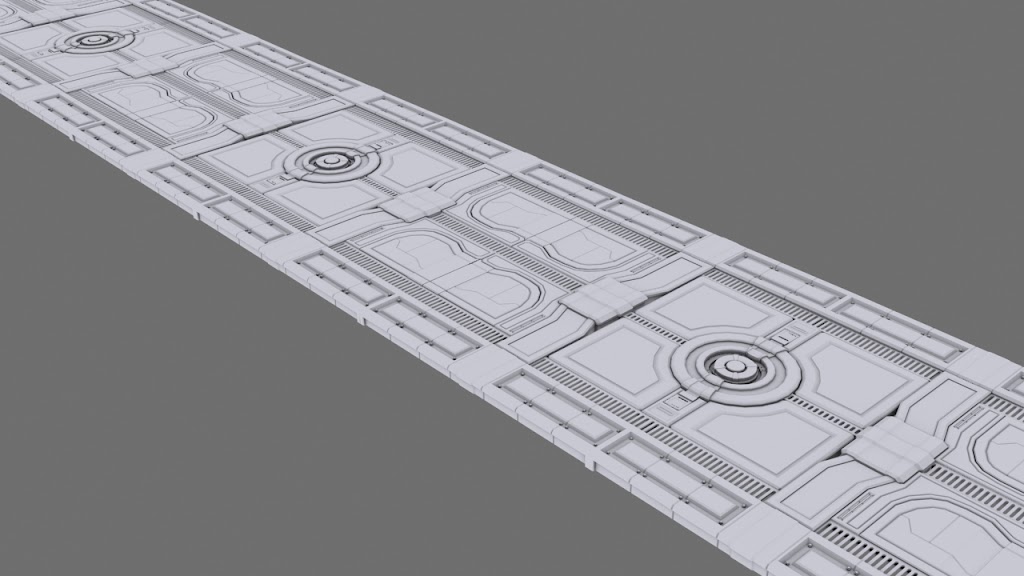
I started the floor with much detail. Still more to work on it, and I'll update some pieces for the wall as soon as I make them right now. All of this is in 3ds max and will go through zbrush for texturing and then UDK. I want to add cables that you can see running under the grates, and some more machinery. Comments and critiques are much appreciated. Thanks!
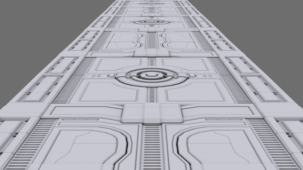
021.jpg022.jpg023.jpg024.jpg025.jpg

Replies

  • Darkmaster
    Offline / Send Message
    Darkmaster polycounter lvl 11
    One thing that I have been told with making tileable sets like this is that since you are projecting these high poly tiles across planes, you really shouldn't be concerned about polycounts. So as a result, there should be NO circles that have hard edges around them. I can't really tell from your shots, but it might be tool late to add in more sides around the circle piece in the center of the tile. If it doesn't work this far in, it's not really a big deal, but ya go back and add side more sides.

    Everything looks cool so far! I would say that there are a lot of sci fi scenes that are posted on PC, so make sure that yours has something that the others don't. I'm not saying not to do them, but just sell yours so that it stands out from the many that are out there. Games like Gears of War, Halo, and Starcraft are proof that Sci Fi environments can still have life in them so just run with that and you will have something cool! Looking forward to seeing this thread evolve.
  • Zanrok
    I am loving the detail man, keep it coming!
  • Taylor Hood
    How many of these threads start with some SCI-FI wall/floor panel?

    Heh, great modeling detail! Keep it up. =]
  • glottis8
    Offline / Send Message
    glottis8 polycounter lvl 9
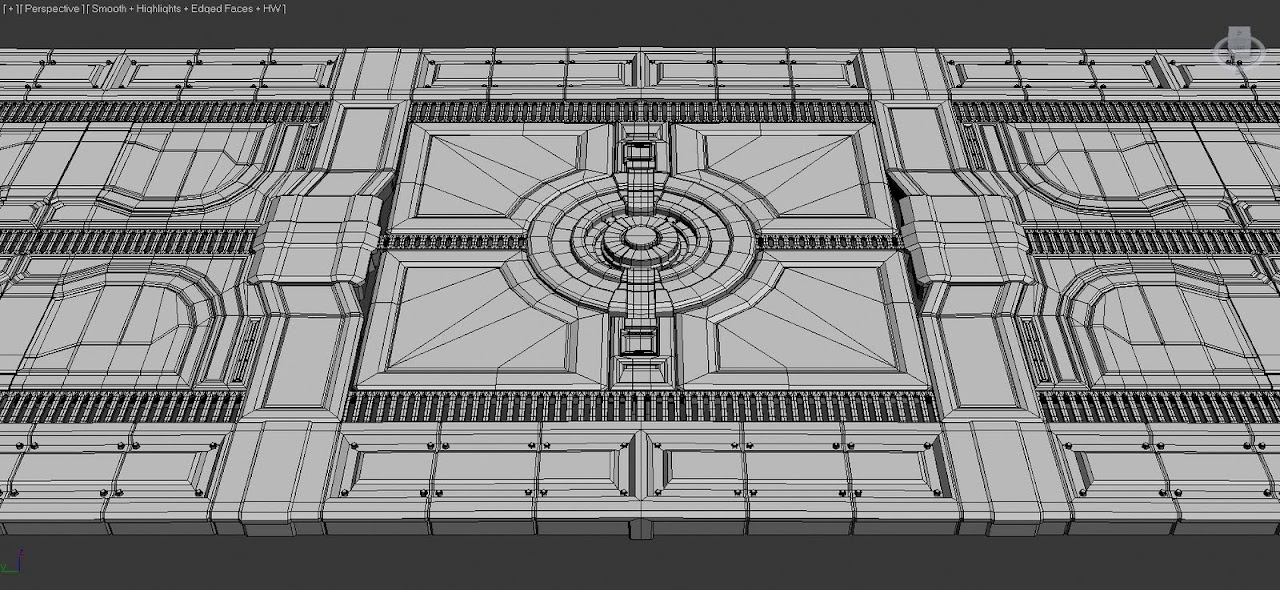
    So I smoothed things out.. fixed some geometry and added some more details. I also blocked the basic shape of the wall... and some details.... Comments on it... but keep in mind it will have a lot of big shapes that will keep the wall interesting and in an interesting shape.
    More to come soon.
    Yea, I know the name of thread is generic... but what else could i name it? extravaganza spaceship corridor special preview? haha... i dunno...

    Thanks for the comments though... there is still a lot of work to do with it. With more feedback I think this can be a good portfolio piece.
    026.jpg
  • raul
    Offline / Send Message
    raul polycounter lvl 11
    nice modeling!!
  • Jungsik
    Offline / Send Message
    Jungsik polycounter lvl 6
    OO niceeee very sci-fi <_< im looking forward to finished scene!
  • roosterMAP
    Offline / Send Message
    roosterMAP polycounter lvl 14
    I suggest you learn how to do high poly modeling. look up tuts on subdividing geometry and baking. It will jump your skills ten fold.

    http://cg.tutsplus.com/
  • cholden
    Offline / Send Message
    cholden polycounter lvl 18
    Should be fine, but you might consider adjusting your scene composition because the other pieces on your site (nfs, and temple) have the same "hall with glowing entry focal point". It's kinda funny, but I see it a lot in portfolios where artists all have the same scenes regardless of theme.
  • SHEPEIRO
    Offline / Send Message
    SHEPEIRO polycounter lvl 17
    cholden wrote: »
    Should be fine, but you might consider adjusting your scene composition because the other pieces on your site (nfs, and temple) have the same "hall with glowing entry focal point". It's kinda funny, but I see it a lot in portfolios where artists all have the same scenes regardless of theme.

    i suppose its a well used environments in games and uses very few assets to create a "whole" environment.

    isnt much like your concept...like it though... what is used for though the panels in the floor look like they are inspection hatches for something maybe a massoive rail gun?
  • glottis8
    Offline / Send Message
    glottis8 polycounter lvl 9
    Hey, this is what you posted in my thread. Looking forward to seeing how your project turns out!

    Thanks! Yea, thats the one that i showed you the AO map example. Thanks for looking at the thread :)
    SHEPEIRO wrote: »
    i suppose its a well used environments in games and uses very few assets to create a "whole" environment.

    isnt much like your concept...like it though... what is used for though the panels in the floor look like they are inspection hatches for something maybe a massoive rail gun?

    They are indeed inspection hatches... the ones that are circular hold cores that they can replace for energy. They rail looking grates hold under pipes and cables. You can actually see them... well.. not in the render... but after i am done and start really tearing the place down to wear it you will.
    roosterMAP wrote: »
    I suggest you learn how to do high poly modeling. look up tuts on subdividing geometry and baking. It will jump your skills ten fold.

    http://cg.tutsplus.com/

    Thanks for the link! i do think this will come handy in some of the smoothing and way of building assets that look weird when i turbo smooth them.
    cholden wrote: »
    Should be fine, but you might consider adjusting your scene composition because the other pieces on your site (nfs, and temple) have the same "hall with glowing entry focal point". It's kinda funny, but I see it a lot in portfolios where artists all have the same scenes regardless of theme.

    Yea... I know what you mean. I that's why I am changing a lot of the composition around. To a wider hallway, and I do want to break a hole in the right side... so instead of having windows.. i might have just a hole blown up where you can see debris and space.... At least that is the plan.
  • chrisradsby
    Offline / Send Message
    chrisradsby polycounter lvl 15
    Hey nice work, you might want to consider breaking up that wall with some more variations :) I'd say at least three variations and you're good to go as long as you add some assets to help out. Looking forward to more progress dude!
  • glottis8
    Offline / Send Message
    glottis8 polycounter lvl 9
    027.jpg

    Yea, with how everything is in pieces i think i can make different tillable sets. Which is nice. There will be more stuff going on...like some other pillars that curve... for loading...some terminals... things like that... this is the basic shape with an update on the frame. More to come today.. since i have the rest of the day to work on it.

    Maybe i'll photoshop over this shot to show more or less what i want to do and make the idea clearer.
  • glottis8
    Offline / Send Message
    glottis8 polycounter lvl 9
    Just some extra details here and there. Let me know what you think. More to come soon. 028.jpg
  • glottis8
    Offline / Send Message
    glottis8 polycounter lvl 9
    Update of some minor elements.. and some pillars that will be holding up and breaking the scene. Still much left to do. Comments.
    029.jpg
  • ajr2764
    Offline / Send Message
    ajr2764 polycounter lvl 10
    Great work so far. I like the details and shape of the hallway. This has a little bit of DeadSpace look because of the parts that repeat right above the wires. I like the idea of adding the pillars in because it does breakup up the tiling a bit. Not a fan so much of the current design of them and the space it leaves between the wall. What if you had those pillars extend all the way back to the wall sectioning off the tiled wall parts you have. What are you planning on doing at the end of the hallway?
  • GoodDreams
    It's definatly very Alien. I think the cables are a good idea but they look weird. I dont't think they should overlap and stick out as much as they do, you just want some really thick, heavy cables with big connectors hooked up to the sides and then snaking down underneath.
  • Acumen
    Offline / Send Message
    Acumen polycounter lvl 18
    what bothers me from this "hipoly" scene is the height difference on the main floor elements. If i imagine walking around this hallway I'd curse 120% of the time cause I'd have to watch out for all these little bumps and shit. I guess it'll be the base of your normal mapping process, but still it's something one could argue about the actual sense and function of the floor :)
    I really hope you'll get back and make the scene less repetitive. Sure it's just a hallway, but your microdetail is really busy and tiling. Modular is great, but the current state is quite heavy.
    Think you got quite the task in front of you, but I'm sure you'll come up with something great in the end !
  • dtschultz
    Offline / Send Message
    dtschultz polycounter lvl 12
    This is a good start, but are you going to fix the faceting in your "highpoly"? If you don't all those hard edges in what look like they should be curved are not look good when you bake them out. All you have to do is add edge loops, and get rid of some of the tris in some of your panels, so they will smooth nicely.
  • Wonkey
    Offline / Send Message
    Wonkey polycounter lvl 10
    It is pretty, but (just like 90% of the sci fi halls)I would hate to walk on it... So if you flipped the hall upside down, and smooth the supports in the middle aisle, you have a nice walkway.
  • glottis8
    Offline / Send Message
    glottis8 polycounter lvl 9
    031.jpg
    So the door progress. those pillars on the side are just place holderish.. but i like how they break the lines in the composition... anyways... didn't have much time to work this.. but will work soon some more.

    I did think about the cables.. i will change them around. The smoothing of some edges are still in progress. Thanks to everybody for their comments. :)
  • SimonT
    Offline / Send Message
    SimonT interpolator
    this + great light = awesome :D
  • Spitfire
    Solid start, cant wait to see more!
  • glottis8
    Offline / Send Message
    glottis8 polycounter lvl 9
    Update on the door. Still i think there is more that I can do on detail for this. But thats the overall shape and comp. Comment please...032.jpg
  • snake85027
    Offline / Send Message
    snake85027 polycounter lvl 18
    nice, keep it up.
Sign In or Register to comment.