The BRAWL² Tournament Challenge has been announced!
It starts May 12, and ends Oct 17. Let's see what you got!
https://polycount.com/discussion/237047/the-brawl²-tournament
It starts May 12, and ends Oct 17. Let's see what you got!
https://polycount.com/discussion/237047/the-brawl²-tournament
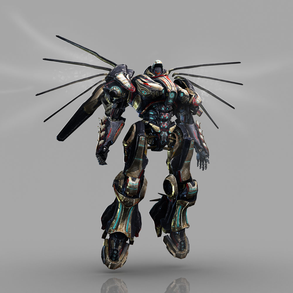
Arkhangelsk Battle Suit
This is my first post on PC. This is my newest model, modeled in max, sculpted in zbrush, textured in PS. It's about 40k Tris with 1024 maps. Crits and comments are always welcome and I have a very thick skin, so don't hold back. Thanks!


Replies
I'd like to see heavier wear at the joints and places that would routienely brush and rub up against things, and not just at the edge of every single plate of metal. Like think about what situation would it have to be in to get certain scratches, like just above the knee part I like how its really torn up from them metal hitting it when it walks.
It feels a little noisy, like I like the shape but when I look at it my eyes aren't drawn to any particular place due to how uniform it is. Less can be more in times like this, maybe try varying up places of heavy detail and low detail to draw the eye where you want them to focus.
The only other thing I can think of is maybe vary it up by include stains, scorch marks, bullet holes, other types of damage then just scratching, though that might be hard to make look unique as it seems like you've got a lot of efficient UV mirroring going on.
On that note, care to show your texture maps?
Below are the zgrabs, nothing special. Really cumbersome because of the file size, I seperated all the ztools to work on them. The diffuse is the upper part of the body.