I am going to be modeling the Frederick Butler House, a restored Victorian home in Detroit for a class assignment. I will be updating my progress regularly
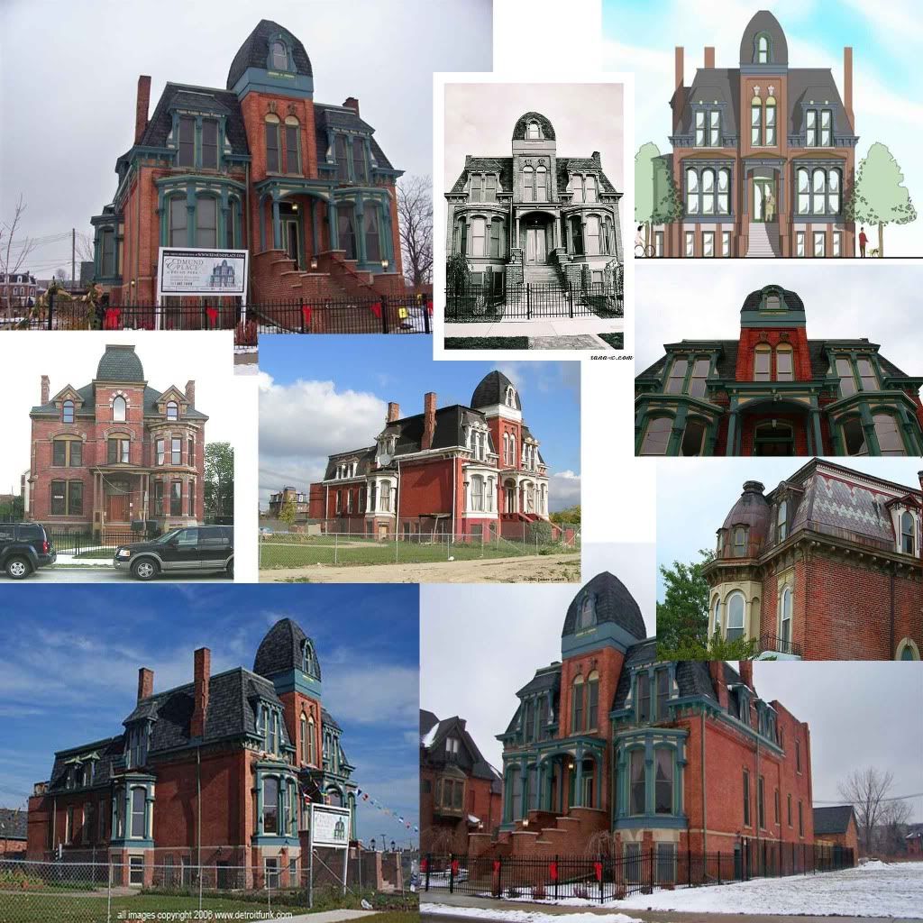
Here's the reference sheet:
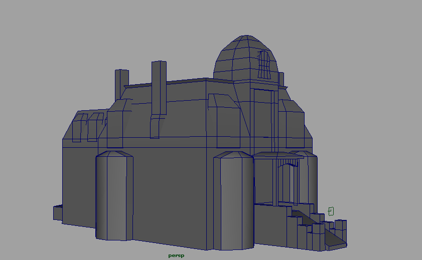
Not much to look at yet, but here's the initial block out:
That house has a lot of promise to make a great model.
Scale does seem a bit stumpy compared to the pictures though, so I'd grab the whole thing and stretch it out vertically a bit.... Especially that dome.
See the angle of all your reference pictures? These are pictures taken at eye level. When presenting this building, try to maintain a similar angle with at least fov90. If you present from above, it'll always make your house appear smaller and squished. It's also an angle our brains don't normally process, and people might see proportional errors that don't exist.
I will definitely keep that in mind for future updates and the final render. Thanks!
Quick question, most of the windows/frames are floating objects, would that pose any sort of problem when it comes to texturing? Or is it better if everything is one mesh?
First thing I notice is that your scale is off. Your bricks and tiles are about twice as large as they should be. For example on the front of the porch the bricks should be 4 across instead of the two across you have now. Your textures are looking nice to start but they are a little clean for this style house as well. I also hope you add that pattern in the roof tile texture that is in one of your reference images, it's looking like a great start so far.
marq4porsche - Thanks for the feedback! I hadn't really noticed that the scale was off but I really should have since its so important to the overall look
chrisradsby - I'll see what I can do to add some variation, thanks!
Replies
Scale does seem a bit stumpy compared to the pictures though, so I'd grab the whole thing and stretch it out vertically a bit.... Especially that dome.
I think when I was enlarging my source photo I must have messed with the proportions of it in photoshop. But its fixed now
Here's a crappy little AO render
I will definitely keep that in mind for future updates and the final render. Thanks!
What do you mean by a clean intersect?
Good luck, you have a good start.
chrisradsby - I'll see what I can do to add some variation, thanks!