Lair of the Lunar Mastermind (UDK)
Hello, this is my second thread on polycount.
(First thread being my sketchbook: http://www.polycount.com/forum/showthread.php?t=64504&page=16 )
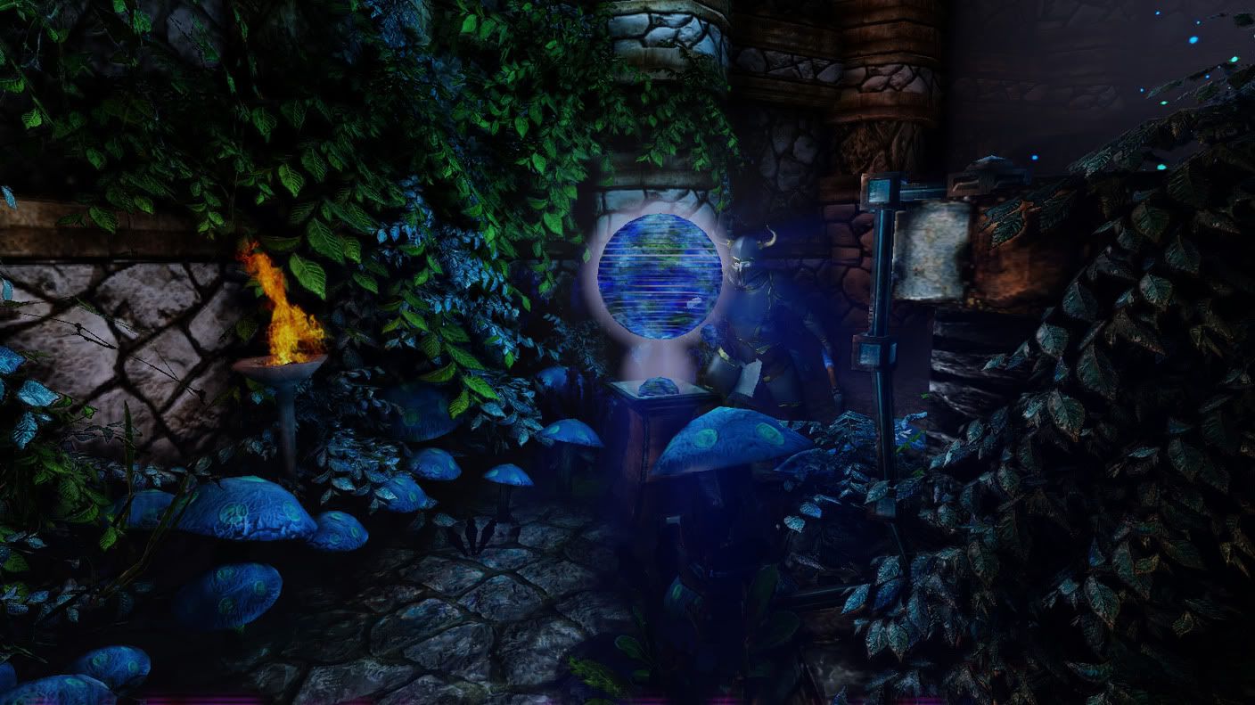
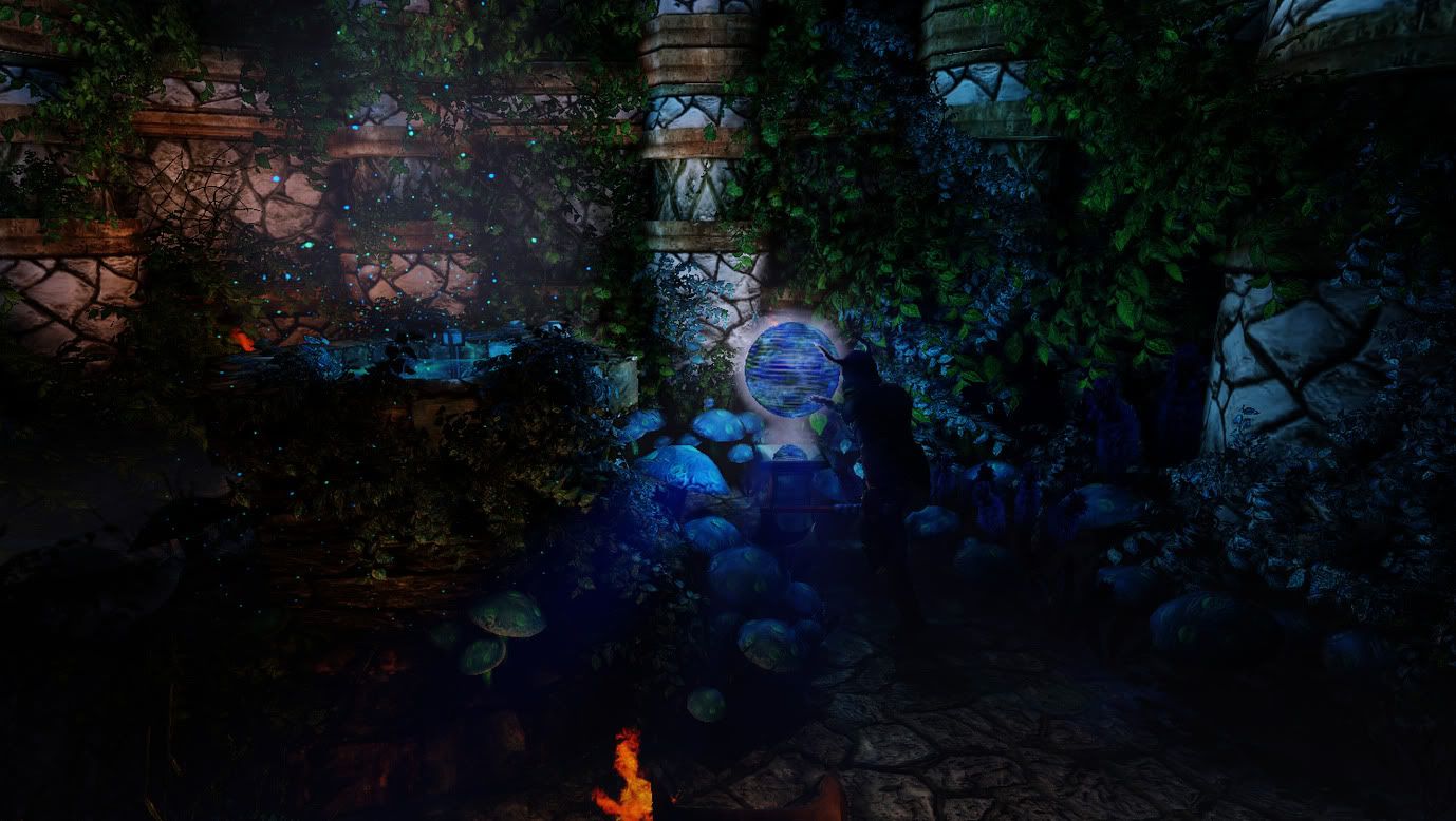
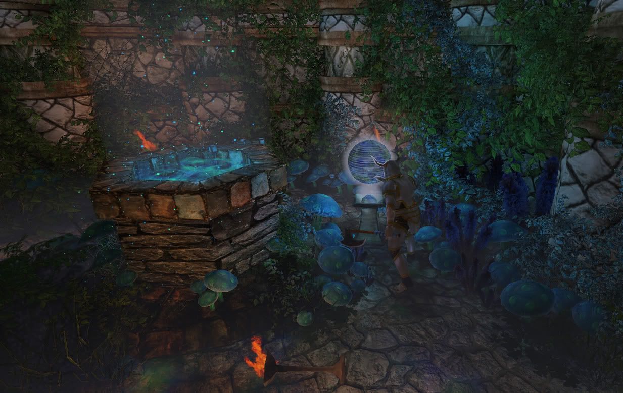
The Lair of the Lunar Mastermind is a real-time 3d environment in the Unreal Engine, created using the Unreal Development Kit.
It is for a game i am creating called Crusader's Quests
I've gotten it to a point where i like it and i think it is the best environment i have created.
I am wanting to hear what some experienced people think about it so i figured it was time i made a thread in this section!
Thanks in advance for any comments and criticism.


Replies
Thanks for the criticism, Vig. I agree about the foliage. It is pretty dense in polys.
The stone materials i actually really want to work on... i don't think it looks good for stone. Aside from the diffuse having too much lighting info, the material itself is looking too glossy.
I'm going to get working on the stones diffuse.
The vegetation is too densely PLACED. As in, you could get a LOT more from uses LESS plants/mushrooms. For example, there are so many mushrooms that you can't see them, only parts of some which are heavily repeating. Back when static meshes were first introduced we weer so excited because we could reduce tiling, not increase it.
Your original image: http://i268.photobucket.com/albums/jj37/ngs616/LotLMM29.jpg
Looks better in respect your current overpopulation of detail and AO.
I'd do a total reboot on this scene's lighting starting with the actual light sources, I mean, there's fire with solid black shadows right next to it.
- Your foliage would be burnt by now with the placement of those torches.
- Torches need some bloom to suggest energy and warmth.
- Your wireframe shot worries me with the amount of density, I'm sure you could optimize and and rid the need of so many (potentially performance damaging) alpha cards.
You have a solid foundation though, keep it up.
Do you know how i lower the amount of AO its using? I can only find an option to use, or not use it. I tried looking it up, but i'm having trouble figuring that out.
I understand why you feel the vegetation is too densely placed.
It is supposed to be this way. What is powering that globe is supposed to be energy harnessed from the moon, coming from that well.
The shot you linked was actually from a corridor leading to this room. There is less vegetation there, because it isn't being effected by the well, only the machine displaying the globe.
I'm thinking i should replace some mushrooms with different types of mushrooms, and redo the plants. They could be more efficient.
Thanks for the criticisms, Mr Bear.
-I moved some of the vegetation away from the torches. Let me know if you think it's still too close.
-I added some bloom to the torches, its a plane right now, i need to make a particle effect for fire and smoke.
-Yeah the density is way too high. I was using this stupid leaf bush i made to do all the vines and stuff on the wall. There is a few other types of plants in there that you can't see unless you really look.
I'm working on all this stuff and i'm going to post some updated shots really soon.
The first shot is without AO, the second is with. I'd love a mix between the two, but i'm not sure exactly how to achieve it.
More tweaking on the lighting. Not sure if i made it better or worse, haha.
-
Things i want to work on...
-The rest of the map (Did a little of that today)
-The fire, i need to make a particle effect for it.
-Create some other sort of lamp/sconce.
-Create more reworked alien technology.
-Create the outside of the lair.
-Adjust lighting much more
-Work on character model and materials.
-Create a zombified human.
other than that. i like this scene a lot.
very nice work
"Go to the content browser and type in the search bar -> UTPostProcess_Console
This file contains the default post process chain. Open it and find the AmbientOcclusionEffect node. Select the node and the property window appears at the bottom. Now you can change the SSAO to something lighter. At the end, don't forget to save the package."
How exactly are you creating your scene's lighting? Again, it just needs to be started over as I feel it's probably being gone about the wrong way. I'd start by making either that glowing blue thing and the torches use their emissive (static mesh properties > lightmass > check the box). By default these will probably be too strong since your scene is tiny, but that's what lighting is; a series of small tweaks to a grand result. Then a dom light for the whole scene and a spot light to highlight focal point.
If your emissive lighting is causing trouble switch it out for some point lights, good work around.
Looking forward to updates.
Thanks for helping out again cholden. The UTPostProcess_Console seems to be obsolete, but you mentioned the term "Post Process Chain" and that was exactly what i needed! I've figured out i can create my own for it. I wasn't aware i could do that. This will allow for a lot of the tweaks i was looking for.
And the suggestion for the use of the emmissive lighting going over into lightmass is a good idea.
I've set the whole thing up using point lights.
Thanks, Mr Bear! I should have some good improvements coming soon!
The sphere is supposed to be a hologlobe that was put together by a "wizard," for lack of a better term, who found and studied an alien ufo and being.
It looks much better animated. Those open lines scan through it vertically.
I made a fire particle effect. I haven't done the smoke yet. It looks okay but it is very simple and unsatisfactory. I am going to make some crazy looking fire soon!
If anyone reads this and knows how to record a video(demo) from within the UDK please let me know. I'd rather show the level animated.
This is the current version of this "scene" of the level.
I need to work on the material of the globe... i want to make it appear as if it has a very sharp shiny reflection.
-for screen capture software you could get camStudio. It doesnt have any limitations at all. And it is totally free!
Thanks, Raul! I actually have camStudio also, but was having the same problem as stated above, when i'd record from the editor it would come up with tons of graphical artifacts that made the video impossible to read.
I'll try to get a video up here soon. I'm also gonna post the old layout i made for this level. It's freaking massive. And i'll post what i'm wanting to do for the new layout.
This one is of a new version of the hologlobe, much brighter and harder to tell its a globe.. but it looks nicer, i need to increase the specular power.
[ame]
These two are of the fire effect. Really soon i'm gonna set the light up to flicker, thats missing at the moment, sadly.
[ame]
[ame]
This one is of the well. It needs some emissive tweaking.
[ame]
-=-=-=-
This is the old layout. The middle bottom is the part you're seeing now. In this shot there is a long blue streak in the middle leading down to the well.
I actually had this level even larger, and rooms off of all the empty corridors, but it's just too large. It'd be tricky to have it be that big and still have the players able to go outside of the lair with it running well.
-The ball effect is nice.
-The fire needs some work. I think the movement is a little off, i can see the particles spawning, and there is no movement inside the flame (or so it seems). It would help to break up the silhouette of the flame more, to make it look a bit more random. Also, consideer changing the smoke color to something dark.
-The well effect is nice too, what was your approach?
i figured out a way to hide the particles spawning. And about the middle of the flame needing to be more evident, thats partially because i'm using an additive material. I've just experimented with some ways to change that, but its late so i'll try to get to that tomorrow!
How i did the well effect. I have a flowing material for the "sparkles" (i call them stars in my file).. i have a warped fog sphere above it making a tunneling fog effect(not to noticeable in the video) for the inside water, i have 2 "bumpy" planes with a rotating transparent texture. (the bumpy planes are just 4x4 with various points in the middle raised up. I probably should smooth it and it'd look even better. It's alright how it is though.
i did make another fire particle tonight.
This one engulfs the crusader's eyes in fiery orbs that flow infernal flames!
[ame]
Wish I could show you the fire pots I just recently made for Neverwinter, it'd be a perfect reference for you. If you want, I can look and see if there's anything in Champions Online or Star Trek Online that I can Fraps as a reference for you. You've got a pretty good starting point but there's details that can make or break it as convincing fire.