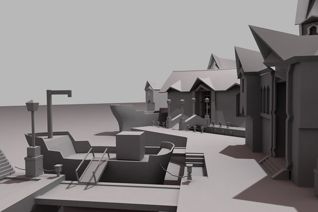
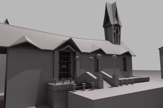
Journey Down Environment.
This is an environment im working on,the concept is from an artist named Theodor Waern. He's doing a point and click game called a Journey down.http://www.twgrafik.com/
I really loved the style of the environment and it will be a good change from gritty and realistic.


I'm finishing out blocking the details and i will get it into UDK soon and start creating textures,models,etc. One thing i need to determine is how modular should i go with the env.
I really loved the style of the environment and it will be a good change from gritty and realistic.


I'm finishing out blocking the details and i will get it into UDK soon and start creating textures,models,etc. One thing i need to determine is how modular should i go with the env.
Replies
Lighting is going to be key, and watch out for those sharp 1 pixel corners!
Thank you,i think the exaggerations will be more evident once i build the actual modular pieces. I think tonight i am going to sit dow,give it a good look and try to figure out how much of this will be modular.
@kaburan Indeed! That along with materials as well,getting the wet look is important equally in the scene,that is if i am to get as accurate as the concept as i can. The textures will be hand painted as well which will also be fun
Play it here:
http://www.bigbluecup.com/games.php?action=detail&id=1344:thumbup:
Just a quick update. Last night i began to create the basic tileable textures which will be seen in the scene. The first one is a cobble tile for the pathways.The diffuse at the bottom left just has some basic color info with the AO applied so i can see the normals better in UDK
Last night i generated normals,AO light maps and height maps in z brush for this tileable texture and these are the first results of the WIP material/textures in UDK. Instead of using any sort of stencils in z brush i just hand drew all of the details maintain the hand drawn art style of the concept.
When i get home ill work more on this texture as well as get the blocked out scene in UDK.
Making these hand drawn textures is sort of new to me so this might be the first of many attempts
I'm wondering how did you make it tileable, though. Did you sculpt it directly on a plane and then removed the seams in photoshop? Or did you go straight into 2.5D mode and used the tilde button to wrap it around?
Well thats the kind of cobble im going for,maybe it is too blooby,i dont know. This texture will be tiled many times on the floor so it may not be as noticeable. Im going to try to paint some of the diffuse tonight over it and see how it looks,if i hate it ill remake the texture again in z brush.
As for how i made this,it was in z brush using the wrap mode.
http://www.scriptspot.com/3ds-max/scripts/stone-placement-tools
to generate the ground map.
bretmcnee- probably cos your used to seeing an inverted (comparitively) green channel no biggy to swap
Is the game gonna be realtime or with rendered(+shopped?) images?
first chapter is available for download
@Snader quite right,its different,i almost considered redoing it but it grew on me.I might however have to make changes as the environment grows,i thought it would be fun to make a hand drawn environment and it all fits together in the end.
teaandcigarettes: i considered pinching more but i dont want to get into either extreme realisim or cartoony. I made the mesh for the normal bake in z brush using the wrap around feature.
By AO technique you mean the light map for the diffuse correct?
I don't feel like the diffuse tiles too obviously,there is some varying colors in it but when i see it in game it seems to break up at a distance quite nicely.
The noise i agree onits gone as for the rain im still looking for a way to creat the materiali was thinking maybe its in gears one for the rain level
I am now working on the modular set for the stone blocks that function as ledges, after i finish the textures ill move onto making the bridge,lamp and little chain poles.
And tonight i mostly finished the high poly lamp ill use for the normal bake,the base
,being stone will require some z brushing but that ill get to once i make the high poly for the bridge sides which is also stone.
This will be the first full weekend i can work on this little scene and i hope i manage to make some more progress.
So another quick update,i am still chip away at this environment every free moment i can get and i have vowed to myself to take this environment to the end. So the texture and model of the bridge is finished. Overall happy with the look of it,at least for the time being. Also modeled out the low poly lamp,there are two versions,one which goes over the stone columns of the bridge and a stand alone light post as well,also made the small poles and chain that goes besides the bridge. If i have room in the texture sheet ill also have the ladder and the rings next to it as well. So tonight is to try to finish the texture for the lamps,pole,chains,ladders and rings so i think i am closed to finished with alot of the modular,instanceable assets then onto the buildings.
Also didnt have a real clear view on the concepts for the chains but i figured diamond shaped links would go well with the very triangle like style seen in the concepts.
Thank you,i hope in the end when i finish it can be a nice center piece for my portfolio. Its been a bit more challanging to the type of work ive done in the past which has been gritty and realistic. Im trying to have it where there is alot of color in the environment so i have had to plan for this type of style to get it all to look right. The handpainted look has also been fun and challenging,trying to mix 2d looking detail along with normals i believe i can still get better at.
stand alone metal lamp post. Texture is still WIP.
The lamppost is looking awesome! Maybe a bit more wear at the bottom? Just to ground it a bit more? I don't know that its a very minor nitpick!