Sketchbook: Charlottje
Bash on my work, PLZ. :]
Critique requested and wanted, definitely need to improve on a whole array of subjects.For people interested,
I'm currently just a student DAE @ Belgium, where I study a sort of game-design curriculum, where I'll hopefully learn to make awesome character concepts and so on and so forth. Pretty much still residing at the noob-level.
So please help me get better :]
I don't have a lot of AWEsome work to begin posting with,
so I'll dump a loadful on y'all of some older stuff. Next post will be newer, I promise :]
Sketches
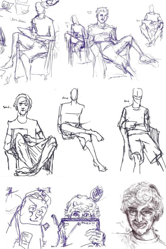
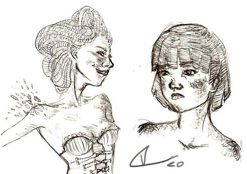
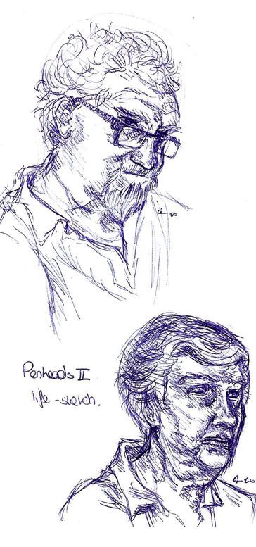
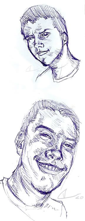
Aquarel

Paints
3D
Replies
cool beans so far, now do more!!!
OH BAM. SHAZIZZLE.
@LosPescados: What improvement? 8DD hurdurrdurr.
Working on a bully and had some fun with Concept Tag.
I like the environment as well, but I think if you picked out some areas of it, like the rocks in the forground, and the riversides and gave them some hard edges, it would make drastic improvements right away!
Haven't posted anything much yet because school's a real killer.
But sitting on the train is making me productive, thank god.
Me likey. :]
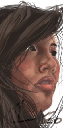
Portraits of random people:
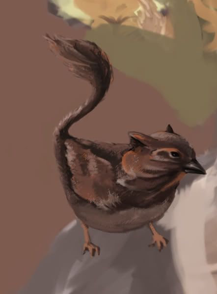
And some imaginaries:
WIP so far:
EDIT:
This is what it became:
See two posts above to see what I started with.
Anyho..good work and keep it up!
Will update.
Link to a (really) short video of my first 3D game-character, made for the game Flatliners together with our team, "Serious".
High-poly baked onto low-poly, textured, spec'ed and gloss'ed by me.
Facial Morphs done by me, Rigging and skinning done by Jhonie Aelbrecht.
Character sheet attached and a wip.
Still got a lot to do before I import in zbrush
Rotating shield.
Although I did like Steven De Meyer's shield
Low-poly character for Hue-man, a Kick Me game
Texturing low-poly faces is horrible :'D
-e + ly fun.
Same for the cutey princess pie.
Texturing needs more work. >.<
Deadline for the game's tuesday, arghhlugluglu//drown.
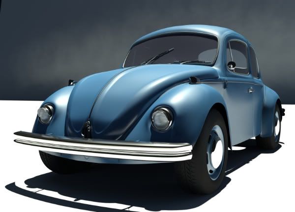
NormalMapping, Sculpted with Zbrush, modeled in 3DsMax.