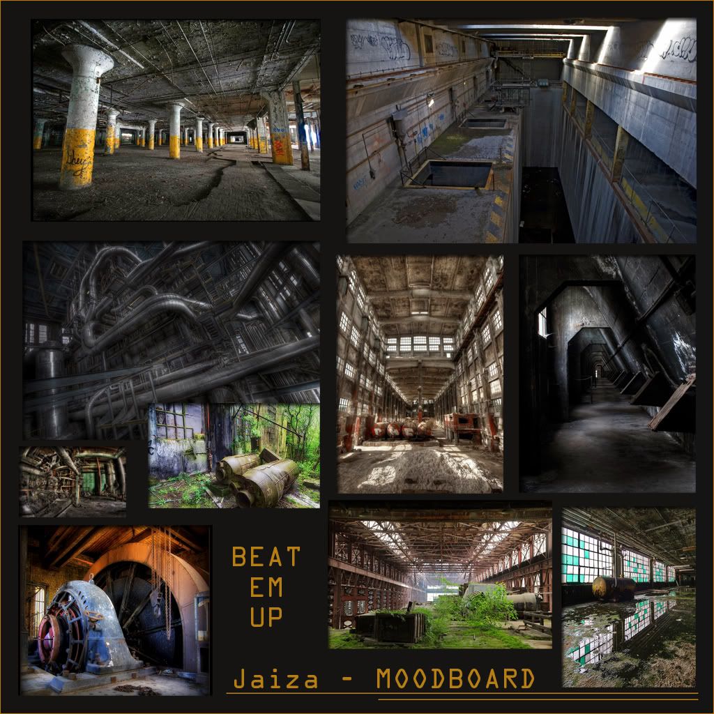
BEAT-EM-UP! | Jaiza
Figured it was about time I participated in a challenge, I do mainly management at work these days so I don't get to model as much as I would like.
My theme is Industrial Decay.
Think:
- Abandoned factory
- Old power station
- cold war nuclear waste facility
- 70's processing plant
The challenges I would like to face:
- Learning UDK, Its something I have wanted to get stuck into for a while so this seemed like the perfect opportunity
- Creating the Environment with smart and creative use of modular pieces
- Finishing with an Environment that would slot into a beat-em-up game with ease
Below is a Moodboard, Progression board and a Blockout, done in 3DS Max.


Cheers
My theme is Industrial Decay.
Think:
- Abandoned factory
- Old power station
- cold war nuclear waste facility
- 70's processing plant
The challenges I would like to face:
- Learning UDK, Its something I have wanted to get stuck into for a while so this seemed like the perfect opportunity
- Creating the Environment with smart and creative use of modular pieces
- Finishing with an Environment that would slot into a beat-em-up game with ease
Below is a Moodboard, Progression board and a Blockout, done in 3DS Max.


Cheers
Replies
Replicating that great used and grungy look will be fun and I cant wait to see some cool props. I especially love the big turbine looking thing in one of your moodboard shots. I also like the use of two levels of fighting space throughout the scene. Nice use of space
Im wrestling with UDK a bit:
- Im getting tiling between static meshes with Lightmass like glynnsmith was, anyone have a solution?
- Also how do you disable SSAO?
Cheers,
Jaiza
View -> World Properties -> WorldInfo -> Default Post Process Settings -> Allow Ambient Occlusion
Hopefully that takes care of the tiling.
Looks sweet! I remeber this problem awhile ago with some udk stuff i did. Found this, see if it helps...
http://forums.epicgames.com/showthread.php?p=27668863
So either theres a setting that might have been removed by Epic, or the suggestion was to cover it up (might not work with the floor)
Also i might suggest having a play with lightmass setting and getting a nice bake done. It might be the area of effect for the lightmass and some bleeding. Double check the meshes snap perfectly and its all nice and straight
/end
Careful with some of the normalmaps on the concrete, it looks like it might be a little lumpy. Works great on the pipe though, looks like its taken a beating
Considered changing the green to something else? If you're going to do the green overgrowth (I hope you are!) then a different colour that compliments that would be nice instead
Go nuts with cables/chains and piping, should be great to play them up in the foreground a bit here and there.
Can't wait to see more
Struggling to find enough time to work on this with work and the baby. I wish we had longer!
If this is planned in your workflow then disregard the injection, but I suggest you take a moment to setup Decals. I say now because it's a very quick thing to setup, with a huge impact and will help you realize your vision earlier.
http://udn.epicgames.com/Three/UsingDecals.html
From your reference images, the most useful decals are; various stains, water puddle
Stain Example. This one is blood, but could represent anything else.
http://chrisholden.net/bd1.jpg
Using the same setup, you can add weather, or fake shadows to literally everything, and get a cheap bonus lighting.
http://chrisholden.net/udk_decal_weather1.jpg
Water Puddle. This example uses a CubeMap, but could use real-time reflections and SAVE you resources under this challenge's rules.
http://chrisholden.net/udk_decal_cubemap1.jpg
For more info on material examples:
http://udn.epicgames.com/Three/MaterialExamples.html
Decals are extremely powerful, and can add much more than I've shown here. Even damage with paralax depth decal has been used for years now. (See F.E.A.R. released in 2006)
I will keep working on this, its been an awesome challenge and I have learnt SOOOOO much.
Some of the feedback and other entries have been very inspiring!
Sorry you didn't get to finish your final section, but the rest looks great. I know what you mean about getting your teeth into UDK. Its been a great experience.
This could work out to be a really nice piece for you with a little more work. I'd focus on getting some of those greens under control and re-investigate the lighting first. I feel they are somewhat one-in-the-same due to the amount of light the green sludge should be emitting. Try to get rid of the solid black shadows.