The BRAWL² Tournament Challenge has been announced!
It starts May 12, and ends Oct 17. Let's see what you got!
https://polycount.com/discussion/237047/the-brawl²-tournament
It starts May 12, and ends Oct 17. Let's see what you got!
https://polycount.com/discussion/237047/the-brawl²-tournament
WIP: Hybrid Space Chick
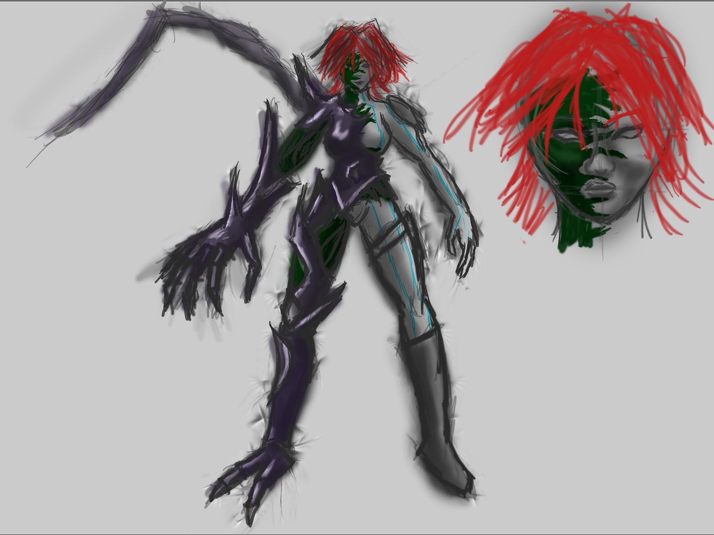
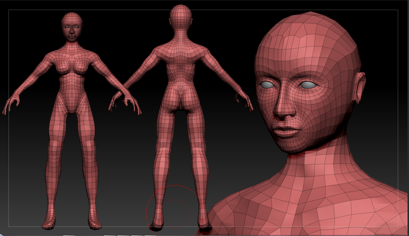
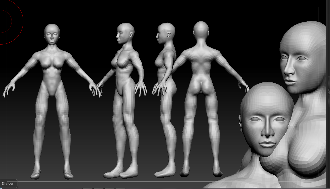
Hey guys! I'm making a hybrid space chick that's kinda inspired by the Queen of Blades. Think half morphed-ish. Hoping to put this in my portfolio please be as critical as possible. Work process was armature>zsketch>retopo>sculpt. First off, the concept, the topo and where the sculpt is so far. I know the hands look really freaking weird right now and the ears haven't really been touched but other than that fire away! Sculpt is at subd 2 for the screen caps. Tri cap will be 10k and I'm going to be using a 2048x2048 to texture her. Not sure if I wanna do that one wing right now. Also thinking I'm going to be making her actual boot much cooler.
Edit: Well despite months of this thread being inactive I've been tweaking and whatnot and decided to call her done. Took way too long. Crits and all that on either the model or presentation greatly appreciated! Yes, I know the marmoset renders are not really flattering. Should I just scrap them?


Edit: Well despite months of this thread being inactive I've been tweaking and whatnot and decided to call her done. Took way too long. Crits and all that on either the model or presentation greatly appreciated! Yes, I know the marmoset renders are not really flattering. Should I just scrap them?


Replies
. Her head is too big, and too wide.
. He width of the area between her legs is awkward. Pretty, slender girls typically have a gap between their legs here (instead of coming to an upside down V shape, but this looks a little too wide.
. Her thighs are very flat and wide, almost how they would look if she was sitting in a chair and they were pressed against the seat.
. You are missing the curvyness in her hips. She has a man-pelvis. A female pelvis is much wider..which is where the curves come from. That is a very important feature that distinguishes male from female.
. Her lats (muscles on her back) are way too big. Once again, this is a feature that is more of a male attribute. They are also significantly bigger than any of the muscles on the rest of her body.
. Breasts - look too strong, like pectorals...instead of having a bulging round shape (from the profile) they should do the opposite, gradually curving away from the body.
. Hand - looks like an alien hand right now. A little too big. Her fingers seem spread out too far...not sure if you would do that on purpose for rigging maybe? But they look a little creepy.
. Peen - The bump on her crotch bulges way too much, definitely looks like shes packing a surprise there.
I would suggest studying some references of female anatomy more.
Also quick question. Is the collage thing I'm doing good for the critiquing process? Or should I just put 1 image per view.
Your concept has asymmetry (which is totally fine) but there isn't any balance. You say you're trying to go for a "half-morphed" appearance. A "half-morph" doesn't necessarily mean you need to have all the morphed features on one side. You can switch it up a bit and still end up with a "half-morphed" character.
But seriously, This is great sculpting! Nice facial features!
Her body looks pretty good I think. Her legs feel pretty masculine, but that may because of the muscle definition, which seems to be something about the character (as she has quite a bit of muscle definition overall). While that may be a design choice, just keep in mind that people might think of her as unfeminine-- not a bad thing if you were shooting for it, of course, but it's something to think about. I'm assuming you're going to put some sort of shoes/boots on her feet?
Keep it up, this is looking good!
the lower legs are too long, the upper arms are too short, the fingers are too long, the lower arms are too thin, the shoulders are too broad, the head is too wide etc etc...
you need to literally go to the lowest subdevision, click "delhigher", and work ONLY on that subdivision until you've got the basic proportions right. then move up to the next and define whatever shapes are going to help the silouhette. pressing "p" to toggle perspective would help you too.
essentially i guess, you're trying to run before you can crawl.
Keep the comments coming guys, its frustrating at times since I like the stylized proportions more but I appreciate your help in getting this right.
Side note: Curse you photo bucket! I'll just have to start hosting the images from my own site.
Shoulder blades are still a bit off and the back of the knee is too strong still in my opinion. C&C would be greatly appreciated. If anyone would like a zoomed in shot of an area let me know and I'll gladly up one.
Note: Hosting these through my site now so the images shouldn't be disappearing any more.
I highlighted the parts that need the most part.
Waist - too wide now, think it looked better previously. (Unless you want a badonka ass.) Also most girls don't have that much room between their legs.
hands - seem kinda large, somethings off about them, I think they have more of a man quality to them than a soft womanly hand.
feet - I know you want to work on the "best parts" but you haven't even done anything to the feet. Give us some toes and a correct arch!
Keep going man, getting anatomy right is hard. You hear a bunch of "ITS WRONG, ITS WRONG!" Thats because they know it's doesn't matter how hard you work on the boobs or face, if the anatomy is wrong, people are going to know that shit within a second. (google "uncanny valley")
Posting here is the right thing to do. Your friends aren't going to be able to give you great feedback cause they don't wanna hurt your feelings. Neither do we, we just don't know you as well and we're not afraid to tell you the truth. You coming along though, really. I'm going to give you a link that may be your best friend. Take some time and read the general human, and the pretty girls. The other ones are useful also, but these 2 are treasures!
http://comicrazys.com/2008/11/22/famous-artists-cartoon-course-pdfs-leo-brodie/
Also google "female model sheets" in google! Add in an image plane and slap it on there, get an idea for general shapes!
Keep it up dude!
I'll probably shrink the hips a lil bit and try to get this legs closer together. I might have to straighten them out like I normally model females.
For the feet I'm going to be covering one with a boot and turning the other one into talons like the concept so I wasn't planning on doing toes. I'll get that arch right though.
Threw the boot in screen caps as well.
[img]http://www.lastlinecreations.com/WIP/9-17-10 - GloveSculpt.PNG[/img]
[img]http://www.lastlinecreations.com/WIP/9-17-10 - BodySculpt.PNG[/img]
[img]http://www.lastlinecreations.com/WIP/9-18-10 - BootSculpt.png[/img]
You have made some good progress on the anatomy, I still there is a lot to improve upon here.
[img]http://www.lastlinecreations.com/WIP/9-28-10 - Sculpt Update1.PNG[/img]
[img]http://www.lastlinecreations.com/WIP/9-28-10 - Sculpt Update2.PNG[/img]
[img]http://www.lastlinecreations.com/WIP/10-11-10 - GameResThreeQuarters_NormalsAndAO.png[/img]
I'm getting the weird banding(?) and was wondering if there was a way to fix this? Also any tips and making my hair look better would be awesome. I'm playing with the alpha threshold and have it around .39 right now.
Crits on texture also greatly appreciated. Planning on posing her soon.
[img]http://www.lastlinecreations.com/WIP/10-24-10 - Marmoset test1.PNG[/img]
[img]http://www.lastlinecreations.com/WIP/10-24-10 - Marmoset test2.PNG[/img]
[img]http://www.lastlinecreations.com/WIP/10-24-10 - Marmoset test3.PNG[/img]
[img]http://www.lastlinecreations.com/WIP/10-24-10 - Marmoset test4.PNG[/img]
[img]http://www.lastlinecreations.com/WIP/10-24-10 - Marmoset test5.PNG[/img]