WIP Gunship (Image-heavy)
Current Project: a futuristic Gunship used by the German Luftwaffe...about 6k faces, 2k textures...
I would really love to hear some input to take it a step further...especially the texture (which needs at least 3 steps to become good...), but crits regarding the model are welcome, too...anyway...images...
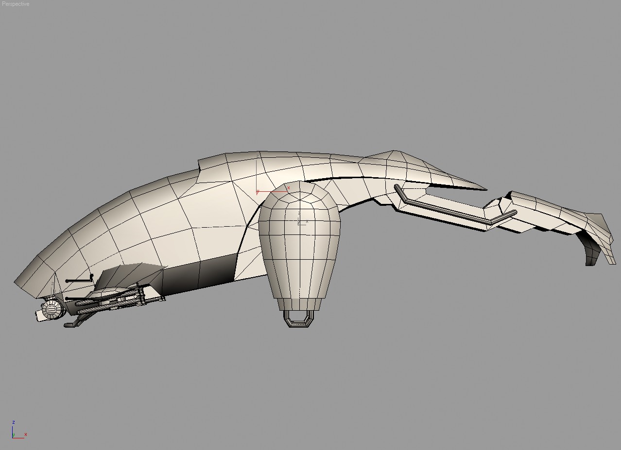
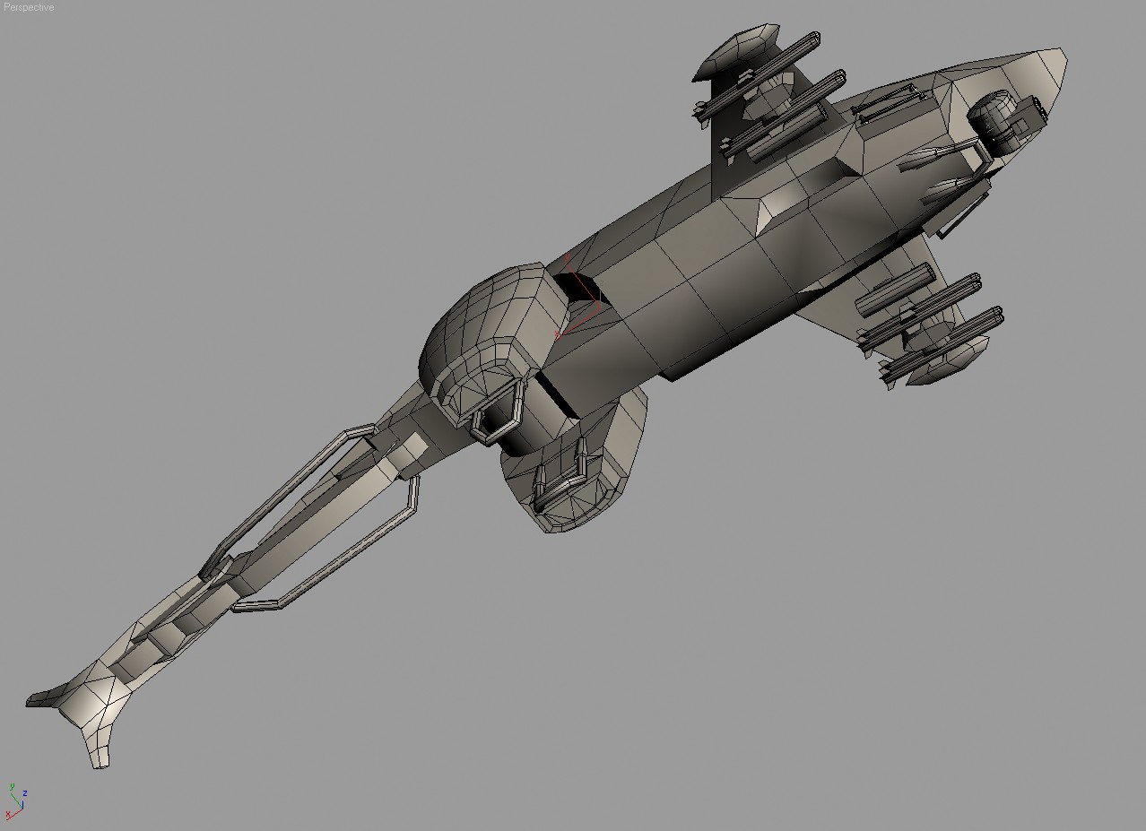
Wires:
Realtime from Max Viewport (using a standard DX Shader, nothing fancy like Xoliul's or Three-Point's, since both are to advanced for my machine...):
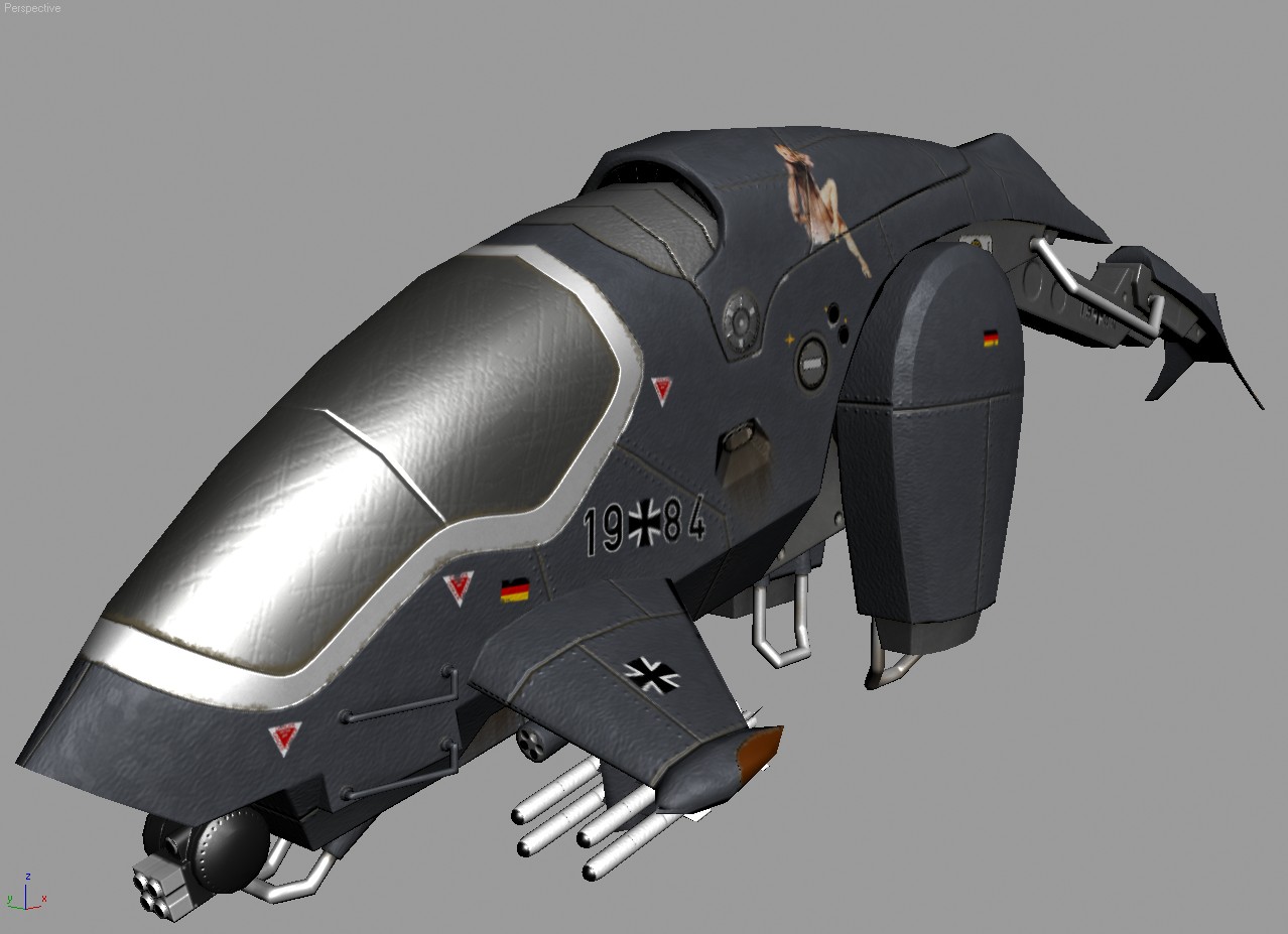
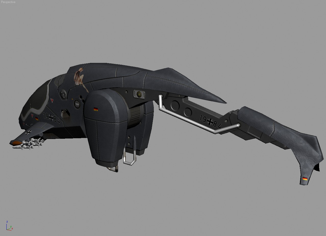
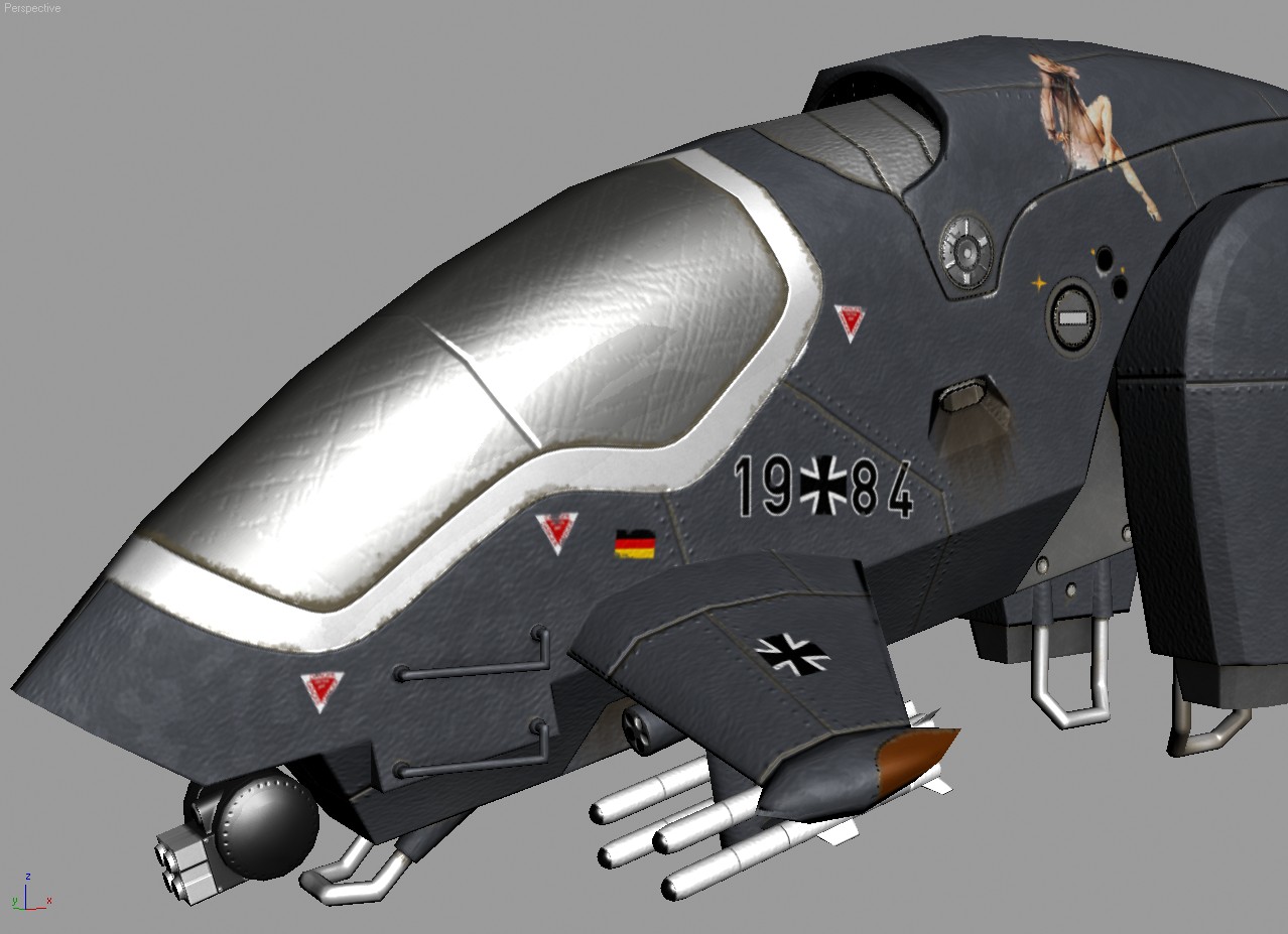
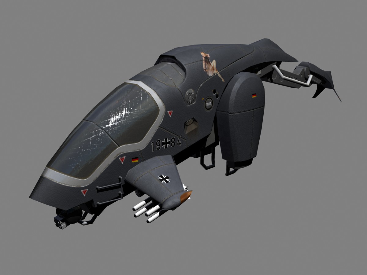
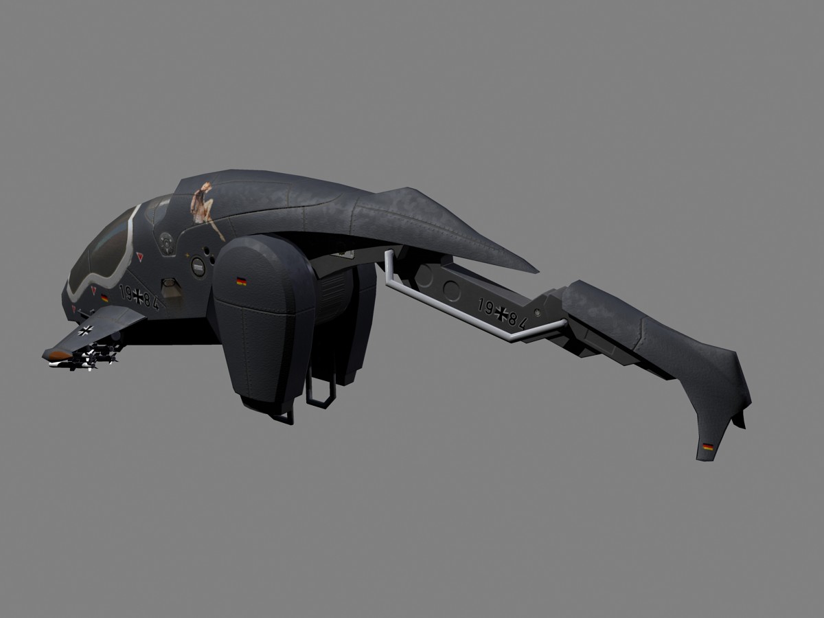
And how it might look like, if my machine was stronger...rendered with MRay:
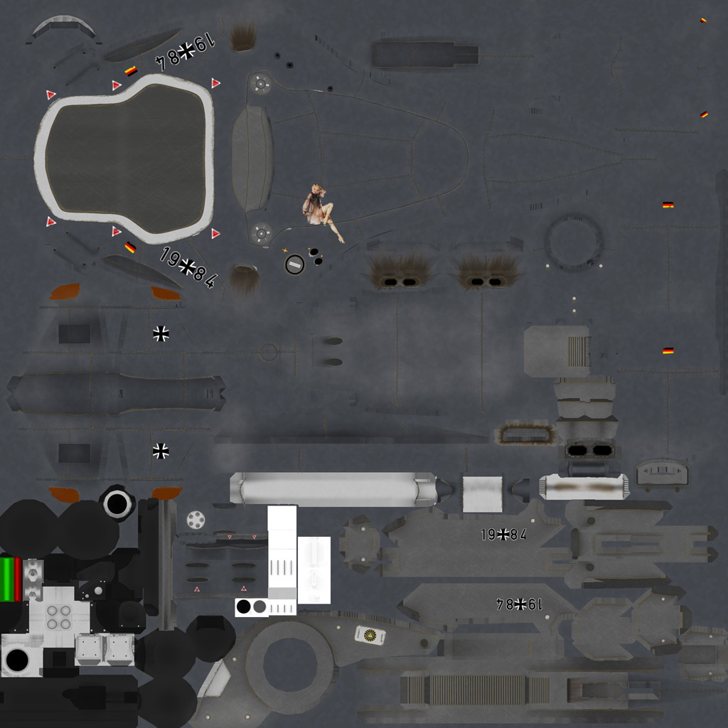
Textures (Diffuse, Normals, Spec, Gloss; half size):
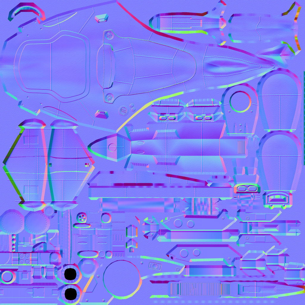
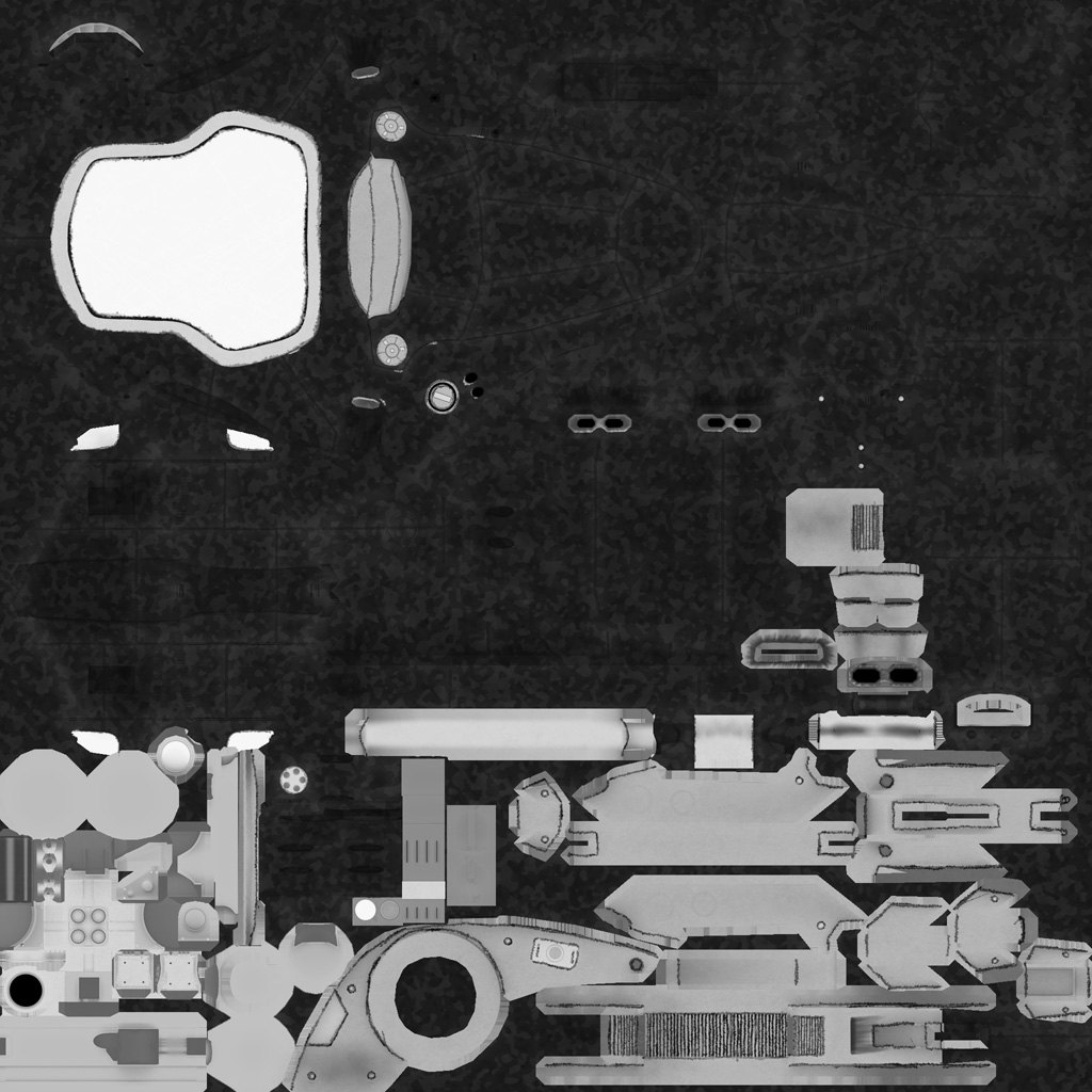

Hoope I didn't scare anyone with my wall of pictures...
I would really love to hear some input to take it a step further...especially the texture (which needs at least 3 steps to become good...), but crits regarding the model are welcome, too...anyway...images...
Wires:


Realtime from Max Viewport (using a standard DX Shader, nothing fancy like Xoliul's or Three-Point's, since both are to advanced for my machine...):


And how it might look like, if my machine was stronger...rendered with MRay:


Textures (Diffuse, Normals, Spec, Gloss; half size):


Hoope I didn't scare anyone with my wall of pictures...
Replies
Why's the canopy so scratched up and not the other parts of the ship that would take significantly more battle damage?
Overall, I'd suggest adding in something that makes it look like it can generate both lift and thrust without compromising one or the other. Your engines look like they're more like ramjet engines, but without a source of fuel, I'm a little confused.
Texture-wise, I'm quite impressed with the way you handled it. I would add in some scratches along the edges of panels to expose just a tad of bare metal. The paint looks showroom new, but the decals look worn and there's burning on the side thrusters. Also, adding a bit of spec or different color for the rivets would go a long way towards showcasing the work you put into making the rivets.
Out of curiosity, what's that fourth map you're using? I recognize the Diffuse, Normal, and Spec, but that fourth one is foreign to me.
Texture ruins it all though. Where does normalmap come from? Did you bake it from high-poly? Specular looks really rushed and careless too.
Normals are mainly baked from highpoly, only the paneling/rivets and the canopy were painted.
The fourth map is a Gloss Map...it determines the sharpness of the Spec...in this case it is very similar to the spec itself, just the scratches on the canopy are darkened...
The spec might be rushed...I just desaturated the different layers of the diffuse and adjusted their values...I might add color to the cables of the main gun, but other than that I wouldn't know what to do different...I must admit I am not really experienced with that...
Yeah, it's very reminiscent of the G-Police choppers.
Overall, I'd say some areas could definitely benefit from some actual geometry. I'm not usually an advocate of detail for detail's sake, but right now the surfaces seem very sparse and lacking in visual interest. You could definitely push the high-poly way further, and consider upping the count of the low-poly.
I don't think ten or even twenty thousand would be too high for a vehicle like this, unless it's intended for a more limited hardware platform.
- reminds me of psygnosis's G-police (1st image)
-use xoliels shader for presentation...reflections shadow maps in realtime etc much better than maxes directx bollox
-get rid of the bump on the metal... let the spec do the work
- add another colour perhaps light grey paint on the underside (see second pic)
-alter the spec range on different panels and maybe tweak the diffuse on some too
Different Diff and Spec for different panels is a very good idea...I will definitely try and do this next...gray for the bottom is also on the agenda...actually it already has been...I don't know why I didn't do it...
Also I think I'll put the Decals into the Spec and Gloss Maps to separate them from the rest...
Concerning geometry...I think I'll increase the number of segments on the main body to make it less angular, but I don't know what I could add in terms of surface detail...I thought about vents or exhausts for the engine but since the craft essentially uses the exhaust fumes for propulsion, this would be a bit counter productive...and I'm not really a fan of pointless Death-Star-Greebles...the craft isn't the most aerodynamic to begin with and adding random boxes wouldn't help...but I concede that it looks quite bland now...
Even though it's a fictional craft, it's pretty obvious that you haven't used much reference of actual aircraft.
Even the most streamlined, functional aircraft can only conceal mechanical parts so well. Look at your paneling - some of it doesn't even make any sense from a manufacturing point of view. Some panels intersect with others, and others simply change direction abruptly without any intersecting plates etc.
Think about how an aircraft like this would actually operate, and how the machinery would be constructed. I'd imagine that some kind of hydraulics would be necessary to move the propulsion engines - where are the pipes, tubing and cabling that would enable this? Aircraft are comprised of hundreds, if not thousands, of individually-manufactured parts - yours is made up of several large, bulky pieces. It's not even clear how it would sit on the ground right now.
Detail doesn't necessarily mean sacrificing or compromising an overall streamlined design, but right now it looks far too simple to be a convincingly realistic vehicle, especially something as complex as a vertical take-off aircraft. I'd start by examining some detail shots of aircraft undercarriages, landing gear, cutaway diagrams etc to get an idea of how intricate some areas of even highly aerodynamic aircraft actually are.
That last one is again MRay...
I scrapped it and started all over...so here are some shots from the high...if you have any remarks (besides the inherent stupidity of free floating landing platforms), feel free to shoot me