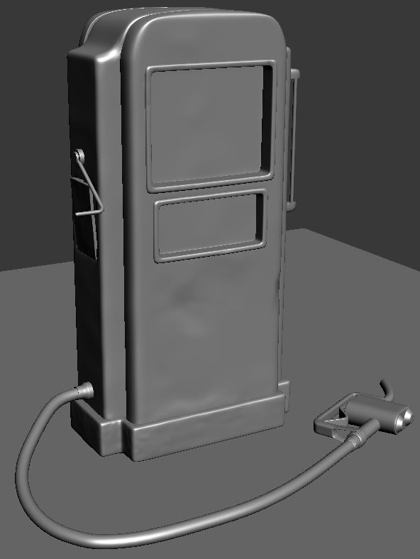
Gas Pump
Hy everyone 
Working on a gas pump here, gotten pretty far on the highpoly, but i dont want to start making the lowpoly before i have heard what you have to say
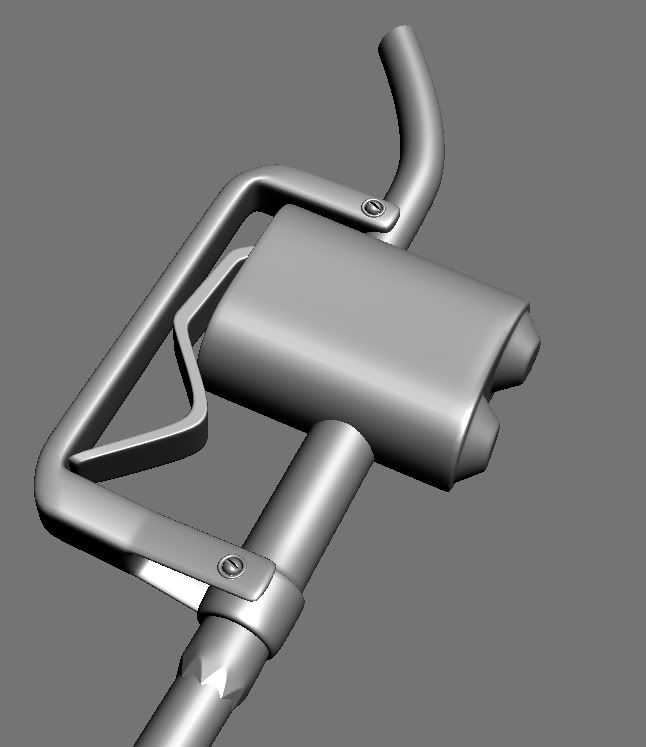
What i am the least happy with is the what i have framed in the second picture, it looks to simple and boring, but i have no idea what i shall do with it, so a little help would be very apprechiated.


Replies
Looking foward to seeing more
(Yes thats a funny attempt of dents)
Here is my main refrence, it's not supposed to be a 100% copy, so anything that will make it more diffrent would be nice
karera: That would make things alot easier than me, since i recently changed to 3ds max from maya that i used for rigging, i dont know how it's done in 3ds max. I might look it up tough
Make sure to make some rusty drips on all those spots you have rust.
Quick question...What's on the backside? I'm going to do a gas pump too and have no idea what is on the backside, is it just the same as the front?
The highpoly turned out nice. One thing u could do to pimp those renders even more is by adjusting the levels of the layer. ( level them out sligtly ) then duplicate that layer. Do filter/other/high pass. Set it to hard ligth. Instant pop!
Now that low poly. Is too high. If this is a folio piece chances r the hose will be stationary. I say you could bring this whole thing down to 1k. Or less. It will show off more that you know where to use the tris.
The textures. I think this is the hardest part of any model. You've got this really cool reference that you kinda glanced at but ur not paying attention to. See if you can match your rust, decals n everything to be exactly like the reference. Don't have to be deadon but it will help you understand what's going on.
You kinda misspelled chief!
I think your getting there mate, just a little more love!
I find it best to do the weathering in order, 1 - Paint weakens and is bleached in the sun 2 - Paint starts to peel 3 - Rusts in the rain etc with some bit knocked out of it for good measure of course
That is a nice colour you've got on it. Been looking at your reference a while now 'cos it's cool! The side and top bits are aluminium so there's no real rust on there, aluminium goes powdery white when it oxidises. Am I thinking into this too much?
Thanks alot for the critics, i have had some problems with that edge mainly because of poor uv mapping, dificult to make it line up. Going to redo the uv's after i have fixed the lowpoly some more
AutospySoldier:
I have no idea how i managed to missspell that xD I had the refrence right there on my other monitor, i guess lack of sleep can do wonders tough. I will make sure to fix the rust
raul:
Thanks alot, i got alot left btw
I will go back and redo some of the lowpoly, since i know that you are right, the hose is what i worked the least on, and it's defently worth it's share of love.
I realy love the way the refrence myself, it's so full of detail, i kinda messed up during the uv map stage, going to redo some of the uv map aswell after i have fixed on the lowpoly
woody_294:
Glad you liked it
You are right, i do have sort of a layer system going like you described, it is a nice color, i did think to go with the classic red, but i ended not todo so
Thanks everyone for the great critics
Update on the lowpoly, it's at 1450 tri's dont know if i can push it any lower.
The silhouette of the hose needs some more loops across. Right now it looks faceted.
Here is a paint over i did, to kinda give you some ideas of what could be done to bring it lower.
"is there a back???" if you are wondering if there is a back side of the main body, the answer is yes.
I have tought of removing it, so i'm going to do so if thats what you tought of.
I will make the alpha planes you suggested aswell, i do alreay have one above the noozle for the spring thing, i have a feeling that would shave of some poly's.
And once more there is one thing i dont understand, might be because english is not my first language as you may have figured :P
"Could try just castin take away" and "Fix sihole or" i dont know what you mean about that, hope you take the time to clear that up for me
Sorry about that.
One thing that will make a difference next time, i forgot that i have to flip the green channel in the normal map for udk(or bake it with the right settings from max), once i did that i looked better
1. If you're keeping the alpha'd bits on the same UV layout, you're going to DOUBLE the texture memory on a compressed diffuse texture. A 24 bit .dds is 1/2 the size of a 32 bit .dds
2. The increased shader complexity and need for alpha sorting is going to be much less efficient to render than a small amount of geometry, in virtually every modern game engine(may be different for portable systems).
3. Adding a 2nd smaller texture is still going to eat up memory, and also introduce a 2nd draw call for your mesh, again which will likely hurt performance more than a few extra tris.
So, moral of the story, do not use alpha unless it is absolutely necessary, and especially not to save a few tris.
Deleted the backside and removed some of the bevels and removed some edge loops from the noozle.
Tricount: 1516
I can upload the obj file if anyone wants to have a look, just ask
Here is the uv.
Critics and tips would be very apprechiated
On your reference.
You can see how the rust rules the bottom of the object. Is not just rust that goes in there there is also dirt and dust and water stains. Think in gradients. Things will get darker as you are going down ( i would actually create a gradient layer just for this ) and make it fade from top to bottom. Also, adding this dark will blend the rust better.
And of course there are still a lot of other things that you are missing, but i know you just got started on it. Overall i think you are up to a great start! Keep it up!
The red are pieces that I laid over each other seeing as they're the same. You have enough room to put them elswhere, however.
I'd recommend not following what I did exactly, but finding your own solution to the issue. It's looking good so far, but it could be made a lot better!
My final suggestion is taking some polygons off of the cylinders that you have, and putting some more on the actual pump's line. Right now it feels to blocky for a larger object and the smaller cylinders feel like there's to much for such a small part of the mesh.
Cheers!
Worked some more on it now, hope it falls in good taste.
If i do i will take all that into account, i did change the uv's some after i posted them so i'l post what they look like now.
Keep the critics comming want to iron things out before i bring it into UDK
Add some brown/orange grime to the chrome, especially in the crevices.
Or make a cool background! :P
I do regrett on doing the udk renders, since i would need more of an scene to show it of properly.
So i did a new screenshot from max, thanks to Laurens Corijn for he's amazing shaders and post process.
I am about to call this one done, and heading to another project soon
ajr2764: Thanks
Kitteh: Thanks