Sketchbook: Janelle Desborough
Hello everyone! I'm a student studying Game Art and Design, and after about a year and a half in the world of 3D modeling I'm looking to expand critiques outside of school.  I'd like to start posting progress on various projects, and would be very grateful for any constructive criticism to help further my skill set. I am very much a novice, so all feedback is welcome!
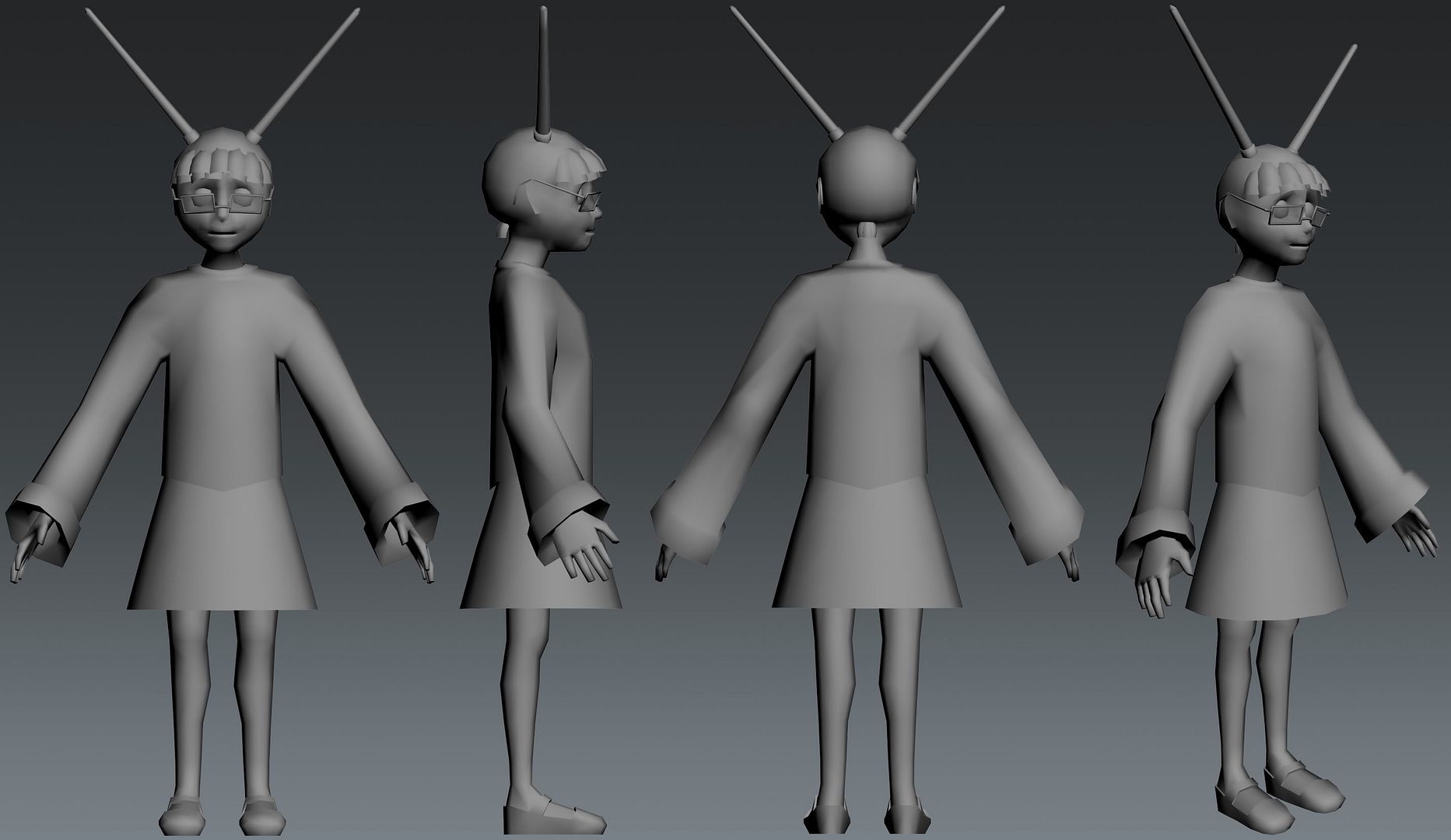
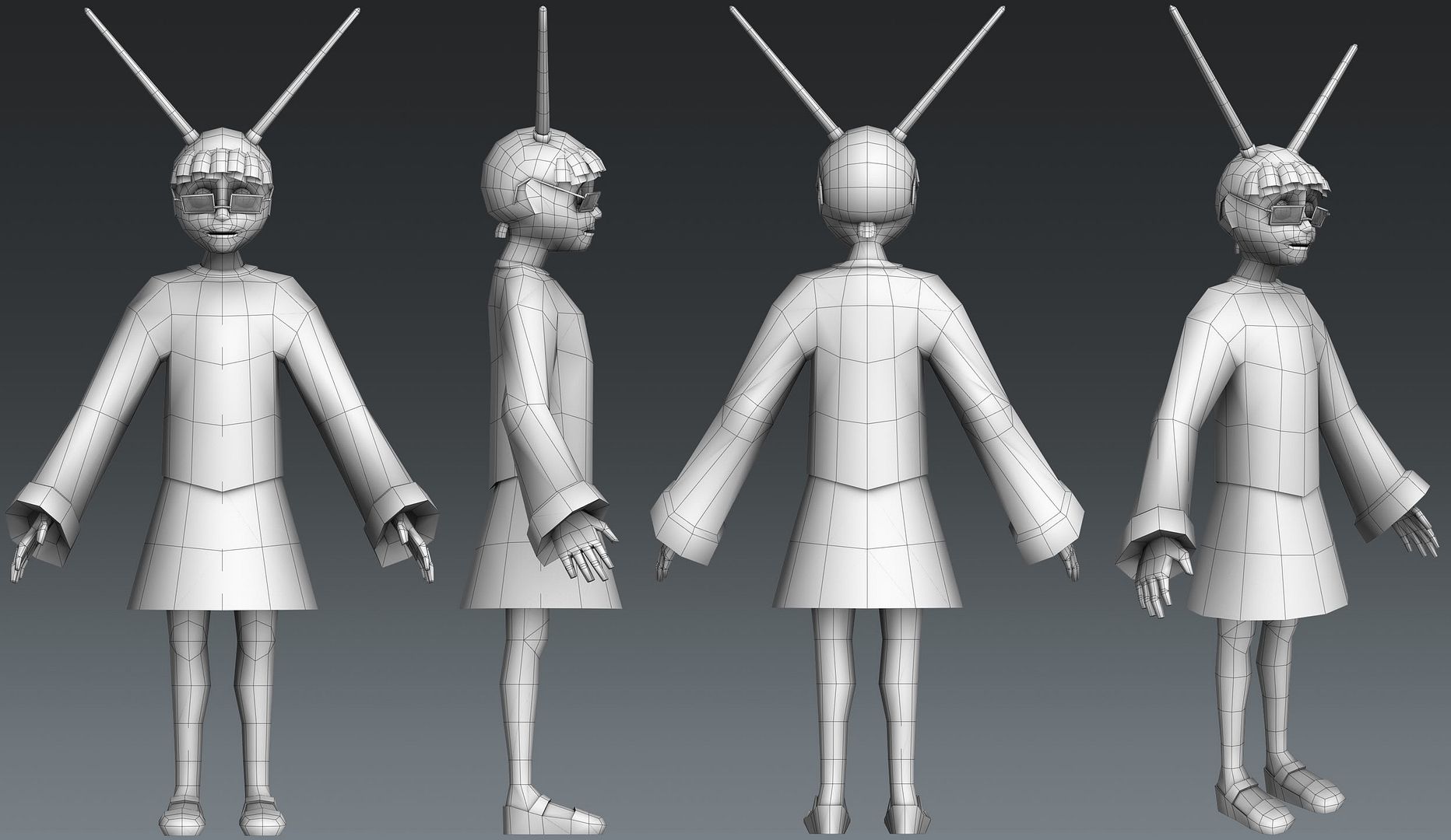
Currently I'm working on a simple character. Here's the base mesh that I plan to take into ZBrush:
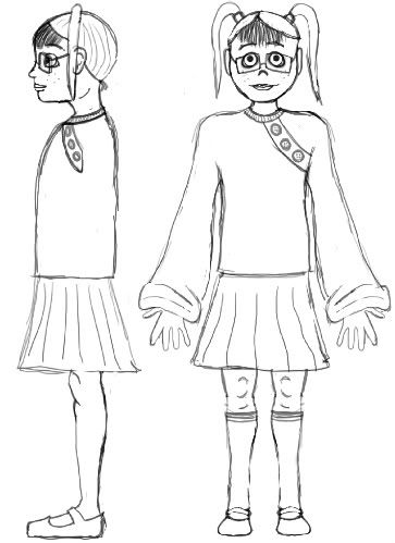
And this is the quick-and-dirty sketch that I'm using as reference.
I'm a little iffy on whether it's best for her design to include the glasses slipping off her nose or not. I fear they may make her look older, instead of small and cute. Here's a render of her without them:
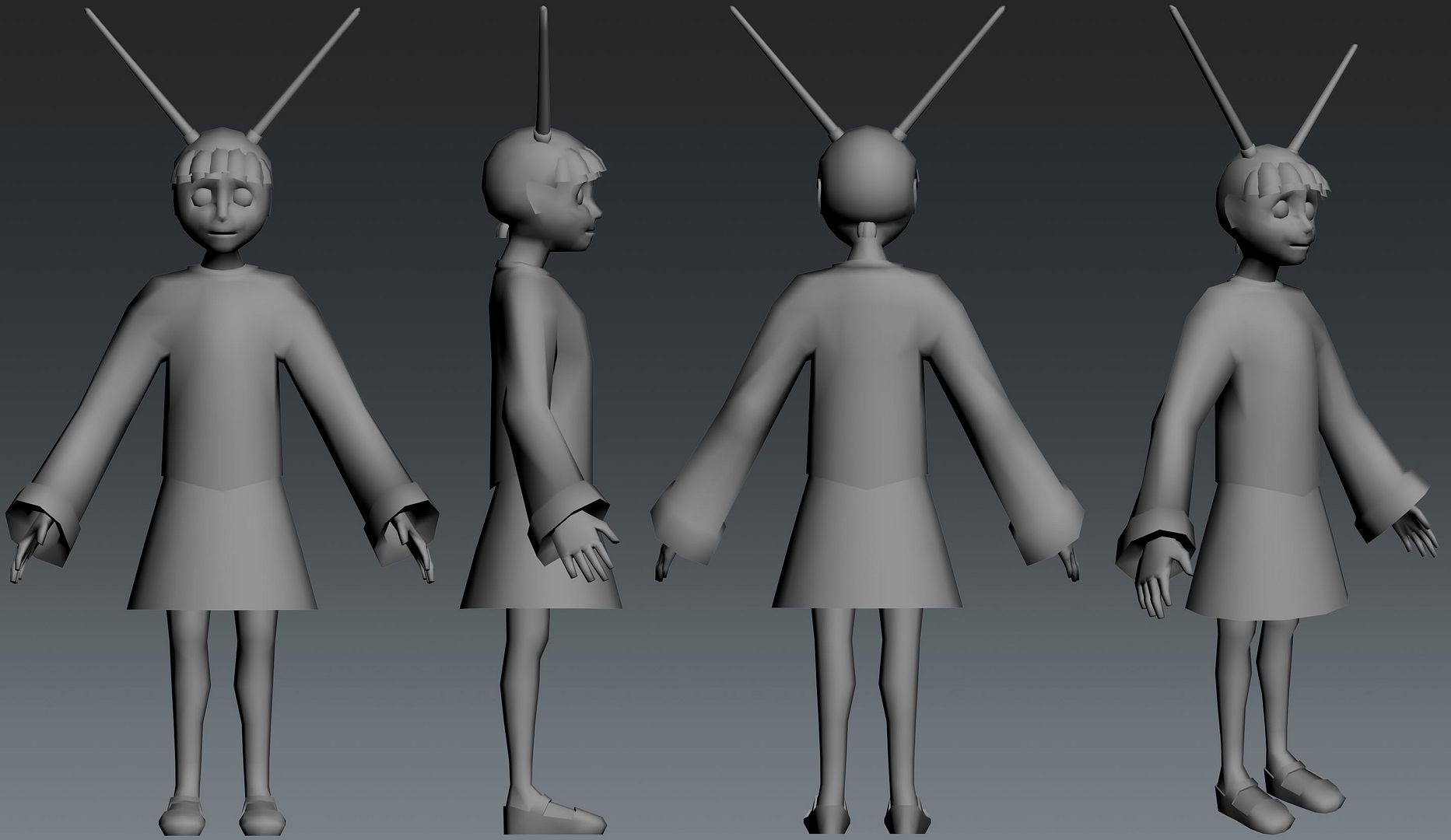
I want to stick to a triangle limit of 3,000. Without the glasses she's at 2,992 now, but if I keep them I'll have to knock it down from 3,232.
Currently I'm working on a simple character. Here's the base mesh that I plan to take into ZBrush:


And this is the quick-and-dirty sketch that I'm using as reference.

I'm a little iffy on whether it's best for her design to include the glasses slipping off her nose or not. I fear they may make her look older, instead of small and cute. Here's a render of her without them:

I want to stick to a triangle limit of 3,000. Without the glasses she's at 2,992 now, but if I keep them I'll have to knock it down from 3,232.
Replies
A couple traditional drawings, which were part of the portfolio I submitted to The Art Institute of Pittsburgh when I applied for the Game Art and Design program.
A creature design that I made about a year ago, where we had to mash together three different species. I'm still fond of this little guy and would like to model him at some point.
A render from a short "rollercoaster/racetrack" animation...this is where I began to learn more about texturing.
I want to document this because it is the first car I've ever modeled, and cars are now becoming my favorite thing to work on. They also weren't something I ever intended to enjoy modeling, it was a complete but pleasant surprise!
This is where I began to play with particle effects in 3ds Max.
Second vehicle, done purely for fun. The Gallardo is one of my favorite cars that I'll never own outside of a video game.
Car number three, the McLaren F1.
I also have some new renders of the little girl as she is now. I need to work on another project today so she's getting put on the back burner for now. Having problems getting a good shape for her head/chin. Decided to keep the glasses, though they were tweaked a bit, and I need to reduce the tri count once I'm done tinkering (3,166 tris now, needs to be 3,000 or less).
This is the first pass on modeling our family Durango (which served as great real-life reference until it was traded in o.o). Shown here it's a hefty 11,393 polys (22,306 tris) and built to be subdivided. Done within two weeks. I'm going to be continuing work on this, adding more detail and an interior, then getting a lower resolution version working in the Unreal 3 Engine. First time scripting, so I'm looking forward to that!
This character was done to go along with the Durango and an environment, which was then all animated together in a short video that I'll link to below. He's 1,704 polys (3,228 tris), and was also done within two weeks.
This was the environment to go along with the Durango and the photographer. I wanted to create a pre-lit studio environment, perhaps to reuse when rendering future vehicle models. It also got two weeks of love. Below the render is my initial concept-scribble.
[ame]
Here's a link to the final video that used all the above models.
I also got to work on two different teams, one for a mock-promotional trailer project, and the other for a level created in UT3. I doubled as producer/scheduling-lady and asset modeler for both teams, so here are some thumbnails of a few props:
That's all for now. I'll try to update as I work on projects more often to avoid these massive updates after three month disappearances. ^_^' I'm learning ActionScript and Unreal Script at the moment, as well as taking some extra life drawing sessions.
Congrats on the Game Jam, by the way!
I've also been going to those life drawing workshops, so I'll share some of those. I've been drawing on newsprint leftover from when I had the actual life drawing classes a good while ago, and this morning I chose to draw with col-erase pencils, so the photos are a bit faint despite my efforts to clean them up. Next week I may just bring a small sketchbook so I can scan easily. Though I sort of like the first few done with china marker...no erasing means I can see where I found mistakes and tried to correct them on the go; sorta neat in a self-reflection sort of way.
This morning's model asked us if we'd like any certain focus in his poses, and I requested some to help me figure out how the shoulders/clavicles work a bit better. He even graced me with the best seat in the house, so I got foreshortening practice too!
Your life drawing improved a lot) General feel of a pose and strokes - cool. It was a good idea to stop drawing small details first ^_^
I always wanted to ask if the Durango is made of different pieces. I love how realistic it looks! It can't wait to see the interior.
I also like the life drawings. You have very nice flow in your lines. My favorite is with the man leaning forward on a ball. You captured a lot of the muscle weaving into the shoulder. I always had a hard time drawing that. :P
Anyway looks awesome!
Speaking of the Durango, that's what I'm updating today! I remodeled the exterior and have it working in the Unreal 3 engine. I'm still planning to model the interior, but that has to be put on the back burner for now to make room for other projects (the next three months have me learning Maya, programming a Flash game in ActionScript 3, character animation, and a start to a website).
I have both a "clean" and a "muddy" set of textures. The muddy one is for use in Unreal. These are screenshots in 3ds Max using Xoliulshader.
Plain wireframe view. My goal was to be under 10,000 tris, and she came out at a total of 9,796. The previous version from a few months ago was at 22,306 tris; yay improvement!
The same model with the muddy texture set as shown in Unreal Engine 3. The lights are fully functional in-game, and here the suspension is shown extended to accommodate movement when driving.
Here's a short test run of the Durango in the engine (apologies for the skipping, that's just the recording lagging a bit). The car has several damage points, and pieces bounce about and jiggle when broken. She's based off of the Scorpion, but is slower and much less agile. At some point in the demo you can see she likes to slip 'n slide when driven too hard.
[ame]
well, for part of the video anyway. God damn Janelle, this is really cool.
I rushed setting up the materials a bit (especially in UT3), so I could definitely stand to redo things if I get to pick this up again. The windows will need a lot more love, especially if there's an interior. I'll read up on cubemaps in the meantime, that's something new for me. There are normals baked from the highpoly though, a lot of the body details are coming from those.