Home 3D Art Showcase & Critiques

Ruined Museum WIP (UDK)

Carter
polycounter lvl 12
Offline / Send Message
Carter polycounter lvl 12
Hello Folks,

Started a small environment piece, a ruined Museum thats slowly started to decay to the elements, the roof will be an arched ornate ironwork thats collapsed letting in the elements and sun.

Reached a point where I can start to show it for crits. Remains of exhibits will be scattered around and I'm planning on having some kind of animal skeleton on that central platform

wip2.jpg
wip3-1.jpg
wip1.jpg

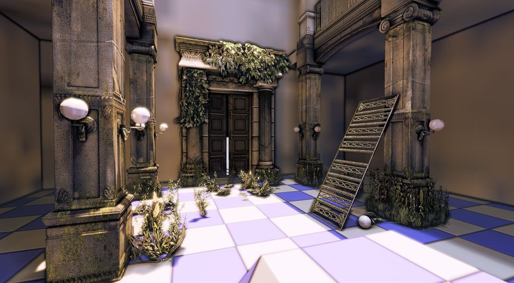
The vegetation is Epic stock just wanted to check the colours and layout before I made my own, also does anyone know how to tone down the ambient occlusion in the corners? Looks a bit Borderlands at the mo

Replies

  • BlvdNights
    Offline / Send Message
    BlvdNights polycounter lvl 8
    Individual pieces look good. The room though feels small, boxxy (inb4ourqueen), and just boring. Any plans to add pieces so it doesn't feel so square?
  • Carter
    Offline / Send Message
    Carter polycounter lvl 12
    Made the layout more of a larger T shape and created an fancy iron bracket, will add an ornate stair case at the end and buildup the wall facing it.
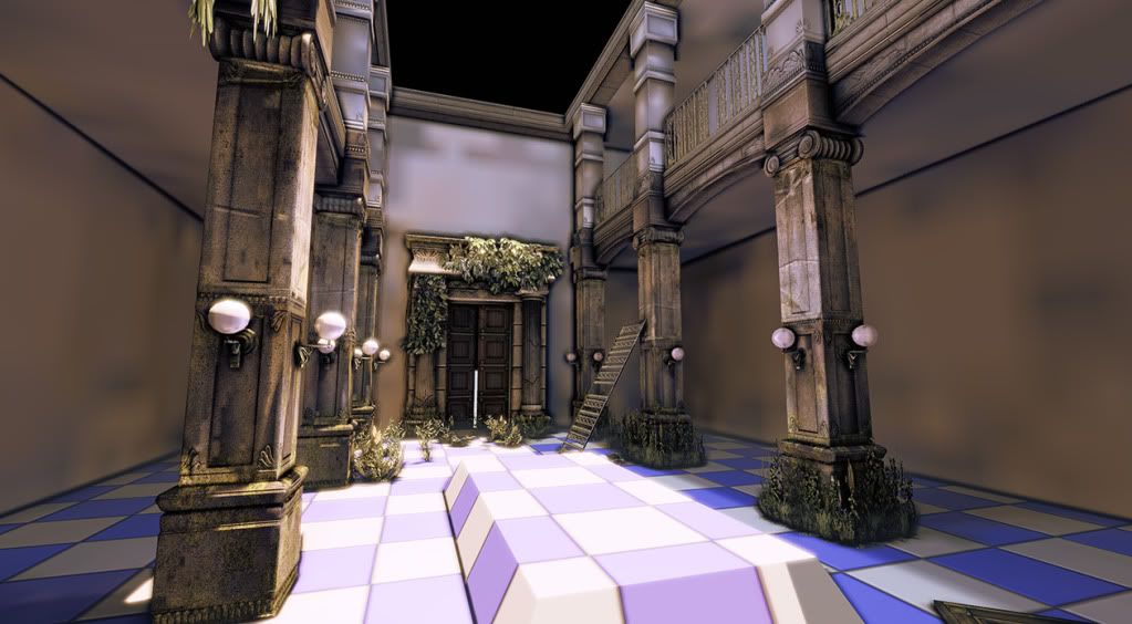
    Reverted back to just the Occlusion and Normal maps was getting ahead of myself a little bit with the texturing.
    Got some time to work on this today so more updates ahoi!

    wip4-1.jpg
  • Carter
    Offline / Send Message
    Carter polycounter lvl 12
    Just realised I haven't given much focus to individual assets so here are some of the high poly assets and the corresponding low poly meshes in the UDK, any errors you spot in the normal map or lows would be much appreciated

    maindoor.jpg
    Assorted.jpg
  • vj_box
    Looking great Carter. The sculpt pieces are real good. I second BlvdNights that the overall space is a little crammed and you might wanna consider putting them in a brief space if you are constructing a sample level or something. The pieces' look and feel would remind me of Uncharted :)
  • sltrOlsson
    Offline / Send Message
    sltrOlsson polycounter lvl 14
    What's up with the errors on the pillar? Can you chow the normal map? Feels like the pillar have no depth. Real nice HP though! :D
  • Carter
    Offline / Send Message
    Carter polycounter lvl 12
    Yah I might give the pillar another bake with more geometry, the creases are meant to be cracks overlayed in the normal but I've realised they look bloody awful so I need to rethink them - thanks for the comments
  • eric.
    Hey man! I think its looking really good. Although I think you can give those cracks and destroyed pieces some more love. If a pillar cracks more than just the crack itself will get worn.
    I also like the hanging foliage, looks neat :)

    I think you should redo that bake on that lamp. Looks a little weird.

    Good job though! Keep it up!
  • paulsvoboda
    Offline / Send Message
    paulsvoboda polycounter lvl 12
    As has been said, the HP stuff looks good but the bakes have some errors. For the overlayed cracks, it looks like you are trying to do that through geometry. You could try painting out cracks in photoshop and generating a normal from that which you then just overly over your baked out normal maps.
    Otherwise, things are starting to look good. It would be nice to get some reference of scale in the room as things are looking smallish, but that could just be me.
  • Carter
    Offline / Send Message
    Carter polycounter lvl 12
    Just a quick post, gotta get to bed
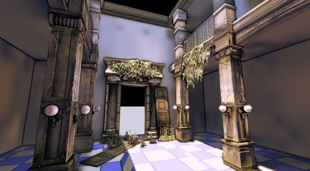
    Built up the detail on the top pillar to a decent level and made this scroll to tie pieces together and to hide some seams :poly128:

    Eric: As stated the foliage isnt mine just borrowed stock epic content to play around with some colour early on, Im going to replace them with my own further down the line. I'm certainly going to give the cracks more love as it seems to be the biggest problem at the mo

    paulsvoboda: The cracks are just overlayed details in the normal map, gonne be going over this tomorrow to get it looking better


    TopPillar.jpg
    Scroll.jpg
  • Marowe
    Did you sculpt all this in Zbrush or did you just model it out in another program? Or both?
  • Dis
    All the normal maps look weird, have you inverted the green channel for them? Depending on the software you're using, you might have to do just that since for example in Maya, the Y axis is up and in UDK it's the Z axis instead.

    Other than that, it looks great. Awesome high poly work.
  • Michael Knubben
    *points at dis*
    That.
  • sltrOlsson
    Offline / Send Message
    sltrOlsson polycounter lvl 14
    Yeap, the bakes looks inverted, or the normal does. Can't you show us?
  • Carter
    Offline / Send Message
    Carter polycounter lvl 12
    Here are the normal and ambient occlusion of the scroll mesh, I've baked it out of Xnormal then inverted the green channel, as I thought the UDK and Xnormal were different but apparently not, have done this on all the bakes

    I've inverted the normal back to the xnormal default as a test and included a pic of that as well

    scroll_diff.jpg
    Scroll_nrml.jpg

    And this is the scroll with the normal inverted back to Xnormal default

    nrmlinverted.jpg

    Think its fixed now, wheeee! Embarrasing :(
    Thanks for the help certainly wouldn't have spotted it
  • G-Saviour18
    Offline / Send Message
    G-Saviour18 polycounter lvl 12
    Normals look much nicer, your screens of the UDK scene look really nice, have you added any special lighting or anything? the props really 'pop out', look forward to seeing this develop :)
  • JO420
    Offline / Send Message
    JO420 polycounter lvl 18
    Have you considered giving your low poly models more definition. The pieces look flat to me and all of the nice normal detail is waisted when you undercut the amount polys you us in the model.

    The scroll model for instance. The bottom of the high poly has a really nice tapered look but the low looks like a straight flat cylinder.


    Same pronlem with the top and bottom of the pillar,high has a cool tapered off look and the low is a flat square,you need supporting geometry to support such strong detail in the normal.

    Add more polygons and improve the silhouette of the low poly models.
  • Snight
    Offline / Send Message
    Snight polycounter lvl 16
    The high poly meshes are great. I agree with JO420 though...add more polygons to the low so the silhouette doesn't start to fall apart.
  • cycloverid
    Offline / Send Message
    cycloverid polycounter lvl 15
    Great start and nice high poly work.

    -To me, your normal maps have a gradient shading to them that would suggest that you have your edges softened where they should be hard. For example, with your 'top pillar', the gradient shading begins where you have extruded those little strips. Since I can't see your low poly, I can't know for sure - but this is probably the case. Read up on the high poly thread here if you need help with that.

    -Also, I wouldn't bother baking a high poly sphere to a low poly sphere.

    -Lastly, a portion of the semi-spherical detail on your 'top pillar' is getting cut off on the side that is facing to my right. Make sure your low poly shell isn't occluding those details if you bake them all together.

    Good work overall!
  • Spitfire
    awesome start, i like your style here.
    I would probably give it all more polys, its a smaller scene, so its worth that extra detail
  • ubu
    Offline / Send Message
    ubu polycounter lvl 7
    The high poly renders are really nice as well, are these done in max with a shellac material?

    I wondering how to get the equivalent effect in Maya to show off high poly sculpts.
  • Carter
    Offline / Send Message
    Carter polycounter lvl 12
    Update time! Been slowly chipping away at this, fast aproaching completion in terms of the building and can start making some smaller assets to scatter around and finally start texturing.

    As suggested i bumped up the polycount on alot of the assets and rebaked them and presented them in max with the same lighting setup as the high poly renders

    crits welcome

    wip3-2.jpg
    wip2-1.jpg
    wip1-1.jpg

    Assorted1_remade.jpg
  • Generalvivi
    Offline / Send Message
    Generalvivi polycounter lvl 14
    This is looking pretty awesome!
  • cholden
    Offline / Send Message
    cholden polycounter lvl 18
    I like the way you're setting up the pieces to this set. It appears as though you could easily assemble a small deathmatch level no problem.
  • Grimmstrom
    Offline / Send Message
    Grimmstrom polycounter lvl 7
    I'm liking the way this is going. One piece of advice I'd give is to put more geometry in the pillars to make the normal map pop.

    They take up quite a considerable chunk of the scene and they look abit flat imo
  • snow
    Offline / Send Message
    snow polycounter lvl 8
    this looks great! this a combination of zbrush/max?
  • BlvdNights
    Offline / Send Message
    BlvdNights polycounter lvl 8
    Ohhhh maaaaaaan. This is looking more promising than a college freshman at her first frat party.
Sign In or Register to comment.