The BRAWL² Tournament Challenge has been announced!
It starts May 12, and ends Oct 17. Let's see what you got!
https://polycount.com/discussion/237047/the-brawl²-tournament
It starts May 12, and ends Oct 17. Let's see what you got!
https://polycount.com/discussion/237047/the-brawl²-tournament
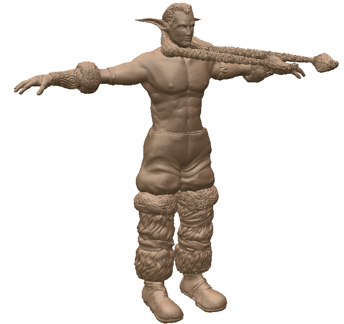
Druid - First sculpt
Hey guys, I have been working on a druid type character for a project in my university. It is my first time sculpting anything, and honestly it is my first time modeling anything realistic so it has been quite fun going out of my comfort zone (I am used to low poly modeling) :poly124: I have been using Mudbox and Maya, trying to get a good workflow going. Once I have the sculpt done, I will throw it in Topogun and make a game-ready version.
Anyhow, here is the concept I am basing the model off of, if anyone knows who this is by please let me know:
http://heroes.ag.ru/h5/races/sylvan/jpg/HeroesV_Sylvan_04u_Druid_Elder.jpg

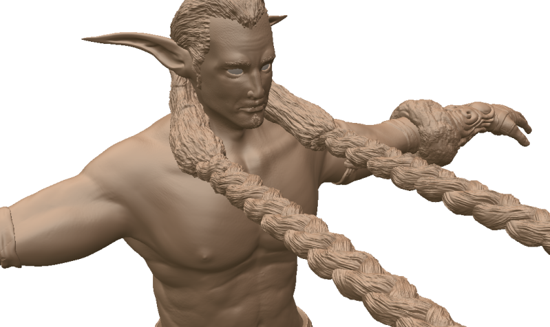
and a closer shot:

Turntable here:
[ame] http://www.youtube.com/watch?v=0rRn9dFMZX0[/ame]
CnC welcome of course, and thanks in advance
Anyhow, here is the concept I am basing the model off of, if anyone knows who this is by please let me know:
http://heroes.ag.ru/h5/races/sylvan/jpg/HeroesV_Sylvan_04u_Druid_Elder.jpg

and a closer shot:

Turntable here:
[ame]
 http://www.youtube.com/watch?v=0rRn9dFMZX0[/ame]
CnC welcome of course, and thanks in advance

Replies
Maybe picking another material would help? It's a bit noisy. Also, the floating braids (is that what they are? )... kind of distracting
Don't use that material to show your work
His chest muscles come down too far, it's like they're drooping, raise them up 2 inches.
His biceps are too fat vertically and his forearm is too small.
Once you knock out the anatomy it'll really help you, keep going good work so far =-)
The reason his hair shoots out like that is just to make my life easier when I throw it in topogun and have to retopo and rig it. Of course it won't be like that once I have the lowpoly rigged :poly136:
Thanks again.
Edit: Just found this site, seems like it has some great looking stuff, specifically the Clay Base/ skin 2 shader material
http://www.pixelcg.com/blog/?p=165
Anyone know why in Marmoset, when I scroll out some it starts to cut seems into my model where my uvs are, but when i get closer it shows the model how it is suppose to be? Ithought it would probably be some detail setting but I couldnt seem to find anything to fix it
wire (11,997 tris): http://grungemedia.com/dkseries/My_Work/druid/finale/screenshot6.png
texture (2024x2024): http://grungemedia.com/dkseries/My_Work/druid/finale/texsheets01.png
Enjoy!
I like the grass, but I think it's a bit tall, and the area around the outside looks too uniform. It just needs a couple of blades to stick out the side more.
Enjoy! (the website part will be filled in once I have an actual website done, which will be sometime before christmas)
Have to thank http://www.maphart.com/2009/artblog/comicon-2009 for layouts of my shots.
I just used planes with alphas. It took a lot of messing around to get the right look.
As for the pose, I just copied the pose in the concept, it would be a pain to configure the pose now because I just skinned it enough to get it into a pose (I didnt want to spend hours working on skinning).
Thanks for your comments