BEAT-EM-UP! | gsokol + boomz
Hey everybody.
Just putting a post up to make it all official-like. Will be updating soon.
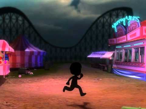
Our environment is going to be located in a carnival. More specific details will follow later, but the theme revolves around the idea that when the gates close at night, the carnival has only just begun, and the clowns/carnival workers (the bad guys if this were an actual beat'em up)are up to no good...or something.
We'll be doing this in Unity.
- Challenges
Anyways, this will be updated soon. Adios!
============================================
Here is my full submission:
Webplayer
http://roryjones.net/project/pc-beatemup/PC_Beatemup_Final/WebPlayer.html
Video
[ame] http://www.youtube.com/watch?v=su5g-y7qV3c&hd=1[/ame]
Images:


Texturesheet:
http://roryjones.net/project/pc-beatemup/PC_Beatemup_Final/TextureUsage.jpg
Just putting a post up to make it all official-like. Will be updating soon.
Our environment is going to be located in a carnival. More specific details will follow later, but the theme revolves around the idea that when the gates close at night, the carnival has only just begun, and the clowns/carnival workers (the bad guys if this were an actual beat'em up)are up to no good...or something.
We'll be doing this in Unity.
- Challenges
- Taking a stylized approach, and both of us keeping consistant with that style.
- Populating the environment with several elements that sell it as a living, breathing environment.
- Planning and preparing a workflow that maximizes our efficiency, to get the most out of the limits we were given.
- To Get this thing done on time...we are busy people

Anyways, this will be updated soon. Adios!
============================================
Here is my full submission:
Webplayer
http://roryjones.net/project/pc-beatemup/PC_Beatemup_Final/WebPlayer.html
Video
[ame]
 http://www.youtube.com/watch?v=su5g-y7qV3c&hd=1[/ame]
Images:


Texturesheet:
http://roryjones.net/project/pc-beatemup/PC_Beatemup_Final/TextureUsage.jpg
Replies
gsokol speaks for us both in terms of challenges. My biggest challenge will be to accomplish our goals in the allotted time, but we're all busy people, right? The most interesting and fun challenge personally, will be to sell a living, breathing environment within the budget. With a location like a carnival, we're going to have a lot of room to explore making things feel lively, that is certain.
You would start in the empty parking lot, heading back to the now closed carnival with the ladyfriend...who things she left her purse here..... then a clown car would roll up and several clowns would pop out...which is where the action would start. You would be fighting them while the a clown takes your gf and puts her in the car and takes off with her. So then you head towards the carnival, and find it odd that all the lights are still on as if the place never closed..and you see fireworks shooting from behind a big tent way off in the distance...so you head on in to save the day.
The second image is the carnival itself. I really wanted to come up with ways to make the environment part of the action, so I came up with this with that in mind.
Super Slide: would have baddies sliding down the slide, either as their entrance to fight, or as an obstacle as they cross the screen.
Strong Man Hammer thing: Within the context of the game, perhaps throwing an enemy near the direction of where the hammer would hit would cause the ball to go up.
Carousel: At the end of this section, I would have this be the final area...or possibly a boss area. First, enemies would come around on the horses and jumping off and fighting you, then you would stand on the carousel after words and fight a boss while it is spinning.
There are some other ideas we have, but don't know if it will be out of our scope for this project. The layout is setup in a way where we can make additions to the scene if we want.
Also, if we have the time, we have an idea for a third area..but again..we want to see what we can do within the amount of time. I tend to try to make environments too large, so creating a more detailed, lively environment is a challenge for me.
Best of luck!
this idea should be loads of fun
Here is a link to a rough blockout unity build. WASD [space], check it out!
Mostly stand-ins of course, but I've been messing around on the ticket booth as our first asset to set a style. I'll call it a WIP. Its got Unity's toon shader on for now, I need to code one that takes diffuse/normal/spec/lightmap with an adjustable factor of self-illumination to get some bright, stylized qualities.
I've created a script/shader/material set for animating the lights, fairly flexible and simple to use. A light pattern sheet (currently with 8 pattern variants (v)) is used to control the light brightness with an adjustable speed. A column-offset variable sets the position of the light within the light series (u) so you can string them along in order. Currently with the 8x8 grid approach, odd numbers lead to issues. If we really need odd values for # of lights in a string (likely), I'm going to use an early-out variable to snip off some of the modulus. The lights can have whatever separate diffuse texture you want.
Thanks TheBat. I don't mind at all, its something I should have already done during the initial post. Any subsequent builds will be accompanied by screencaps
I like the premise and the moody concept art. I also like how you two have placed foreground and background objects in the scene, the sense of depth and immersion is pretty good.
Keep it up
Heres the super slide
Quick WIP update on the carousel:
Now I just need some horsees!
Now with MORE HORSEEES!!!
Example:
http://2.bp.blogspot.com/_hZnWAaRKSns/SUnUJKTCzqI/AAAAAAAAA7o/sbDx5abaOBs/s400/merry+go+round.jpg
I understand that you don't have the timeframe to make them that crazy, but maybe just some variation in colours with a little design would make them fit better?
Just my two cents which even if you don't follow they still look great anyways.
Cheers
Tiros: Don't worry, I'll get some lightbulbs on there soon.
Thanks for the comments guys! Only a few days left...gotta lotta work to do to finish this haha.
http://roryjones.net/project/pc-beatemup/wip1/WebPlayer.html
Here is the latest web build.
Also, for those of you who cannot view the web build...or are too lazy...heres some screenshots of our progress:
Ok so this image isn't taken in the proper angle for a side scrolling beat'em up..but it looks cool and shows most of the path.
[edit after using the unity player] Oh I see, they don't actually have geo they're just normal mapped...
'Nother update.
Web Build:
http://roryjones.net/project/pc-beatemup/gsokol_wip//WebPlayer.html
Images:
Getting close to getting this finished..going to spend tomorrow night after work finishing things up. If anybody has trouble playing the web build...if its slow or anything, let me know. This scene isn't very optimized so it may run slow.
Anyways...I'm at 190.4k tris. I don't anticipate having any trouble chopping this down to meet the limit. For textures, I'm currently using about 70% of the total allotted space. I have every intention of trying to use the remaining 30% left to add some more prettiness.
Let us know what you guys think!
Interested to see what you produce with the remaining 30% budget left though
kysterama - Thanks a lot. I'm really happy with the lighting, and I'm glad you dig the colors. Part of the challenge for me was to work in colors like this, and I think I learned a lot. I typically stick to photosourced, dirty/grimey stuff so this was a fun learning experience...so I'm glad you like it. Your entry is kickass by the way
Grimm_Wrecking - I agree...web build shows things off the best...I had trouble getting screenshots that showed this off like I would have liked. Yea the build is insanely heavy. I didn't have time to optimize the scene, but I might do that sometime next week (I plan on staying away from my PC for the weekend...Ive seen too much of it the past week). Then I'll post up a better web build.
Here's the final web build we put up though...
http://roryjones.net/project/pc-beatemup/PC_Beatemup_Final/WebPlayer.html
It can bake lightmaps too using Beast Lightmapper. Bakes average 15-30 minutes on a decent machine with a fair amount of lights and objects in the scene. Results are great with baked lighting as well, though you are locked to the forward renderer.
Thank You for answer. Yep, I'm already using it
[ame]
Webplayer
http://roryjones.net/project/pc-beatemup/PC_Beatemup_Final/WebPlayer.html
Video
[ame]
Images:
Texturesheet:
http://http://roryjones.net/project/pc-beatemup/PC_Beatemup_Final/TextureUsage.jpg
This environment is so eerie...
With the webplayer version I got past the carousel and the shadows the ferris wheel casts on the ground are beautiful, you should've shown that in the video.
I'm also glad to see more people using Unity lately, great job.
Skeptical Nate: Thanks a lot. I really liked your entry as well. Definitely stepped out of my element quite a bit and learned a lot from this.
Ben Apuna: Eerie is definitely what we were going for. And your not supposed to get past the carousel :P Maybe I'll play with the lights a little and see how it looks if it were to cast on or before the carousel.
I was actually surprised by how many people starting out were planning on using Unity. There were quite a few entrants planning on it. I think Unity is picking up steam and is a really nifty engine. Boomz and I have passed around the idea of making an iPhone build for this as well.