[WIP] Prowler
Hey everyone. I'm just posting progress work for a quadruped I'm working on for a private project. Feedback would be most appreciated.
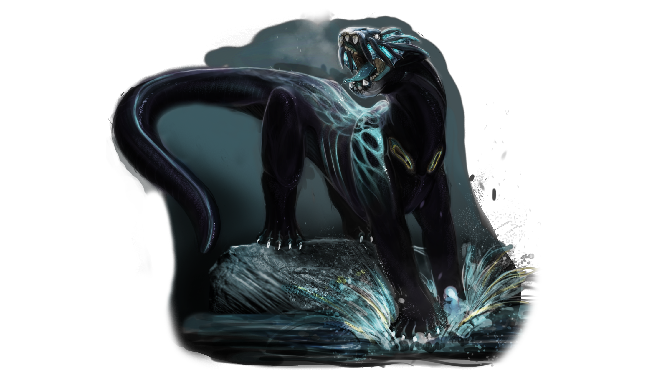
Here's a piece of concept art I did before I started modeling. The model sheet is kind of shitty so I'll probably leave that out.
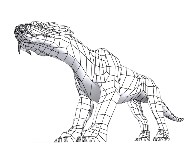
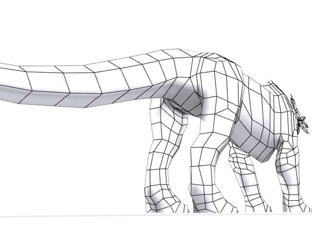
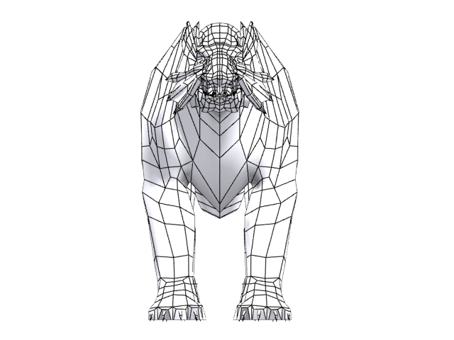
Low Poly Wireframe Shots:
3538 Tris, Not including Eyes
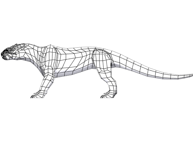
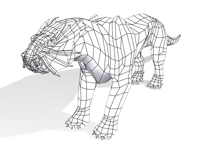
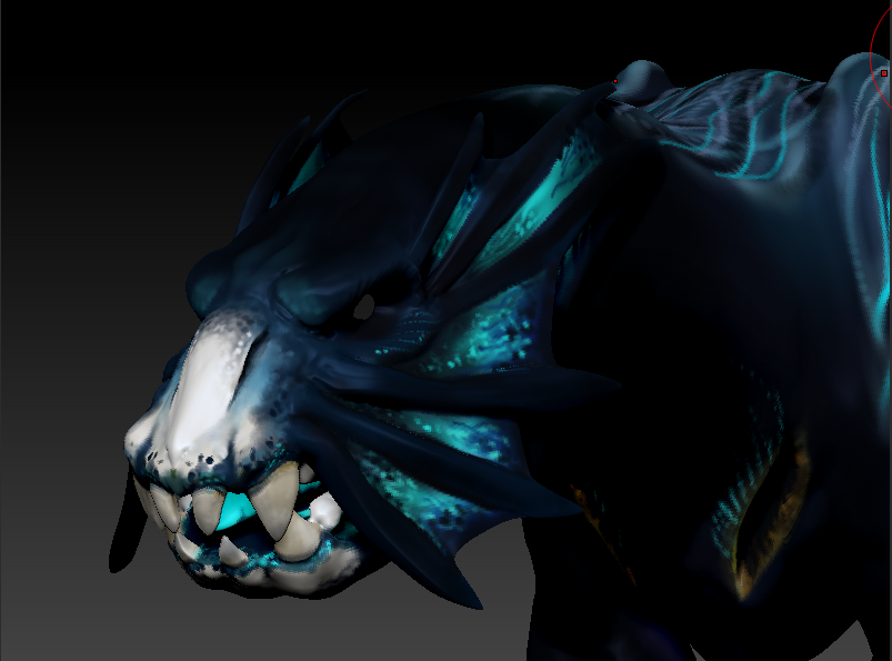
High Poly ZSculpt Shots:
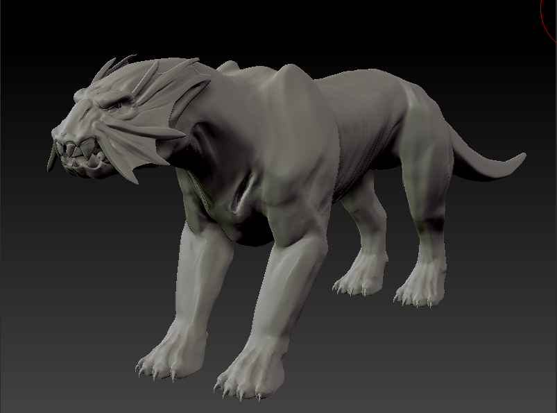
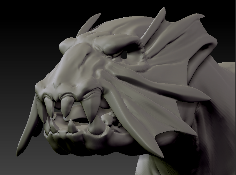
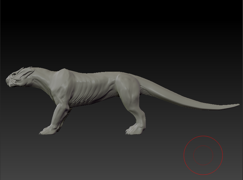
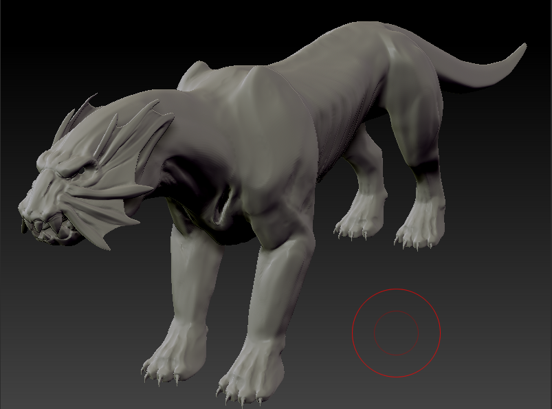
High Subdivision PolyPaint
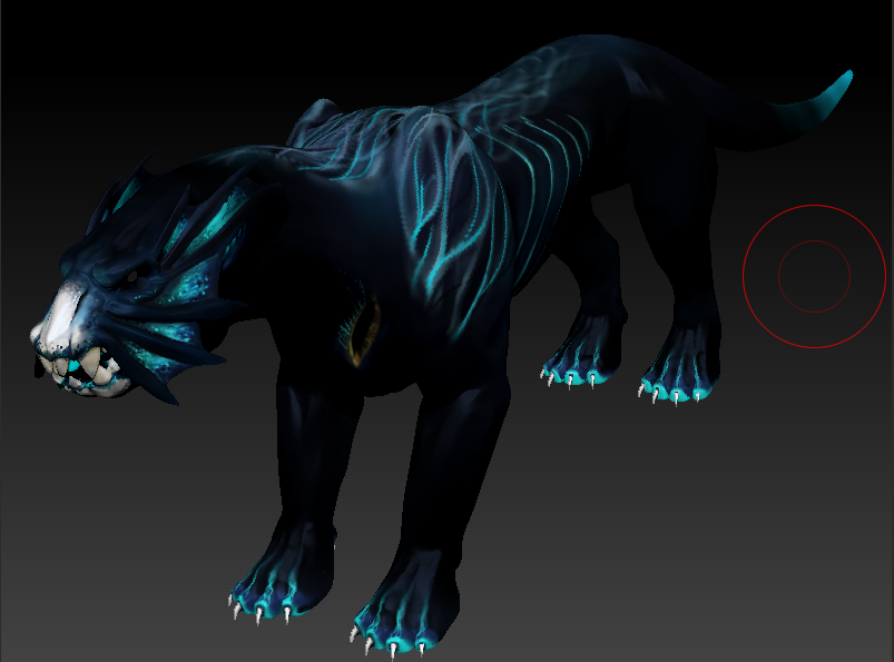
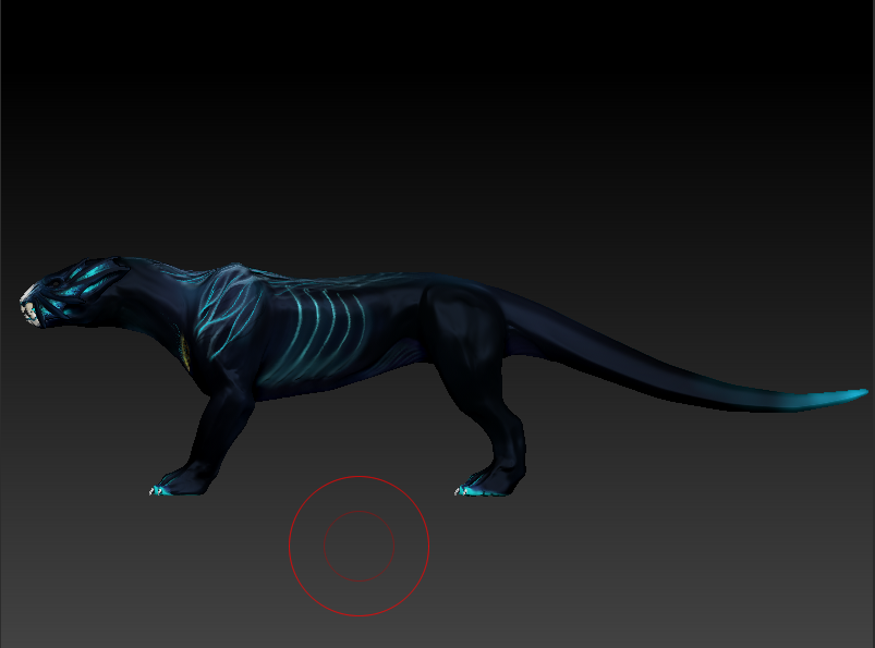
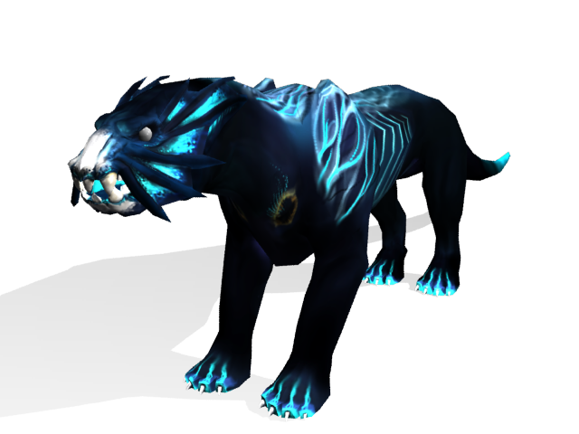
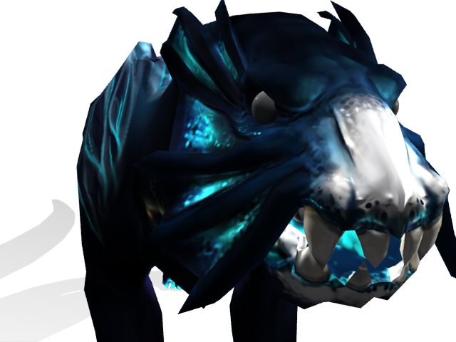
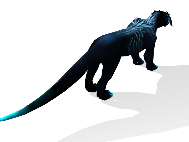
Low Poly with Diffuse and Normal
3538 Tris, Not including Eyes
Thanks a lot everyone for taking the time to look at my work. I hope to get some nice feedback.
Here's a piece of concept art I did before I started modeling. The model sheet is kind of shitty so I'll probably leave that out.

Low Poly Wireframe Shots:
3538 Tris, Not including Eyes


High Poly ZSculpt Shots:


High Subdivision PolyPaint


Low Poly with Diffuse and Normal
3538 Tris, Not including Eyes


Thanks a lot everyone for taking the time to look at my work. I hope to get some nice feedback.
Replies
I myself recently delved into a quadreped beast, though mine was in fact directly inspired from Avatar. with my initial sculpt i came up with similar issues, if you care to take a peak for reference's sake, i documented my work process in a thread. the thread is available here.
http://www.polycount.com/forum/showthread.php?t=75730
also, you may want to go higher-rez for your poly painting. it appears you're losing some quaility due to lack of vertices while you were polypainting, theres alot of choppiness and aliasing. you may want to take another pass at that and perhaps jump up a bit on your texture rez for your low poly.
I might well be wrong here, but did you model your base mesh, drop it into zBrush, add lots of subdivisions and then start to sculpt? I've discovered that it's often more useful to work your way up through the subdivisions gradually, scultping larger forms and adding as much detail as you can at lower res. Then when you're happy with that, work your way up to the finer detail. Your sculpt sort of has that feel to it. As I said I'm just guessing at that though.
The thing that really seems to catch my eye is the sharp protrusion of, what I'd imagine, are the shoulder blades? The lines of the body overall are quite smooth, but the shoulders really seem to be at odds with this. They seem quite far apart as well.
The feet look a bit odd as well. Given this creature is quite feline, the feet don't really look like paws.
Looking promising though, hope that helps a bit
Yeah, I did the high poly detail and the polypaint in one night just to get it ready for class, but I'm ready to put more effort into it now.
The feet and shoulder blades have been bothering me for some time, so I'll see what I can do about fixing them and making it more conducive to the overall design.
One of my teachers also told me to spend more time on the diffuse texture really getting those underlying skin tones and muscle structures. I also want to add some fine skin detail with pore texture and whatnot. As for the specular level, I haven't gotten a chance to make a spec map. I wanted to make him look all slimy like the picture of the salamander you linked.
It sucks, the "gills" or whatever you would call them on the front of the chest were meant to be used only underwater when it was swimming. Most of the design work was done before I saw Avatar and I kind of got pissed when I saw what they had done with their Thanator. Whatever.
But yeah, thanks a lot guys. I'll post with progress when I have a chance.
these things give character, and that's really important when defining monsters... without character, they're not scary!
as the others suggested i think the silhouette can be pushed and defined some more working on the lowres, and maybe you can sculpt it in a more interesting pose. But it's nice nevertheless.
I think I might go back in and redo the low poly and add in some more detail. I could probably push the limit upwards of 6-7k tris.
As far as the pose, I'm going to keep it in this stance for rigging and importing as I eventually want to use this guy in the UDK.