BEAT-EM-UP! | Skeptical Nate & Keen
Latest:
[ame]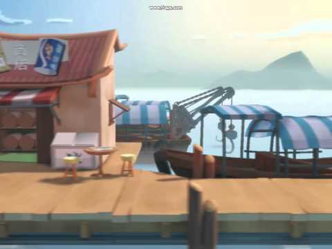 http://www.youtube.com/watch?v=yQNbAXXHLnU[/ame]
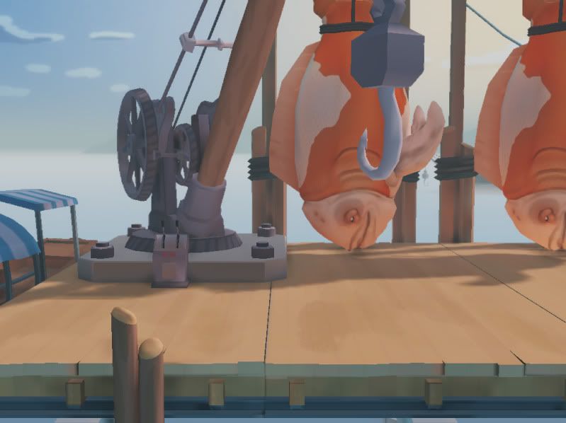
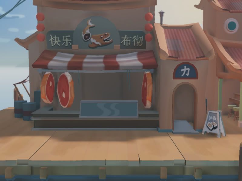
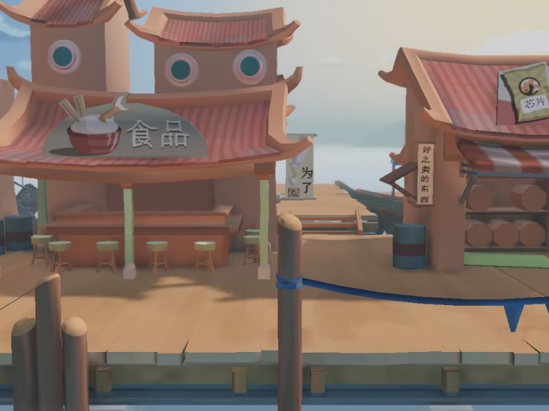
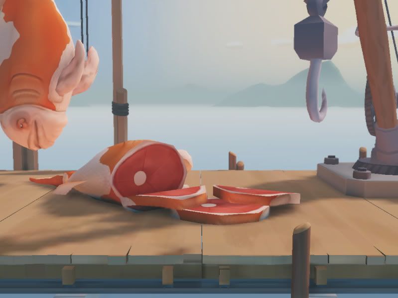
Oh hey guys! Didn't see you there.
Me and Nate are gonna take a stab at this one. Gonna take place on a floating pier fish market where the fishermen catch GIANT fish/whales. Going for an oriental theme. Here's some stuff.
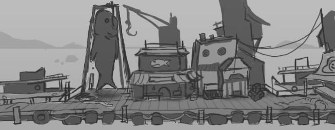
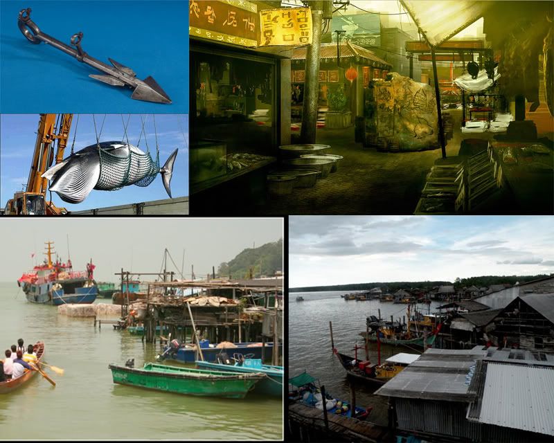
Better concepts to come!
[ame]
 http://www.youtube.com/watch?v=yQNbAXXHLnU[/ame]


Oh hey guys! Didn't see you there.
Me and Nate are gonna take a stab at this one. Gonna take place on a floating pier fish market where the fishermen catch GIANT fish/whales. Going for an oriental theme. Here's some stuff.


Better concepts to come!

Replies
Is this going to be a modern setting or older ?
You could have a Sea Shepard boat in the background xD
Good luck !
Some cool fresnels in UDK perhaps. I think would look awesome!
Kharn - The setting will be modern, just lacking in modern technology
Kaneth - We are going for a very stylized look for this scene. Not quite as crazy as alien hominid. More like metal slugs.
So here's some variation of the initial sketch. Made them more industrial looking than I intended, we're aiming more for a small fish market. Anyway, Nate's gonna do a block out hopefully tomorrow, and then I'll paint over his block out specific buildings. Stay tuned!
Keep up the great work guys, I look forward to seeing this in engine.
Neat stuff guys.
So here's an idea for the style we want to go for. Still gonna explore a few more art styles. But let me know what you guys think!
Remi - never heard of flap jack before, checked out more of their art style. Pretty cool!
Trying to further work out the art style we want to go with. Rented Spirited Away and got a ton of good reference
So here's progress. Sorry if the Chinese is terrible, I google translated it.
3D blockout coming very soon!
More art, please!
And yeah, Spirited Away is such a gorgeous movie.
Here's our blockout. Would love to hear any critiques you guys have on it.
[ame]
Keep those updates coming, looks very nice so far!
Nice blockout!
edit: we were just imagining that was some sort of warehouse that you end in. I blocked it out SUPER quick. Loren will go through and do a proper concept. It will be some sort of warehouse where they package the whale meat up and ship it out or something.
Edit edit: This is our hero in the game for now.
In the meantime I drew up some ideas for our Whale. It's a cross between a Koi Fish and a whale. Let me know what you guys think!
So here's where we are at so far.
Lighting is still kind of a big issue. We're getting lots of weird artifacts that we cant figure out how to fix. I've circled the problem areas. Weird seems and random spots that look like smoothing group errors but aren't (I dont think). If you any of you have any ideas why some of the shadows look so bad and how to get rid of the seems for the modular pieces that would be great.
and his belly some lighter grey , and add spots for colour variation all over, that would be cool
About the lighting issues, I think you need to work on your lightmaps, here is how.
You can do it for BSP as well, just select the faces you want, hit F4 and on the Lighting (section) --> Lightmap Resolution (32). you'll have to lower this value to something like 8 or 4 , well you can go way down to 1, but it will increase your render times.. so its up to you.
hope that helps.
keep up the nice work
Decided to take advantage of a 30 day trial with mudbox to shape the Puka Whale.
Nate, check my thread for more info on that silly liquid material I gave you.
What I'm totally eager to see is how you're gonna implement the scene with the background setting. Cause right now, it's a walkway just in the middle of the ocean with zero connection to a harbor or anything. I'll be stalking this thread till your submission
The modeling is coming along really well.
I love the way it is looking so far and I cannot wait to see how everything will look with textures on them!
Cholden - word, I hope you won't be too disappointed, but we don't plan to use any normals for this scene (maybe we'll add them after the challenge is finished) But I fully intend to exaggerate those details into the diffuse.
Acumen - Glad you like it so far! we're actually just going to show the end of the dock and the scrolling will stop before you get to the beginning of it.
Neox - Yeah....I was aiming for some sort of hybrid between a whale and a fish, winded up leaning more toward fish heh. It's cool, either way it's gonna be huge
Cea & Andrew - Thanks guys!
So....I did a paintover to get an idea of where we want to be in 10 days. Wish us luck guys.
You said 10 days but the challenge ends october 22nd.. so 5 days :Z hurry up guys,
we want to see it finished!
Here's where we're at so far. Just blocking in color at this point. Some of the modelling is still quite WIP. Like that rigor mortis fish at the end.
Thanks again Cholden for showin us some more UDK tricks.
[ame]
The best thing about this all is, it actually looks like a possible beat-em-up-scene. While others have also created beautiful scenery in the contest, they look not quite fitting to the actual genre that you all are aiming for. But your piece really looks like a "believable" fighting place. I can even see little crashable objects in the background
Gorgeous !