BEAT-EM-UP | ParoXum
Watch in HD (1080p if your computer can handle it):
[ame] http://www.youtube.com/watch?v=Y87rqvfZlFg[/ame]
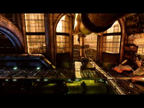
Here's my final shots, I dont know how much beauty shots needed for this challenge, so I'll post all four at the moment:


And here's my texture sheet, a bit less than 2048*4096 pixels used(half size here):

The whole level is 172,000 -ish triangles, minus the editor camera.
Map and package for 60Mb.
Did I say this challenge was starting just a the right moment? This is great.
I will use the UDK
Here the setting for my piece:
-Futuristic prison
-Nuclear Depot
-Sewers
-A spaceship that you have to kill throwing nuclear waste barrels
-Lots of pipes
-Lots of electric cables
-Unknown planet background metropolis
-Flying cars? (Yeah Johnline, you read it)
If the challenge is 6-8 weeks long there should be enough time If I can work on it a good amount of time.
The goal:
The challenge for me is to create some sci-fi props and create a scene using a lot of metal parts. As you can see in my previous work I almost always did medieval, stone things and foliage. This one will be dirty.
The moodboard

And two quick concepts I made to imagine the plane and the level:


The plane is optionnal but it can make a nice living element in the sewer part. While the other parts are closed. Also the level might not look like this at all about the proportions. It'll be more like 60% foreground and 40% background.
[ame]
 http://www.youtube.com/watch?v=Y87rqvfZlFg[/ame]
Here's my final shots, I dont know how much beauty shots needed for this challenge, so I'll post all four at the moment:


And here's my texture sheet, a bit less than 2048*4096 pixels used(half size here):

The whole level is 172,000 -ish triangles, minus the editor camera.
Map and package for 60Mb.
Did I say this challenge was starting just a the right moment? This is great.
I will use the UDK
Here the setting for my piece:
-Futuristic prison
-Nuclear Depot
-Sewers
-A spaceship that you have to kill throwing nuclear waste barrels
-Lots of pipes
-Lots of electric cables
-Unknown planet background metropolis
-Flying cars? (Yeah Johnline, you read it)
If the challenge is 6-8 weeks long there should be enough time If I can work on it a good amount of time.
The goal:
The challenge for me is to create some sci-fi props and create a scene using a lot of metal parts. As you can see in my previous work I almost always did medieval, stone things and foliage. This one will be dirty.
The moodboard

And two quick concepts I made to imagine the plane and the level:


The plane is optionnal but it can make a nice living element in the sewer part. While the other parts are closed. Also the level might not look like this at all about the proportions. It'll be more like 60% foreground and 40% background.
Replies
First report, I shouldnt concept from a 2D image as perspective wont make me able to cheat. It'll be better for this challenge to concept from a blockout using paintovers than directly in PS, but that's only my opinion.
There's less space to fill in the background so, good news I'd say.
What do you think, it's still very early but eh.
-Footbridge + ramp + wip pillar:
Kaneth: thanks, I hope I'll be able to make this epic feeling.
great idea and nice highpoly models so far
Anyway, small small progress, diffuse and normal maps done for 5 assets, no spec maps yet:
Yeah I ran into the same problem with tiledshot, was sad it didn't show light shafts (I think there are some other screenspace effects that don't show up either).
Yeah tiledshot kills most post processing effects like bloom and lightshafts. Bummer, but it shows in realtime though, so if you do a video it'll definetly get noticed.
I slowly finished my first real HP for a heavy exterior door. In the meantime I also finished specular pass for the previous assets and will have a picture of that soon.
Since I choose a full modular process I'm thinking about some re-design of the level atm, I will wait to have more props in to play Legos'.
Got the texture base colors running and I'm soon going to work on the specular map,
I need crits since metal texturing is my weakness, looking forward to know what I can enhance in this texture:
Update with spec map:
I call it done because I have a ton more props to do yet.
Though the left side seems a bit too busy... maybe tone those rivets/bolts down a bit by covering them with some paint. I figure they put the rivets/bolts on then do the paint job...
Keep up the great work
I still have more wall panels to do, and fire is temporary, painted some fx over the screenshot to see where I'm going.
textured assets feel a bit monotone..would be nice to get some accents in there
http://www.google.es/images?hl=es&q=machinarium&um=1&ie=UTF-8&source=og&sa=N&tab=wi
I would tone down the glare a bit and try to get rid of some of the blacks.
Also, I'm not sure if you know this but I was playing around with the August UDK build and it looks like you can now do tiled shots with the light rays.
Keep it up.
Thanks guys, it's still early, even if this challenge is already half done... I'm doing relly slow progress every week, I'll push more in the last weeks.
Changed all the level for first part of the scenery, removed the third part and added a demolished bridge as second part, which you can spot a little on third screenshot:
It's getting there, I feel it.
PS: I moved to the UDK September beta so PostFX and lighting need strong crits as it's certainly weak at the moment.
looking at your last pictures with this nice deep background, i wonder how to catch the whole scene without losing too much depth?
I like where you're going with that blue light in that first image, but maybe desat it a bit and consider having similar lights along the gameplay-area walkway to make it pop out a bit more from the background.
It's a bit rushed as I only worked like 2 hours in total on this but meh.. I'll come back at it if it becomes a first plan asset
Zack: No fear mate I think we both go on very different directions, so there'll be no problem
I'll try and fix the blue light and do what you guys said when I'll come back to UDK for lighting.
There's still place holder meshes, and ground lack some wires/cables/metal tubes hanging to give a pass more of depth.
Keen: thank you very much, more to come.
I did a test video, and it turns out it rendered darker than the real lighting:
[ame]
Watch in 720p or 1080p if your comp can handle it.
This video feature the full background city and flying traffic (animated) and that's pretty much it, nothing new since previous screenshots. Ah yeah, optimized the whole scene polycount from over 350k to 170k. There should be enough room for what I want.
Really a shame the video is so dark. I put a big ? question mark here.
Love the animated background!
But seriously, I think the lighting is fantastic, and the amount of unique detail put into each section is fantastic. Bravo sir!
Amazing stuff.