The BRAWL² Tournament Challenge has been announced!
It starts May 12, and ends Oct 17. Let's see what you got!
https://polycount.com/discussion/237047/the-brawl²-tournament
It starts May 12, and ends Oct 17. Let's see what you got!
https://polycount.com/discussion/237047/the-brawl²-tournament
[WIP]Sci-fi Environment-UDK
Hey guys. I've been working on this uni project, well actually a game is being developed..very short time to do so. I've been working on the environment and level design among some other things. Due to time constraints I could only make low poly models so I've been relying alot on photoshop to bring out details from heightmaps. All of the models that are required for our little game are modeled, optimized and unwrapped and Im mainly now focusing my attention to texturing with only 2-3 weeks left(I hope we make it).
Im going to be posting some pics for critiques and some guidance on some issues. Trying to push the assests to a porfolio quality because I do want to do environment art/level design. This is my first sci-fi environment I've really wanted to do one(so many good ones I see on the forums).
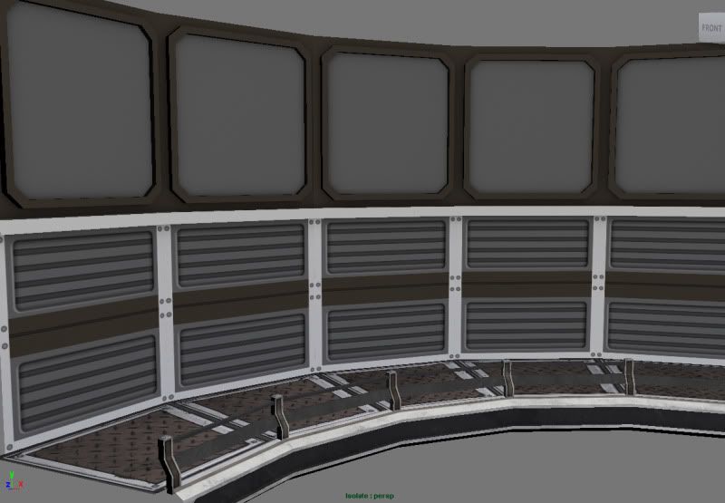
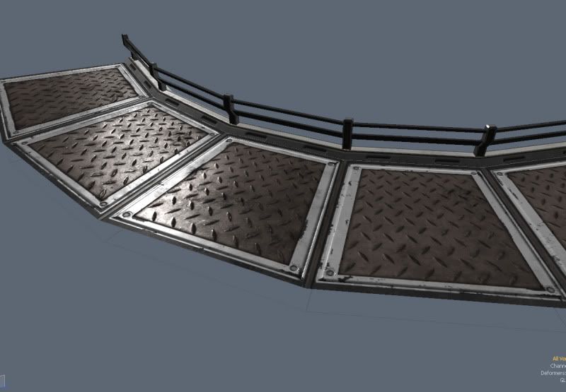
Images below are the central Hub modular 90 wall mesh and platform. I already textured the platform D,S & N maps. Im not sure if Im solid on the color scheme Im trying to get some opinions/ critiques on the pieces. The wall mesh I have just AO and blocked in some colors and rough details to fit with the style I created for the platform. Not sure want I want to do with the upper middle gray parts. I'll be posting some images later from UDK of the overall environment. Thanks.


Replies
First thing that really jumped out at me though was the diamond plating for the floors. First its a little too large, and secondly its kind of overdone in the 'environment world'. I'd recommend re-thinking your floor texture abit. There's nothing wrong with simple flat metal plating with tiny details in it
The player interacts with large metal block structures in the world that can be used with their special abilities. The blocks have certain symbols and colors associated with them. Im trying to use alot of white, brown & gray because I dont want the color scheme to clash with those blocks. I'll post some other pics of the overall environment later on.
If its a locked 2.5d camera set up, you could really push the details of the walls and play to the camera a whole lot.
Making environments for platformers can be tricky... Especially when you get into the 'logistics' of 'why is this box floating here in the middle of nothingness??'.
Any crits would be great, Im going to try to rework the platform diffuse a little.
I started to add some wear and tear to the wall piece and I felt it was lacking some interest, in the indented panels it seemed to grayish. I want to know what you'll think of having those lighted areas behind the panels. Do you think I should lean toward that direction?
One thing with the texturing of your objects though. They're looking a little flat at the moment. I don't know how much further you're going to push them, but one thing I would consider looking at is how the environmental elements react with the objects. For example, have dirt build up in the crevices and corners of your objects. Micro surface scratches in your spec, to give visual break up / variation. Etc Etc.
As for the lights behind the grates in the wall. Its an interesting concept, but in the images you've provided, its a little hard to see the difference between the lit areas and the unlit areas.
Keep at it though, its coming along!!
I'm really looking forward to seeing what more you come up with ajr2764.
Don't be afraid to let the environment have some personality. All too often Sci Fi environments appear really bland and don't come across as that exciting. Look at reference from Starcraft 2 and Dead Space 2, which are two games that have really brought new life into Sci Fi, in my opinion. Keep up the great work, and I look forward to seeing this thread unfold!