Shadow base GO! (UDK Environment)
Hey guys. been working on this for a little bit and thought i could use some fresh eyes on it.
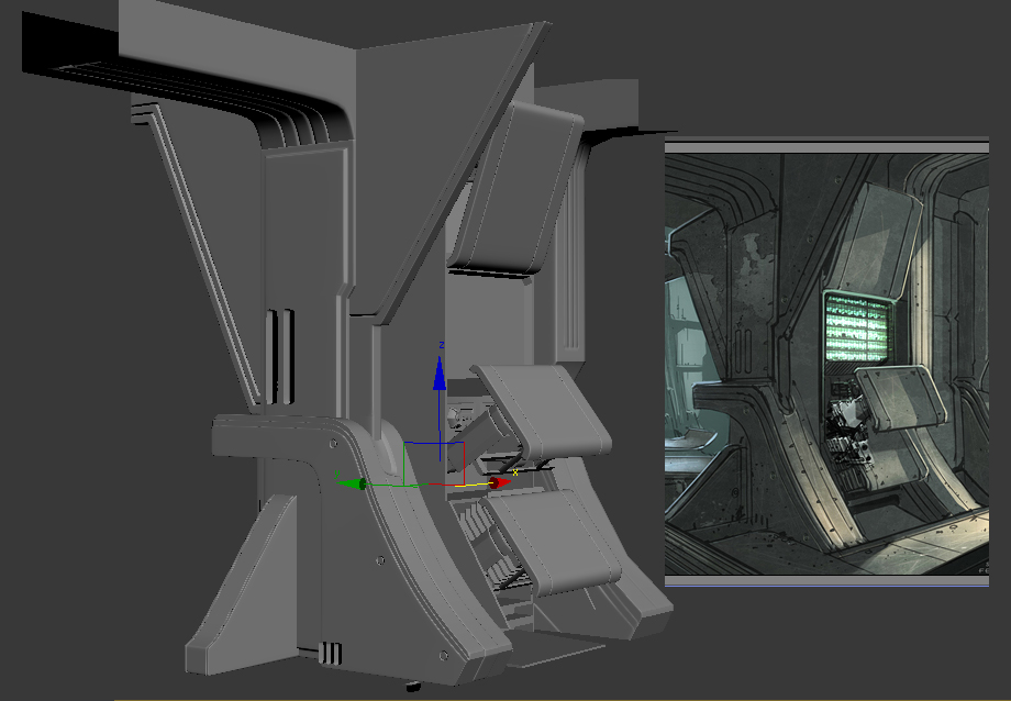
Here is the concept by Feng Zhu i'm working from, you guys may have seen it in WAYWO:

here's some key model screens taken from max:
variation on the previous shot


current color scheme:
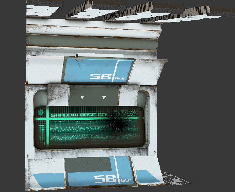
along the same vein as Moon the movie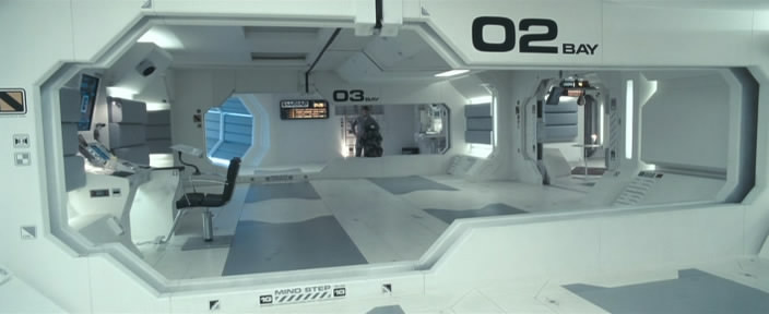
more stuff on the blog: http://jseamanart.wordpress.com/
ANY critique and comment is welcome and will be considered! so please SOCK IT TOO ME!
Here is the concept by Feng Zhu i'm working from, you guys may have seen it in WAYWO:

here's some key model screens taken from max:

variation on the previous shot


current color scheme:

along the same vein as Moon the movie

more stuff on the blog: http://jseamanart.wordpress.com/
ANY critique and comment is welcome and will be considered! so please SOCK IT TOO ME!
Replies
Red Lines
The left side support spar has a much more gradual curve in the concept. Even accounting for the difference in angle between the concept and your image, that middle panel is much higher on your model.
The ceiling of the left hallway is angled. It looks like your model is a 90 degree turn there. It might just be the angle your screen shot is from. Hard to tell.
Blue Lines
The support in the background is much taller in the concept art. If easily clears the top panel before starting to curve.
Hopefully the paint-over helped. I have always found it easier to read those than to try to figure out what people mean from a description
Needed to take a couple steps back and work on the big picture rather than messing around with the details. so i blocked out a layout! Critiques and comments welcome and appreciated.
and everything is floating off the ground because the brush and the floor tile were z fighting and it was driving me nuts. it wont be floating when i finish the floor.