The BRAWL² Tournament Challenge has been announced!
It starts May 12, and ends Oct 17. Let's see what you got!
https://polycount.com/discussion/237047/the-brawl²-tournament
It starts May 12, and ends Oct 17. Let's see what you got!
https://polycount.com/discussion/237047/the-brawl²-tournament
My island scene!!!!! WIP
For all of those who are in front of a computer but would rather be at beach.
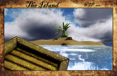
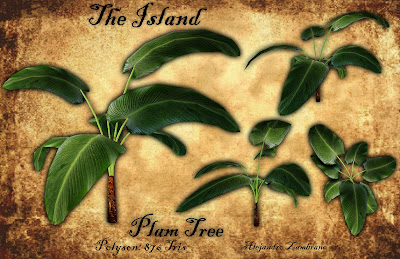
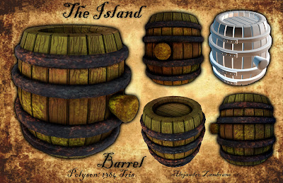
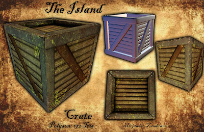
For full resolution images goto http://alex-leveldesigner.blogspot.com/


For full resolution images goto http://alex-leveldesigner.blogspot.com/
Replies
The crate's top seems really deeply set...and I think the textures overall, on all of the objects, could use a lot of work. Why does the palm tree have a photo texture, when it's clear it's the only object that does? The wood grain on both the crate and barrel aren't very convincing...and neither is the rust, cork, or the mossy/mildewy bits. The mildew and rust textures seem randomly thrown on - try to make them more convincing.
On your presentation sheets. Drop the grungy background. that or fade it out to the point where it cant be seen easily.
Do the changes, and keep up the good work!
Secondly, I'm not too sure what style you're approaching, whether it's stylized or going for realistic, but I think you're not looking at references either way, like the green splatters on the crate don't really make sense. Try replicate/stylize what you see, not what you think you see.