The BRAWL² Tournament Challenge has been announced!
It starts May 12, and ends Oct 17. Let's see what you got!
https://polycount.com/discussion/237047/the-brawl²-tournament
It starts May 12, and ends Oct 17. Let's see what you got!
https://polycount.com/discussion/237047/the-brawl²-tournament
Nooby's Mace
Hi guys.
Here is a mace I made this week.
I've used the Skeletor Mace (from Castle Crashers) as a model for this mace.
I'd like to get some critics about this because I really want to do better.
I'd like to use this mace as a custom skin for the Homewrecker in Team Fortress 2 but it's way too hard for me to put my model in Source, so I added it in the UDK, for testing in game.
Here is the original image :

Here is my model without texture and with Edges :

(Yeah I don't really know how to get a render of the model AND the wire so I used a material that fails a little (explain the big grey areas))
Here is the model with its texture :
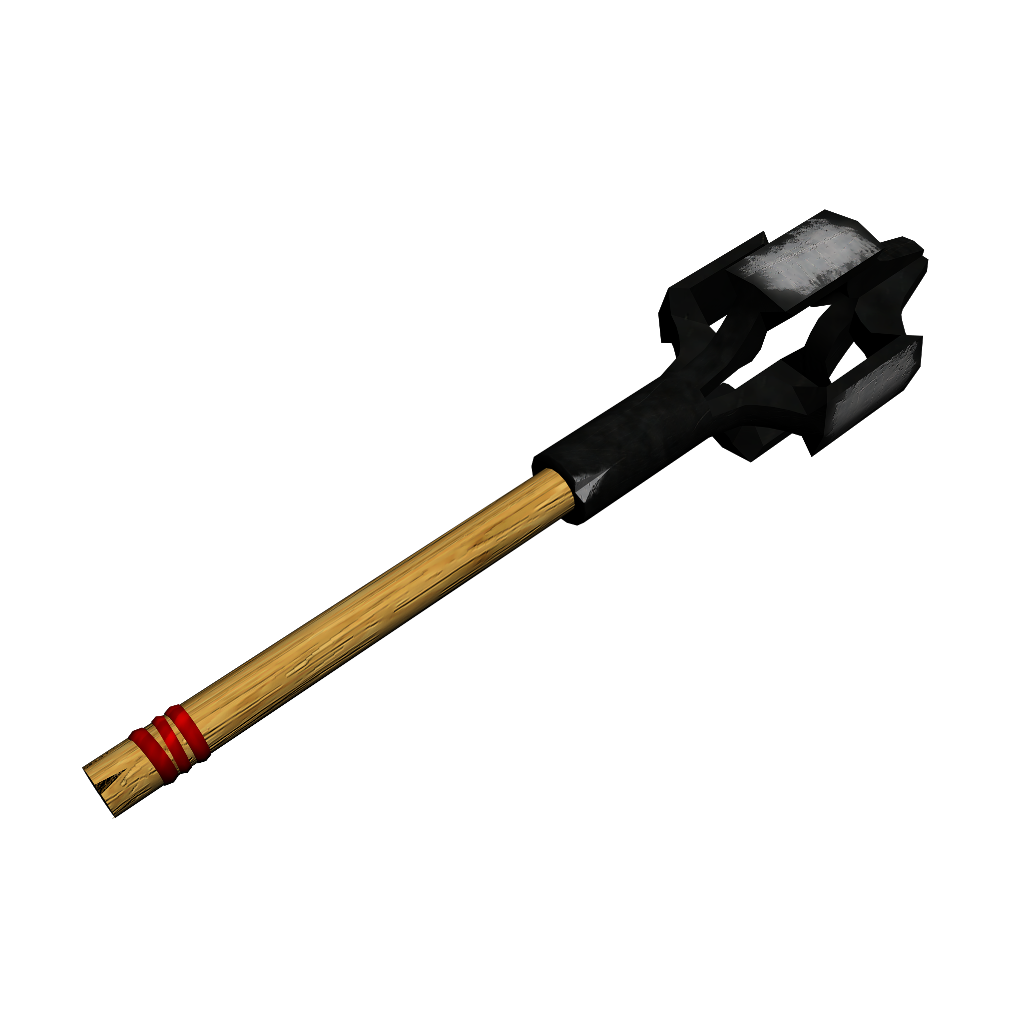
And here are two views of the model under UDK :
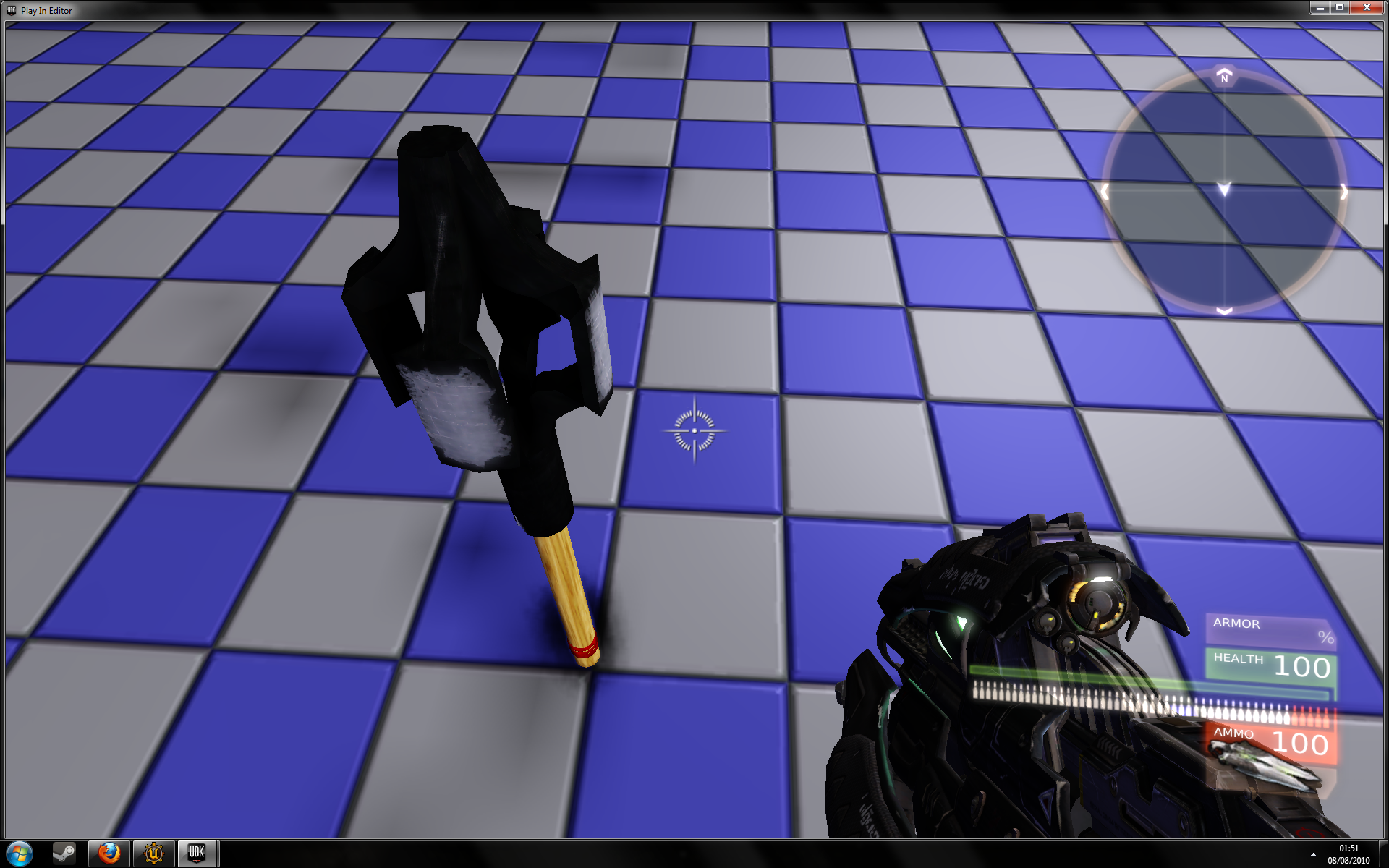
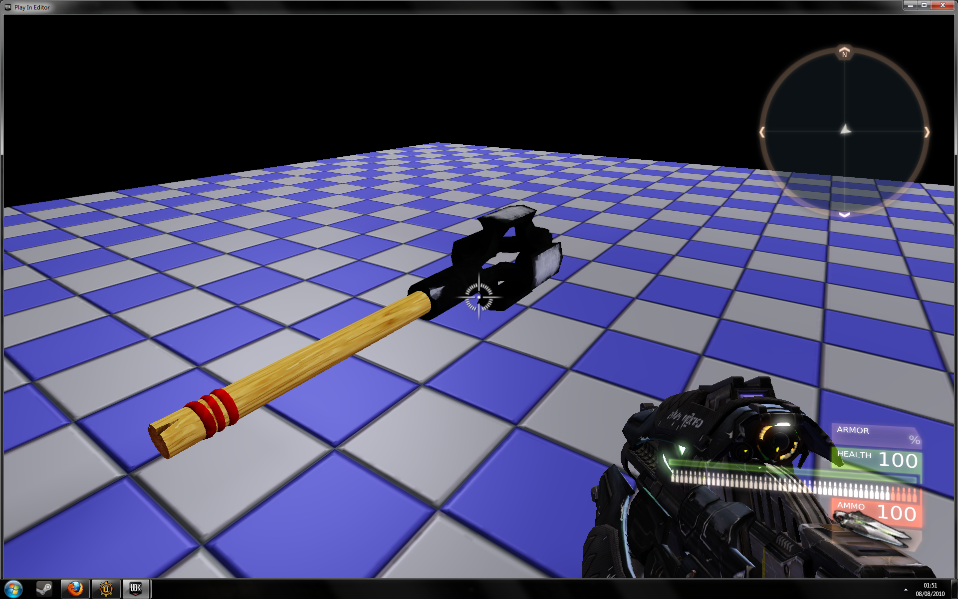
As you can see, I have some problems for making the "notch" and bandages (the red things).
Oh, and also for texturing the "notch" (the borders of it)...
So... What do you think about it ?
What is good, what is bad (except my english =P) ?
Here is a mace I made this week.
I've used the Skeletor Mace (from Castle Crashers) as a model for this mace.
I'd like to get some critics about this because I really want to do better.
I'd like to use this mace as a custom skin for the Homewrecker in Team Fortress 2 but it's way too hard for me to put my model in Source, so I added it in the UDK, for testing in game.
Here is the original image :

Here is my model without texture and with Edges :

(Yeah I don't really know how to get a render of the model AND the wire so I used a material that fails a little (explain the big grey areas))
Here is the model with its texture :

And here are two views of the model under UDK :


As you can see, I have some problems for making the "notch" and bandages (the red things).
Oh, and also for texturing the "notch" (the borders of it)...
So... What do you think about it ?
What is good, what is bad (except my english =P) ?
Replies
I also use this "up" for asking some questions :
Is it possible to change the graphics settings of the UDK ? If yes, how ? I searched and didn't find anything.
Is it possible to change the bindings of the UDK (I mean, for when I'm testing my maps) ?
Because it's on WASD by default, and my keyboard is an AZERTY one so it's quite hard to move (except if I change my windows keyboard settings for QWERTY).
I'd like to make a Team Fortress 2-like style for my UDK, I searched for tutorials but I only found about how to make a Borderlands-like style and it wasn't really explained...
thank you in advance.
Do you have a high poly? If not you should make one and then you can bake in the red bands and the notches too probably.
The wood texture is way to bright and doesnt look very used. and i think the metal needs a lot of reworking as it doesnt look like metal at all really.
Racer445 has fantastic metal tutorials you should have a look at
here it is http://www.vimeo.com/3779494
and the big grey patches are meant to be wear right? At the moment they don't look like wear at all you need to have a look at some refernece to see how that would wear also you need to add some wear on the edges too
but yeah overall looking good
the mace have 783 Polys.
It's the only "version" of the mace that I've made.
I absolutely don't know how to do for it.
If I must do two times the same model, but once with "high" details and the other one without any detail, if I must do the high poly then use a modifier to do a low poly version of it...
I tried to keep TF2's texture style but, as I said, I really suck at texturing. '^^
For the metal I used a metal texture found on CGTextures and I decreased brightness to get a color like on the original image.
So :
-Wood too bright.
-Metal doesn't look like metal.
Thanks for the link, I'm watching it.
Yeah, the big grey patches are supposed to be wear... =(
(But I'm not really sur to understand what you just said)
Thanks for the critics ^^
I think you should try and mess with some of the proportions for the mace if your going for a TF style
By the proprotions you mean that the entire mace is too big ?
If yes, I know, I'll resize it when I'll know how to put it in TF2 (and when my mace will be a little better).
You mean that the handle should be like that )(
Instead of like that ||
Right ?
If you're going for TF2 style, I would advise to mute the red color as well as the color of the wood. Right now the color of the metal part is really contrasted, so the wear looks more like paint than anything else. If you look up some references of metal weapons, you can observe where the wear and the scratches occur, and how they look more accurately. I think you can get away with a lot less detail, and still capture the look of the surface. Good luck with it!