Home 3D Art Showcase & Critiques

WIP - Durp

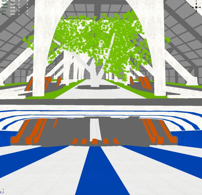
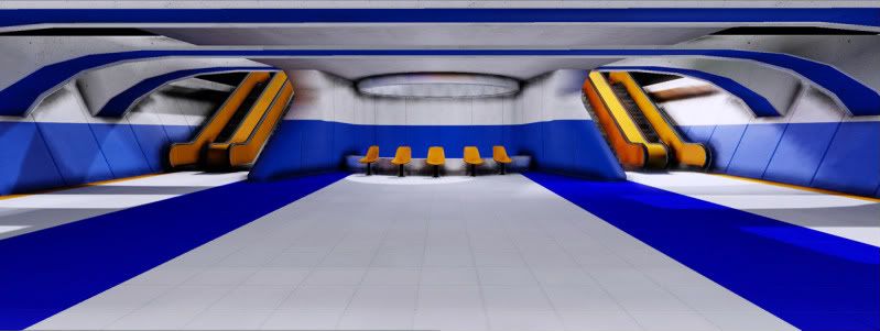
New environment I'm working on. Going for Mirrors Edge type art style.

Worried at the moment that its gonna come across a bit too plain, empty and boring but not sure what to do. Looking for as much critique as possible and I should hopefully have regular updates.

First screen is what I have so far in unreal and 2nd screen is the planned final layout.
crazyscreen.jpg


layouttest.jpg

Replies

  • Momo
    Minor updates. Tree has been switched out for bamboo and top level is somewhat up and running in unreal now. Having problems with lightmaps on segmented static meshes though. Hopefully get that resolved today.

    Screenshot1.jpg
    Screenshot2.jpg

    Here is screenshot of the lighting seam. I got a couple suggestions in the UDK thread I'll be trying out today. Gonna mess with the UV layout and if not try re-rendering the normal map out as it maybe causing problems.

    seam.jpg
  • BlvdNights
    Offline / Send Message
    BlvdNights polycounter lvl 8
    The lighting in the scene makes the space feel really small. Also more spec :D
  • Momo
    Still plugging away. Tons of stuff missing spec and a few things missing textures still. Most of the major stuff is in at least. Gotta try and make the bottom level a little more visually interesting. Probably gonna try and mess with some tile designs in the overly large white space and add some wall lights or something.

    Level2.jpg

    Level1.jpg
  • Momo
    Minor additions today. Gonna spend some time looking over shaders tutorials and see if I can come up with any nice glass shaders.

    Level22.jpg
  • 00Zero
    nice! very cool spatial design. colors are a bit too saturated i think. even for a mirrors edge sort of theme.

    mirrors edge was never dull or boring. if you take a closer look, the textures had a lot of detail even though it was subtle.
  • Klumpmeister
    Isn't Mirror's Edge's art style only one color through out the area and not two colors?
  • Mike Yevin
    Offline / Send Message
    Mike Yevin polycounter lvl 11
    Mirrors edge has tons of colors, they like to go for high contrast though (mainly white with splashes of color). But like 00Zero was saying, if you go really close to the textures in the game, you will notice that almost all (if not, all) of them have grunge and minor detail added to them.
  • Momo
    Isn't Mirror's Edge's art style only one color through out the area and not two colors?

    Mirror's edge is usually only 1 color or 1 main color with minor touches of second contrasting color.

    I'm treating the two levels as separate areas. The idea was if it was playable you would go from one color scheme to a totally different one. Similar to what they do in Mirrors when going from exterior to interior levels.
    if you take a closer look, the textures had a lot of detail even though it was subtle
    if you go really close to the textures in the game, you will notice that almost all (if not, all) of them have grunge and minor detail added to them.

    You guys are right. I think they also have more contrast with the grunge especially on the stuff like concrete. I'll make sure to have another look at some of the texture stuff. I most likely won't hit the style exactly but its the theme I'm going for.

    Thanks for all the input.
Sign In or Register to comment.