The BRAWL² Tournament Challenge has been announced!
It starts May 12, and ends Oct 17. Let's see what you got!
https://polycount.com/discussion/237047/the-brawl²-tournament
It starts May 12, and ends Oct 17. Let's see what you got!
https://polycount.com/discussion/237047/the-brawl²-tournament
Portfolio pieces under construction - crits welcome
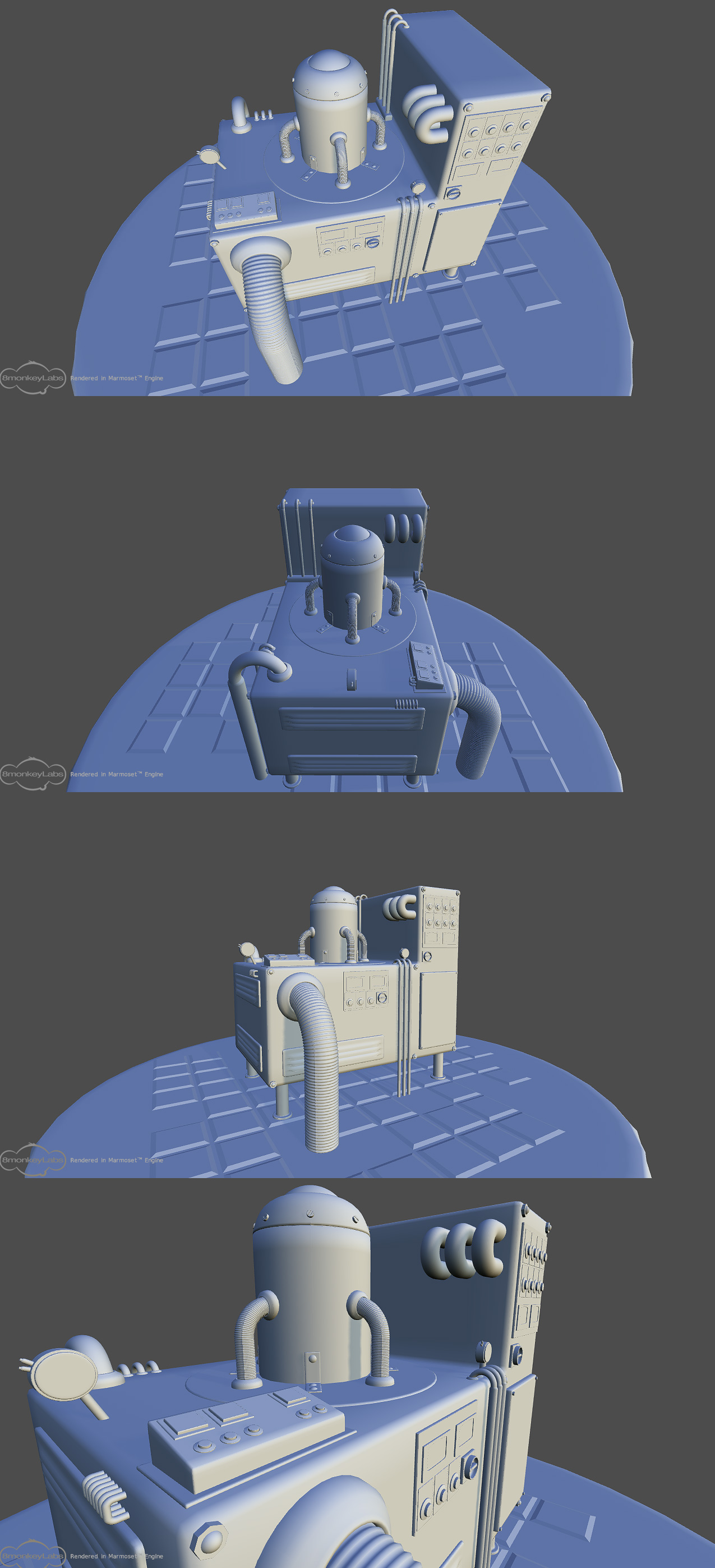
Ok, started working on some new portfolio stuff the other day and this is what I have so far. It's only a high poly at this stage but I wanna be sure about the amount of details. Before I start going for the next step ^_^.
It's a industrial model completely taken from fiction and my own vague concepts. So it's more or less modeled from my head on the fly.
What it does? I have no real goal for what it should do only how I want it to look.
Crits and comments are very welcome.
Things to do so far:
-Move the bolts on the sides more in so they aren't so close to the edges.
-Fix the plate under the model so it looks better / smoother.
-Add more polys to high poly
Pix:


Replies
The floor seems to be grid-like, yet the parts of the machinery which intersect with the ground do not fall neatly into these grid sections. Maybe it's a design choice, but it's very obvious with the feet in the second image, and the large pipe at the front that goes into the floor seems to be sized for one of those grid spaces, yet it doesn't end up inside one.
It just drew my eye in an unconvincing way. Maybe this is what you mean by fixing the plate under the model though.
Also, it seems like some of the parts seem tacked on, as in they aren't connected to the model in a convincing way. I'm talking about the mirror / circular lever on the left hand side in the first image and perhaps the 3 coils on the side of the raised section. These sorts of extensions tend to have a larger base where they meet the main object, as you have done with the pipes.
Other than that, I can't see anything that looks wrong / odd, but I'm new to this so I could be wrong about some things. It's a good model and I look forward to seeing your progress
Hello
Yes the floor need some tweaking and fixing. The floor is meant to be tiles with a few tiles missing and so on. But I think I'm going to remake the tiles and have them be a lot more tight in between the tiles. And get base connections for the pipes though the floor also. Along with the 3 coils on the raised section that are more or less smacked on at the moment.
Thanks for commenting.
And keep the crits flowing ^_^.
Also working on this M4.
Here are the refs I've been looking at during the barrel build.
I've only worked on the door and the stoneparts so far.
Any comments on the scene/texture?
uniforms style (models):
Judging from the door and its frame you are going for an very exagerated style. The fence and the front of the building doesn't reflect the style you used on the door. You should go over those pieces but you said they are only blockouts anyway.
Considering the detail you put into the frame of the door I don't see a reason to not do the door, the handle, the ring holding the sign with the same attention to detail like the stone. I would consider doing the door board by board and you may have some spacing between them.
Also The handle really looks too flimsy compared to this massive stone.
textures:
Only some suggestions, as you are going over the textures anyway:
Your stone texture is on the right way but needs some more work. You have some shadows painted in which look nice. You are missing some highlights and maybe some scrathes here and there. Each stone can cast a slight shadow on stone below: you can paint this in your texture.
Your are mirroring your texture which is quite obvious. Also by mirroring your uvs the stones on one side of your door are not shaded correctly. I think you could just paint both sides of the frame it will look better. If thats not an option you should consider changing the shading of your stone such that the lightsource is directly above. In that case you can mirror your uvs without weird shading inconsistence
The wood Texture still need a lot more work. It looks a little rushed. But you said your going over this.
Good luck with this piece.
I did a repaint of the door and stones and the open sign. About the handle on the door I really don't know how to make it less flimsy hehe. I think it fits the door.
I also made room for the stone so the have own uv space. Did mirror the door about 40 % instead.
Also made an attempt at the tileable wall in the background.
New:
Thanks for the tip.
I've removed some black from the brown wood behind the windows and also started on the windows.
You don't need black. And you do need to reduce your brush opacity to about 20%m and take your time painting.
good luck, hope you take the crits here and implement them.
Thanks for the tips. The tech I've used is very similar to that tutorial but with a bit darker colors and some black. And also I've seen the tutorial before ^_^
I've trying to implement the crits I get as I go ^_^
Here is the progress so far: