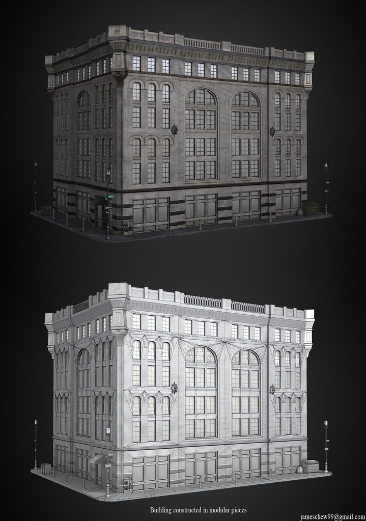
I've been working on some new portfolio pieces over the past few months. I've learned alot from pc(mainly just lurking and drooling on other peoples work) and wanted to thank everyone's contribution, and heres a humble contribution of my own. Please feel free to C&C.
Hey James, your work is looking really good as always! I'm liking all of it, really clean stuff! That rifle has some nice textures, and that truck is really awesome.
Update: Updated textures on my graduate piece.. Stryker.
Will be getting the renders of the props for my modular building set rendered out. Not really sure why my images are showing up a tad bit blurry, tried hosting it through blogger and photobucket.. both give me the same results.. perhaps someone knows why?
hey man most of your stuff is looking nice, your girl model tho could be alot less dense in the general nip area also the anatomy on her is a bit off, but girls are tricky so keep workin on em! dig the truck btw
I also like your work very much. I think the truck could benefit from a little more color variation. Have you considered using a different color or camopattern for the awning in the back? Atm the trucks looks very .. green.
Woogity: Hey Woogity, yeah maybe the anatomy on the chick is a bit off. To be honest this is the first 3D female I've attempted. I'm going to try to keep that in mind and focus on the anatomy more next time.
Slave_Zero: Thanks man, I totally agree on the truck, I'm going to play with the hue of the tarp/awning a bit. Will update soon with new render.
N88tr: Yeah theres one render with wires+normals.
Autocon: I agree, the M4 is a bit splotchy looking, originally the textures were done for only the sake of the character rendering in mind and I pushed the wear on it perhaps too much.. close up render makes it evident. I'm going to play with the spec to make it a bit more subtle.
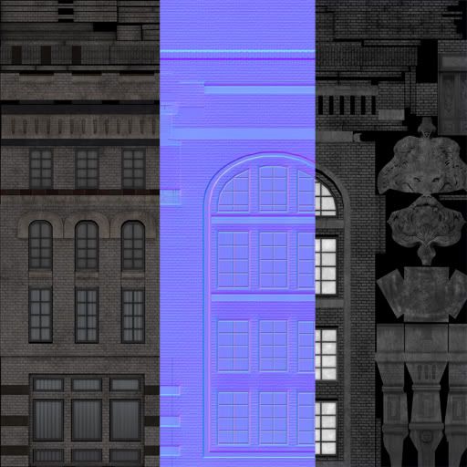
Thanks for the feedback guys, appreciate it! Heres a new update of the ornament piece from my modular set.
Some VERY solid stuff here! I feel liked you missed an opportunity on the van with the canvas cover to break up the green color with a brown or something. I don't know, something about it feels very toy like to me. I love the textures on the metal and paint though!
The only crit i have is on the truck the inside/wheel-well area. It looks like some wires or cables were in the high poly and they look good on the texture sheet, but the geometry or smoothing groups are killing em. Thats being really nit-picky though. Great work overall, i really dig that lion piece.
Really solid assets. I agree with Autocon about the cloudiness. If you were to flatten it out, and give some minor scratches to imply useage, it would go a long way. My crit would be to rework your shader/spec maps on some of your assets. Also try to change up the value or hue of the tarp, because it is the same color as the metal of the truck. (or vice versa) The spec of the tarp is exactly the same as the metal, which is not making it read correctly. Love the assets, just a little more polish, and boom great results.
Seaseme: I've changed the hue on the tarp. Sometimes I just need a pair a fresh eyes after starring at my work for this long, thx!
imb3nt: Thanks! I agree, I've changed the mesh so that its one solid mesh instead of having geometry extruded in where the wires cross(thereby casting a shadow onto the wires). I think this helped a bit, let me know.
Spug: The splotchy look on the m4 that will be my next target for fix. In the meantime I've updated the spec/hue of the tarp based on the suggestion of you and a couple others here.
Wow the truck looks better, and I am really digging how the textures are popping a lot more as of the update. I would also suggest to give your prop assets a gradient from top to bottom, thus giving them more appeal, and will draw the eyes of the viewer down all over your assets. Right now, they are flat, but the normal/model/texture is mighty fine. With just a wee bit more polish lad, it will be baller.
Replies
Keep at it!!
I updated the character pics, made some proportion adjustments based on some critiques.
Will be getting the renders of the props for my modular building set rendered out. Not really sure why my images are showing up a tad bit blurry, tried hosting it through blogger and photobucket.. both give me the same results.. perhaps someone knows why?
biggest problem I see is your gun has to much black splotchyness all over it. giving it a really high contrast. looks too cloudy
Slave_Zero: Thanks man, I totally agree on the truck, I'm going to play with the hue of the tarp/awning a bit. Will update soon with new render.
N88tr: Yeah theres one render with wires+normals.
Autocon: I agree, the M4 is a bit splotchy looking, originally the textures were done for only the sake of the character rendering in mind and I pushed the wear on it perhaps too much.. close up render makes it evident. I'm going to play with the spec to make it a bit more subtle.
Thanks for the feedback guys, appreciate it! Heres a new update of the ornament piece from my modular set.
The only crit i have is on the truck the inside/wheel-well area. It looks like some wires or cables were in the high poly and they look good on the texture sheet, but the geometry or smoothing groups are killing em. Thats being really nit-picky though. Great work overall, i really dig that lion piece.
Great work!
imb3nt: Thanks! I agree, I've changed the mesh so that its one solid mesh instead of having geometry extruded in where the wires cross(thereby casting a shadow onto the wires). I think this helped a bit, let me know.
Spug: The splotchy look on the m4 that will be my next target for fix. In the meantime I've updated the spec/hue of the tarp based on the suggestion of you and a couple others here.
Thanks again for the feedback guys!
Heres the updated version:
Some more props from the modular set:
Nice looking models you got there. That army truck looks amazing? How big is the texture on the truck?
Do it up. Great art.