WIP: Pirate
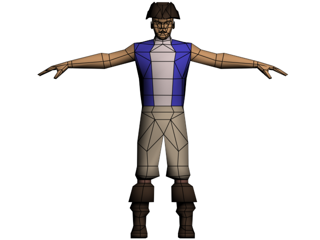
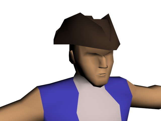
Well, this was originally supposed to be one of the main characters for a game that doesn't exist and has no name! He was to be Captain Kade Cromwell, but he's just too boring to be a captain.
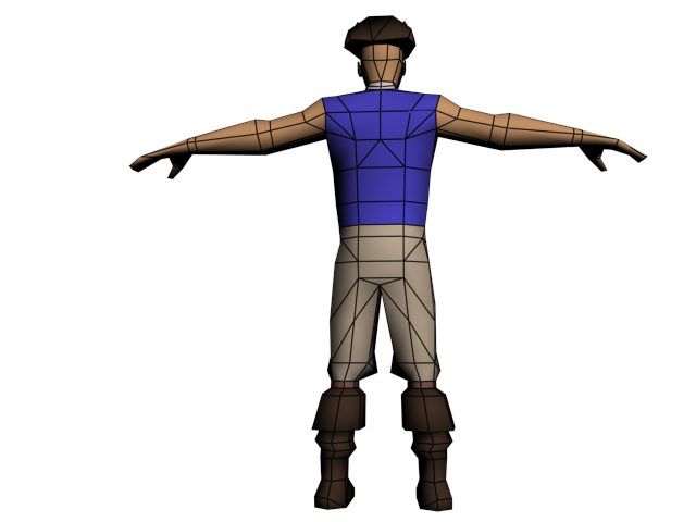
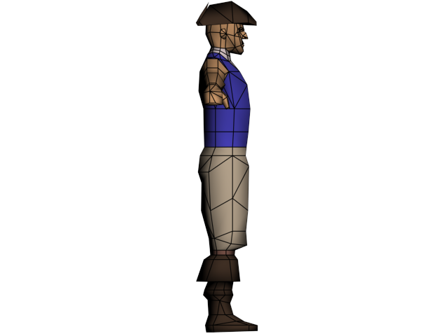
This is being made for my low poly class at the Art Institute. The budget is 1k tri's, and there are some things that I wanted to do that the instructor told me not to do - such as give him a long coat that you usually see Captain's wear, because it's apparently be too hard to rig.
Anyways, I have the low poly pretty much done. I've done almost all of the optimization I think I could. I've never rigged a character, and this is also my first attempt at creating a character. I'm primarily worried about how the geometry will deform.
Accepting any and all criticism!
I was also thinking about changing the geometry in his arms and giving him a long-sleeved shirt. He doesn't have a sword yet, but he will soon. I'll be posting everything from the rigged character to the environment that we have to make him in over the next 3 weeks or so.


Replies
Right now your texture has a whole lot of nothing going on, but since you're probably going to need to re-model a bunch of this I wouldn't worry about it just yet. Focus on making the most of your 1k budget. Then make the most of your UV space. I'd suggest mirroring as much as you can.
Thanks for the link, I'll look into it.
EDIT: His knees are just above the boots. The line where the pants begin to tuck into the boots and the line above that would be the knees, or at least where I intend on his legs bending at.
This character has to be unwrapped, textured, skinned, and have an idle animation for Monday.
His belt is basically right on top of his bellybutton, pirates (or everybody, really) dressed a lot different 300 years ago. Also his pants are supposed to be pretty loose and baggy... Maybe that's what's throwing it off?
This was also my first attempt at any real texture detail. While it certainly isn't t he best (My 2d skills have never been my strong point, though I'm attempting to improve them!) I think it turned out alright. I hand painted everything and just threw some overlays of leather texture, some dirt, and cotton.
I probably could have done better with the hair. I wasn't completely sure how to approach that whole situation, and the texture is pretty weaksauce. The pants also suck. After several attempt at trying to paint them, I just had to accept the best attempt. I also understand that I probably should have lightened up some of the darker areas on his face. His eyebrows also need to be a bit darker.
Overall I'm satisfied. While I still have a long ways to go, I did significantly better than my classmates. I think I might completely re-do the entire character, I'm pretty sure that it would turn out much better.
PS. I know there are some details missing such as a rope around his pants to hold them up, some cuffs on the wrist area of his coat, as well as buttons for the front. I need to practice better time management for my classes!