The BRAWL² Tournament Challenge has been announced!
It starts May 12, and ends Oct 17. Let's see what you got!
https://polycount.com/discussion/237047/the-brawl²-tournament
It starts May 12, and ends Oct 17. Let's see what you got!
https://polycount.com/discussion/237047/the-brawl²-tournament

Replies
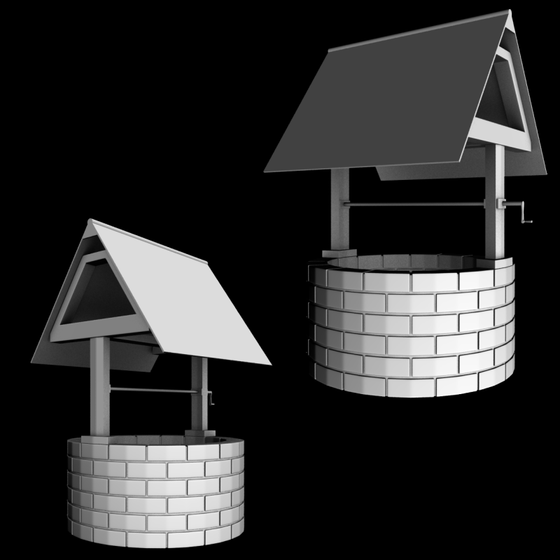
I'd start by pushing the detail on things like the crank and the wooden beams - right now, although it's early, it's really bland both in terms of detail and overall shapes. Add some geometry to the roof planes and the beams and break up some of the straight lines to make it more interesting.
Think about how the bricks / rocks would actually fit together. Most wells of this type aren't made from beautifully pristine brickwork - they're made up of rough, uneven stones. Right now, it looks way too neat and crisp.
I'd resist the temptation to think 'I'll just do it in ZBrush' and actually focus on modeling the key structural details like the roof, and make sure to use as much reference as possible.
The stones are all placed in perfect lines, the roof looks too straight, it looks more like some kkind of miniature than a real object.
I know your still in a block out phase and want to do some sculpting later on. You should consider altering the stones a little and doing something more interesting for the roof (silhouette). The forms can be changed more or less while you sculpt but positions and orientations can be adjusted now and will make it easier to get more variations to your surfaces.
Example:
http://www.zinnfigur.com/shop/images/ware/8/843_AS013.jpg
Also:
Your stones are not well rounded. Eyery stone has a little edge where it should be round instead. Maybe its by intention but to me it looks weird.
The handle of the crank seems to small. You want to pull a bucket full of water and the crank is supposed to make it easier for you. The longer the crank the easier it is to pull up the weight. I see no reason for it being so small.
i fixed the problem with the rocks that little edge thingy is gone now, and i rotated them a bit.
elongated the crank and handle
also separated the beams for the roof so it doesn't look like one big chunk of plastic
i think im going to redo the roof completely and make it so it looks like individual planks
i wont most any more pics right now because it still looks alot like it does in the others
http://www.polycount.com/forum/showpost.php?p=924231&postcount=56