Home 3D Art Showcase & Critiques

GraveYard Scene (UDK)

polycounter lvl 9
Offline / Send Message
Reverenddevil polycounter lvl 9
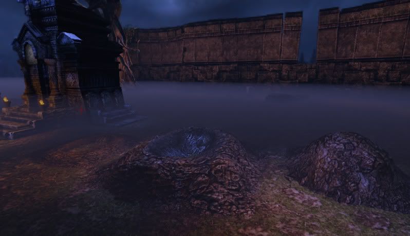
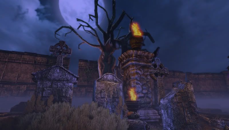
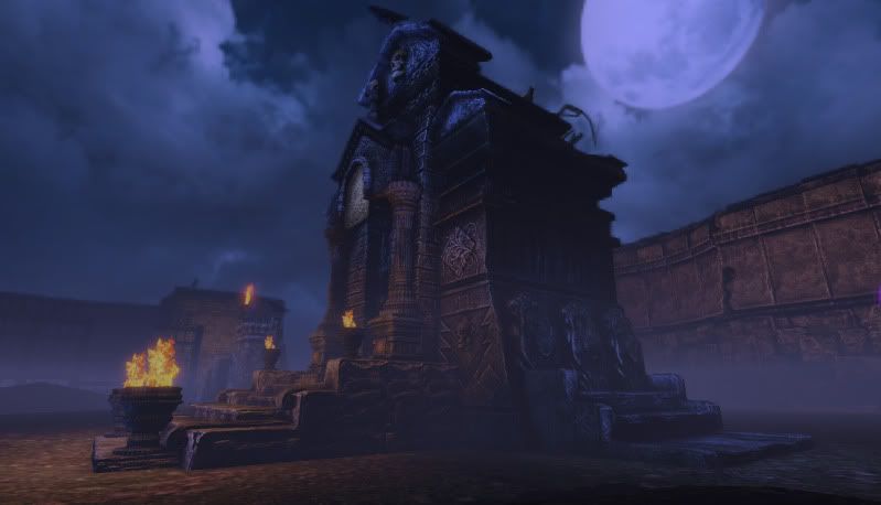
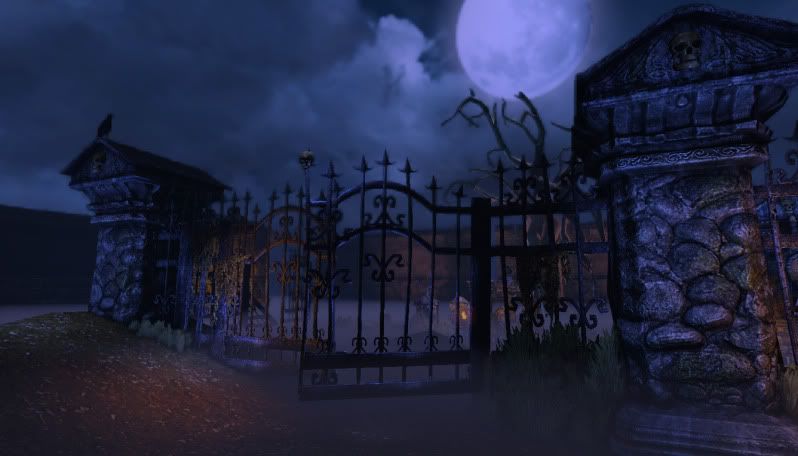
Here is a scene I have been working on. I still have to build the scene, I am just working on all my assets first and getting the mood right before I put it all together. My lighting is not final at all nor is the placement of assets. My focal point is going to be the Mausoleum and tree. I have a couple more assets to finish then on to the overall build. Let em rip... Thanks on advance for the crits..
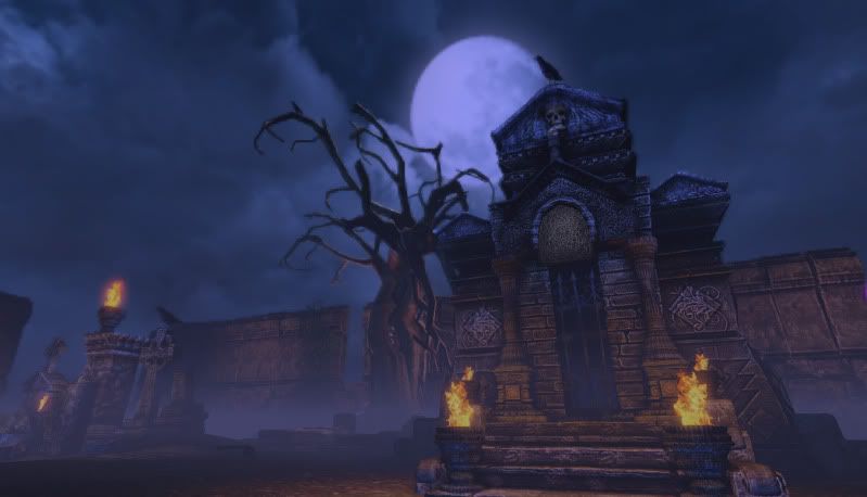
Grave1.jpg

Grave5.jpg

Grave4.jpg

Grave3.jpg

Grave2.jpg

Grave6.jpg

Replies

  • SanderDL
    Offline / Send Message
    SanderDL polycounter lvl 7
    Looking good so far. Your ground mist is a little too thick in the distance it makes things look like they are floating.
  • glenatron
    Offline / Send Message
    glenatron polycounter lvl 11
    The lightings mighty nice, and I love some of the arch. elements, especially the struts near the gate.

    The only crit. I can make is the grass looks a little clumpy atm, needs finer strands. And like Sander said, maybe lessen the mist a teeny bit, it really needs to fade in over a greater vertical distance.
  • c0ldhands
    Offline / Send Message
    c0ldhands polycounter lvl 15
    Scene has a nice atmosphere dude, lighting and color/mood is established. What i feel its missing is a few more props or more ground detail, more tombstones( its a cemetary after all)and more trees cause its feeling abit empty right now.
  • Reverenddevil
    Offline / Send Message
    Reverenddevil polycounter lvl 9
    Thanks guys
    I will be populating the scene with more tombstones when I start building it out. I have a couple pieces to create modular headstones although I plan on creating a couple more.
    In regards to the fog I am still playing with it a bit and will be working it out.
    I still plan on more trees I just threw the tree in last night. The grass is a bit clumpy I agree I want to re do it and get some more variety to it. I will hopefully update soon.
  • BloodFox
    looks awful, you should just delete everything on your computer and give up....
    just messn , great work you can almost smell the rotting corpses, the only thing that really stood out was the tree maybe some moss or dead leaves to show it was once living.
  • Reverenddevil
    Offline / Send Message
    Reverenddevil polycounter lvl 9
    Haha, thanks Josh... Here are two new shots. I updated the trees, not sure of how I want to layout the scene completely yet (suggestions if you have any). I am also still in the process of finalizing lighting. I also updated the grass but you cant see it to well in these shots, that's because I am not happy with it.

    Grave7.jpg

    Grave8.jpg
  • achillesian
    branches arent pointy enough, common problem if you used a zsphere base
  • elementrix
    Offline / Send Message
    elementrix polycounter lvl 16
    i'd use another wall around the scene instead of the one straight from peris's tutorial
Sign In or Register to comment.