[UDK] Kowloon - Walled city :: WIP
Okay,
this started out as a group project for a level design course in school. There were 5 of us, and the goal was to make a single player level in UDK with 100% custom content.
We decided to base the level on Kowloon, a densely populated walled city in the middle of hong kong, better known as the city of darkness. They call it that, because the buildings are so close to eachother, that the sun never reaches the streets / alleys.

Here's a video that depicts it quite well: [ame] http://www.youtube.com/watch?v=KEo6ogAnoZ8[/ame]
It was quite hard to find good reference images, because the city is now demolished, and there isn't much to be found online.
Due to a lack of time, I wasn't really satisfied with the final result that we handed in, so I decided to revise it now that I have some time at my disposal.
I'm going to reuse the props that were made by me and the rest of the team, to create some new and interesting scenes so I can add this project to my portfolio. I'm also creating some new props to fill up some of the empty spaces.
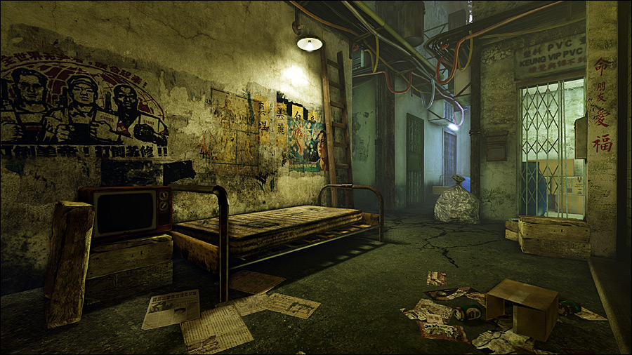
This is what I have for the first scene so far:

I'm quite satisfied with what I got right now, and I'll be moving on to the next scene shortly.
Any feedback on how to improve this scene, is more than welcome.
this started out as a group project for a level design course in school. There were 5 of us, and the goal was to make a single player level in UDK with 100% custom content.
We decided to base the level on Kowloon, a densely populated walled city in the middle of hong kong, better known as the city of darkness. They call it that, because the buildings are so close to eachother, that the sun never reaches the streets / alleys.

Here's a video that depicts it quite well: [ame]
 http://www.youtube.com/watch?v=KEo6ogAnoZ8[/ame]
It was quite hard to find good reference images, because the city is now demolished, and there isn't much to be found online.
Due to a lack of time, I wasn't really satisfied with the final result that we handed in, so I decided to revise it now that I have some time at my disposal.
I'm going to reuse the props that were made by me and the rest of the team, to create some new and interesting scenes so I can add this project to my portfolio. I'm also creating some new props to fill up some of the empty spaces.
This is what I have for the first scene so far:

I'm quite satisfied with what I got right now, and I'll be moving on to the next scene shortly.
Any feedback on how to improve this scene, is more than welcome.

Replies
As for scene, I wouldn't expect anything so light and warm down there. Blues, purples and some cyanish neon lights make more sense but w/e, it looks good. I'd suggest dirtying-up the floor and/or specifically where walls start, that's where the dirt should accumulate. Considering how littered the scene is, it looks like someone sprayed the ground with a hose
Lighting wise (and this is where your scene should really shine, imo... leave the beauty prop renders to the end) I'd suggest creating a darker buffer zone between the foreground light and the background light (The cyanish), and possibly hide that light source itself. It will create more drama and temp the viewer to explore deeper.
I've made the changes that were suggested.
Anything thing else that could be improved?
I'm going to model a couple more small props to fill some empty spaces here and there, but then I'm going to call this scene done, and move on to the next one.
holy crap
@Paradoxum & Shepeiro: I was planning on doing a second scene / shot which was centered around the vertical aspect of the city. But I guess it would make more sense to try to combine the 2 in one single shot, so I'll give it a try.
@Shiv: Thx a lot for the website, it contains some images I hadn't found yet!
Also it's one of the greatest games ever made.
I think I'm calling this scene done, unless anyone has anymore suggestions?
please consider these very quick and simple modifications which I think will help the scene:
1) The mattress is quite rigid, if you look at the attached image, you'll see the green line i drew, which represents the area where the wall and the mattress meet. This line is "too straight" , and since it's central to the scene, my eye is drawn right to it. You can get a nice visual boost if you just add a few loops to the mattress, and alter the edges a little bit ; creating a slight bow / variation.
2) The frame of the bed; I've done a similar model, and I found that a slight downward bow on the support structure will make the bed look more worn/used.
3) The newspapers look like they're flattened by a stream roller. Add a a few loops and maybe move the verts around a bit to give them some cheap depth.
Overall, fantastic work, the textures are great; and I really enjoy the scene.
Here's the final version:
This is what I have so far:
Any suggestions on how to improve this scene?
As for this scene, firstly I'd add more vertical texture variety on the wall to the right of the stairs - experiment with variations and length of stains, and break up some of the grunge that runs from the top two steps towards the camera. Some of the shadows from the handrail are blending into the staining of the wall - something to consider.
Secondly, I'd make some lighting changes. Make the lighting indoors dimmer and maybe just use the single fluorescent light fixture as a key light to accentuate the shadows. To contrast this, I'd maybe try out making the light from outside stronger and more of a fill light than it is now - try and make us decide which is worse, in here or out there. It'd also give the small exterior area that's visible a little more life.
One of the things I liked the most about the lighting of the first scene was the transition from the warmer lighting of the living area, to the cooler lights further down the alley - maybe a similar lighting scheme would work for this.
Great work so far! Looking forward to seeing how this shapes up.
Ok, updated a couple of things. I changed the texture on the right to make the shadows stand out more and added some more details in the street.
Perhaps you could add some decoloration and/or smudge near the edges.