Home 3D Art Showcase & Critiques

environment project - handpainted dungeon/forge

polycounter lvl 15
Offline / Send Message
elementrix polycounter lvl 15
hey all, so I started this project to create a handpainted dungeon/forge in viking style (dragons etc.) It is supposed to be for a dungeon runner game but I also want to make it for the use in my portfolio.

My main objectives are to learn a lot about handpainted textures and modular construction so I can quickly generate large dungeons with minimal effort.

so here are some images:
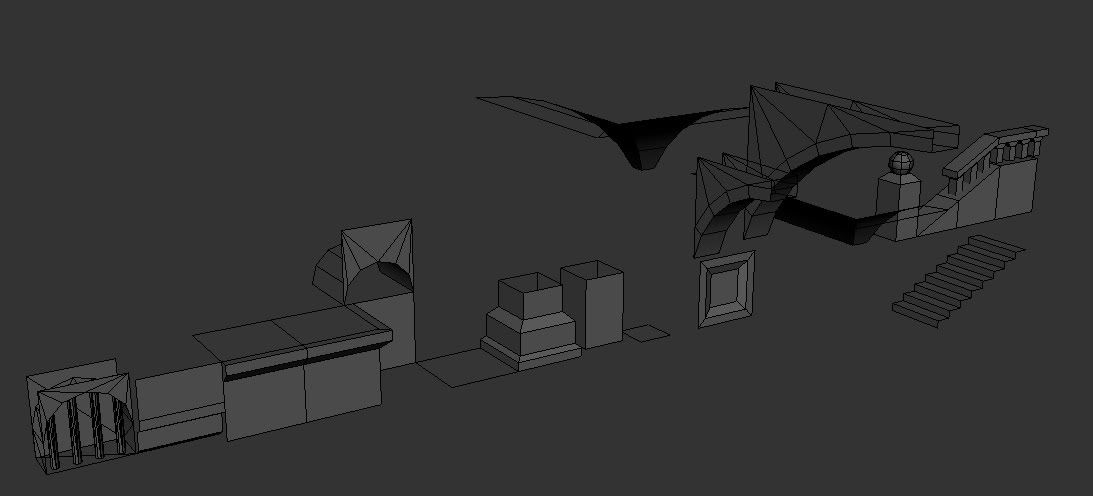
these are the basic modular pieces I have so far:
buildingblocks.jpg

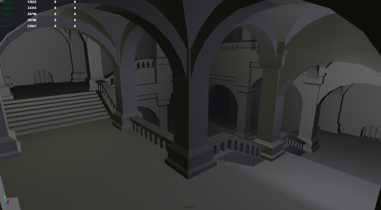
and a room I made with those modular pieces:
stair_room.jpg

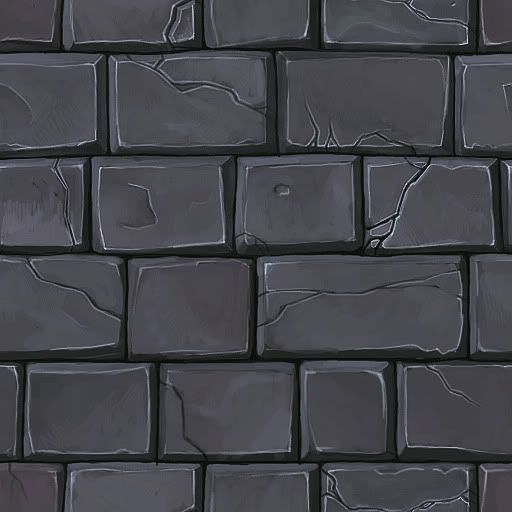
and here is my first handpainted wall texture:
handpainted_wall2.jpg
wall-1.jpg

I really want to learn handpainted so feedback on that would be great.

Replies

  • EMC3D
    Options
    Offline / Send Message
    EMC3D polycounter lvl 7
    Hey man, I'm doing a project aswell with handpainted. The angle in your render looks pretty neat, and that handpainted brick texture looks really lush, gonna be fun when I start doing mine lol.

    Are you gonna take it into the UDK? There's alot of shader tricks you can use to break up your tiling textures and push the brick textures and what not.

    Looking forward to this, hope to learn some stuff.
  • Minos
    Options
    Offline / Send Message
    Minos polycounter lvl 16
    Nice texture but I think you went a bit too far with the highlights!
  • Tumerboy
    Options
    Offline / Send Message
    Tumerboy polycounter lvl 17
    Looks like a great start! I think the highlights on the stones might be a bit much? Maybe have a few that bright, but tone the rest down, or blend them out more?
  • Taylor Hood
    Options
    Offline / Send Message
    It could shine with subtlety or it could just be awesome and stylized.
    Either way, good job, man.
  • haikai
    Options
    Offline / Send Message
    haikai polycounter lvl 8
    The texture looks pretty good so far. I was going to say it looked like it needed some more hue variation, but the Maya view looks like it has a good amount. I don't do a lot of environment art, but I've tried painting a wall texture before and know how tough it is to get the right amount of variety without being overwhelming when tiled.

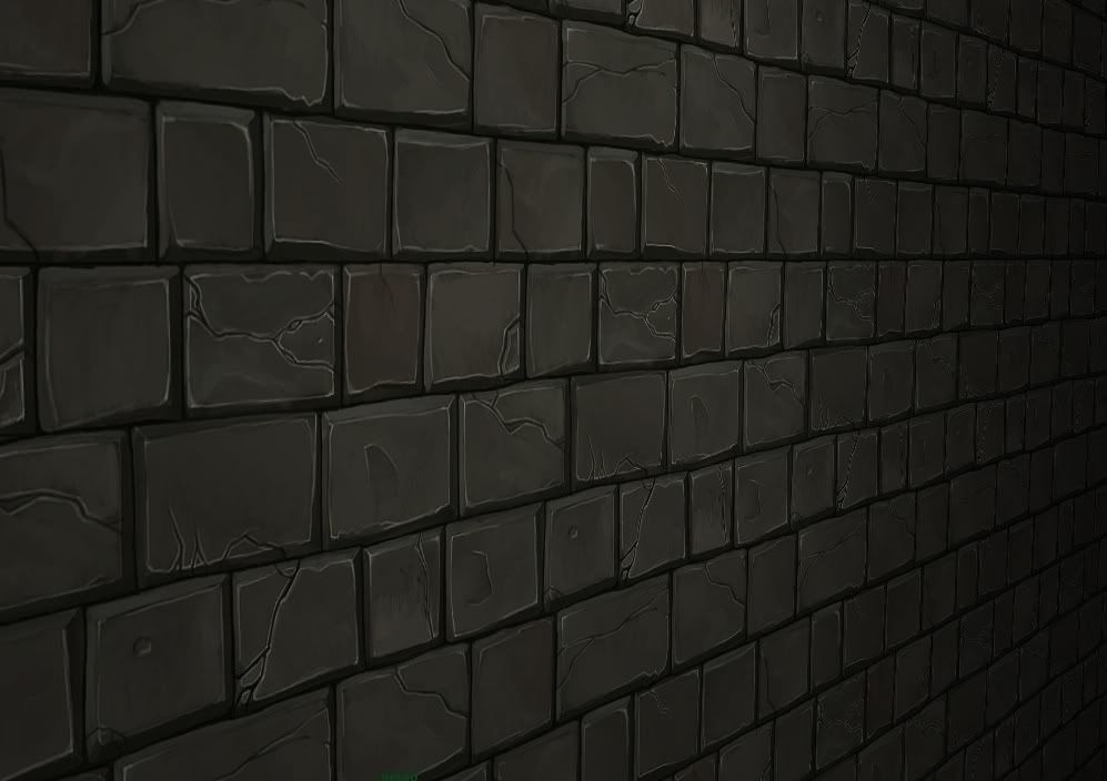
    Maybe the highlights on the underside of the bricks and around the cracks are a little too strong. The highlights are the same color and intensity almost regardless of the direction of the light source. I'd recommend picking a direction for your strongest light and then using a different light color on edges that should be hit at other angles.

    You should also try staggering the stone sizes a little so that you don't get such straight horizontal lines when you tile it. You can indicate another dimension as well by trying to convey how some stones might be pushed in or pulled out a little more than others so that they're lit slightly different.

    The models are looking good. I like the layout. Perhaps some you could vary the shapes of the columns and such later too.
  • elementrix
    Options
    Offline / Send Message
    elementrix polycounter lvl 15
    thanks for all the replies,

    @Mr Bear - Yes for my portfolio the plan is to use UDK, but for the actual project this is going to be used in a custom engine.

    I agree on the highlights and I'll take some of the other advise to improve the texture

    I think I'll also download allods online to get some nice examples and inspiration:)
  • IchII3D
    Options
    Offline / Send Message
    IchII3D polycounter lvl 12
    Nicely set up, surprised you got so much out of so many little bits. Just remember the more segments you have the more draw calls you have, so probably want to merge it all in the end. :D
  • SgtNasty
    Options
    Offline / Send Message
    Very nice. That initial shot is pretty interesting, I'm excited to see where this goes.

    I don't think the highlights are too bad. I guess they could be toned down a bit.

    The main thing that I noticed is that the SHADOW parts (the bottom/side "faces") of the bricks is too dark. It mostly shows in the partially lit shot you have of your textured wall. With low lighting, it looks like the gaps between the bricks is massive. This will especially show if the camera isn't right up to the wall. Maybe just adjust the levels of the texture, bring the highlights down, and the shadows up.

    PS. Looking at this on my work monitor, so it may look fine for most. Either way, I would be on the safe side though.
  • elementrix
    Options
    Offline / Send Message
    elementrix polycounter lvl 15
    so I made a new room, I think I'm going for this tomb as final scene:

    Room_2.png
    Room_1.png

    There will be a statue in the middle, the lighting is just basic maya stuff, when it goes in UDK I'll do some better lighting.
    The room is just an empty base now, it will be filled up with props.

    I also made a tomb and textured it, the texture is 256x256.
    The style doesn't really match the texture in my first post, but I'm still in the stage where I want to experiment some more.

    Tomb-1.png
    Tomb_Diffuse.png
  • Devin Busha
    Options
    Offline / Send Message
    Great start man, that tomb texture is sexy! Are you planning on adding color via overlays and such? I'm really looking forward to seeing your progress. :)
  • cholden
    Options
    Offline / Send Message
    cholden polycounter lvl 18
    Cute stuff! The first assembled image reminds me of Bastion Stairs. Inquiring minds want to know if there will be more color in the textures. Cuz I'd be all like "gradient map!" and then do some wacky painting.
  • SnakeDoctor
    Options
    Offline / Send Message
    SnakeDoctor keyframe
    I really like the tomb man, the only crit I can give is the cross seems to much like a medic cross in my opinion and not like a religious one. I think i would look better if you stretched the cross and shield it is in vertically just a little bit.
  • EVIL
    Options
    Offline / Send Message
    EVIL polycounter lvl 18
    I agree on the cross part, but you can remove the need for stretching by giving the cross shape some more details, like these
    cross1
    cross2
    cross3
  • elementrix
    Options
    Offline / Send Message
    elementrix polycounter lvl 15
    I fixed the cross, thanks for pointing that out.

    On the colors, almost all tombs I could find where one color, In the total environment I'll add some more color (also through lighting) but I'm not really sure what kind of colors I'd have to put on the tomb. maybe the cross could be red, or do you guys mean I should give the whole tomb a certain color range like for example the purple I used in my brick wall texture?
  • cholden
    Options
    Offline / Send Message
    cholden polycounter lvl 18
    elementrix wrote: »
    almost all tombs I could find where one color,

    Yes, yes, stone is gray, the sky is blue, grass is green, bricks are red and so on. I'm not talking about slathering down layers of paint on everything. It's the subtle colors differences found in objects that haven't had a monotone filter applied to them. Something like what you've done with the bricks, but I feel their colors are too weak to as well. What the indigenous stone is, weathering, aging, and so on always add a ton of subtle color to an environment. It's one of those "learn it now or learn it later" kind of things that will increase this scene's value or make you want to redo it as soon as you finish.
  • glenatron
    Options
    Offline / Send Message
    glenatron polycounter lvl 11
    yeh, the form and surface detail in the textures look great, you just need, as cholden pointed out, subtle colour variation in the rock. just an overlay, with blotches of colour from the red-green end of the spectrum.

    also, id say the texture resolution is a bit off between the base of the tomb, and the rest of it, which is a pity as its such a clean unwrap otherwise.
  • elementrix
    Options
    Offline / Send Message
    elementrix polycounter lvl 15
    It's been some time since I posted in this thread but I'm still working on it and would like some feedback again=), The building blocks are being used in a little game project and some fellow artists already made some pretty nice rooms with it, but I'm currently focussed on this room as example.

    This time I finally decided that this part is going to be a prison and I'm working on the props:

    Barrelandpot_3d.png
    Barrelandpot.png

    CabinetandPlanks_3d.png
    CabinetandPlanks.png

    Doors_3d.png
    Doors.png

    LightSources_and_Buckets_3d.png
    LightSources_and_Buckets.png

    Table01_3d.png
    Table01.png

    ThroneandPot_3d.png
    ThroneandPot.png

    Weapons_Rack_and_Skull_3d.png
    Weapons_Rack_and_Skull.png

    and this is the level currently in maya with very basic textures which I still have to refine but just to give an impression
    Wip01.png
    Wip02.png
  • Mistry10
    Options
    Offline / Send Message
    Mistry10 polycounter lvl 8
    loving your style man !
  • Wells
    Options
    Offline / Send Message
    Wells polycounter lvl 18
    are you painting in grey-scale first?

    all of your textures are very monochromatic with nothing in the way of color variation, just light and dark.

    you're off to a great start, though
  • elementrix
    Options
    Offline / Send Message
    elementrix polycounter lvl 15
    no I paint with colour, I guess I'm not that comfortable with using to much colour, although I tried to apply some of the comments I got in this thread earlier if I go to far with the colours it doesn't feel "right". Maybe someone could help with a paint over on some prop?
  • JasonLavoie
    Options
    Offline / Send Message
    JasonLavoie polycounter lvl 18
    Heeeyyyyy this looks super fun, nice work so far man :) Will you be putting this into UDK (or something else) as time goes on? (sorry if you have answered this already, just curious).
  • Jonathan Marshall
    Looking amazing. I like the strong highlights. This has the sensibility of oldschool 16-bit rpgs, but it looks 100% modern. Very good job indeed!
  • Minos
    Options
    Offline / Send Message
    Minos polycounter lvl 16
    Looks neat, cant wait to see where this is going :)
  • jimmypopali
    Options
    Offline / Send Message
    Just a quick question about the modular pieces. Is there a rule you followed to get them all to scale to each other OK? Like certain units had to be 3 squares high or the roof needs to be a certain height to fit with other pieces?

    If there are any rules or tips to remember. I wanted to start doing modular pieces, but I don't want to get into it and find out nothing fits together.

    It's either that, or I'm thinking about it too much :P
  • tarkata14
    Options
    Offline / Send Message
    I really like your painting style, can't wait to see how this turns out :)
  • an aggressive napkin
    i think if you just darkened the tomb (to match the rest) or added some color swirls (to look like marble) it will look great
  • polozad
    Options
    Offline / Send Message
    polozad polycounter lvl 9
    I guess it will be more darken after the lights placement, which will add a shadows and semitones.
    Looks very good so far.
  • SimonT
    Options
    Offline / Send Message
    SimonT interpolator
    looks really cool!
  • elementrix
    Options
    Offline / Send Message
    elementrix polycounter lvl 15
    @JasonLavoie: Yes I'm planning to put it in UDK in the end, but for our little game project we are using our own custom engine that still needs a bit of work=)
    The lighting you see in those maya screens are lightmaps baked in UDK though.

    @jimmypopali: Of course I keep a general size that everything has to be based around. When building a modular set it's a lot of trial and error before you get something that works. Just use the grid and take a base measurement of like 1x1 grid and build around that. It's extremely hard to get everything lined up perfectly so I also have my "hide geometry" like the pillars in which other geometry just intersects and can be cut of nicely. Maybe I could write a little tutorial on my process for modular building sets but I'm pretty busy right now.

    About the throne, I'll work on the texture a bit more soon.

    thanks for all the replies=)
  • Mark Dygert
    Options
    Offline / Send Message
    I love that you're thinking about lighting, layout and composition early. I love that you're working modular, I really like your style too. Awesome stuff, great start, really looking forward to seeing where this goes.
    cholden wrote: »
    Yes, yes, stone is gray, the sky is blue, grass is green, bricks are red and so on. I'm not talking about slathering down layers of paint on everything. It's the subtle colors differences found in objects that haven't had a monotone filter applied to them. Something like what you've done with the bricks, but I feel their colors are too weak to as well. What the indigenous stone is, weathering, aging, and so on always add a ton of subtle color to an environment. It's one of those "learn it now or learn it later" kind of things that will increase this scene's value or make you want to redo it as soon as you finish.
    To push this further you also have to take into account light, everything bounces light, otherwise you would never see it. Not all lights are white and not all light that is bounced, caries the lights original color. In other words everything reflects, it might not be a mirror finish on every object but you can take a few constants into effect like the ground, or light generally being cast from overhead.

    Color also speaks to mood.

    I really like what Cholden said about gradients, they work great at adding to your textures and love to see those added to pieces. But adding a gradient to your texture is going to be hard because of how the pieces are arranged. There's an easy fix.

    Create a 2nd UV channel for your mesh. Do a simple planar map from the side.
    Create a gradient ramp material, set it to use UV2.
    Use Render To Texture to render the gradient ramp to UV1.
    Overlay/multiply the gradient into your texture.

    You can also do this with shaders in a handful of engines.

    If you're interested in an example I can whip something up pretty quick.
  • Yuecake
    Options
    Offline / Send Message
    Vig, I'd be really interested in seeing a quick example of what you mean if you have time!

    Elementrix, your thread is really helping me with one of my projects - can't wait to see more progress, it's looks very nice so far.
  • mfossett
    Options
    Offline / Send Message
    This whole thing makes me super excited! Great job so far man! I think I am going to start on my own project as well now. Can't wait to see more!

    Cheers!
  • elementrix
    Options
    Offline / Send Message
    elementrix polycounter lvl 15
    so I'm still working on this, or started working on it again. I hope to have it finished in a couple of days as it's the last project for my portfolio and then I can put it online =) I made a statue and brought it all in udk, everything is vertexlit because I get better results from that then lightmaps. I also refined most textures but don't want them to be too full of detail.

    Next is decorating the whole place.

    Wip01-1.jpg

    Wip02-1.jpg
  • Jeff Parrott
    Options
    Offline / Send Message
    Jeff Parrott polycounter lvl 19
    This is coming out really nice. Crazy amount of hand-painted goodness going on at PC right now. Super motivating to see.

    It feels like God of War PS2/PSP to me a lot. I think it's the monochromatic/not overly saturated textures. Which honestly is a nice change to see (even from my work).

    I would adjust some of the values on textures. It all feels made of the same identical stone, just different sizes.

    Scene has a lot of dark spots. It would be cool to see the light pools a bit lighter and the scene lighter across the board.
  • Hazardous
    Options
    Offline / Send Message
    Hazardous polycounter lvl 12
    I love this! I want to explore it right now!! Can already see a player running around in here with a point light attached to them dramatically lighting the surrounding area and casting shadows all over the place.

    Once you get all the clutter and stuff in here this is going to really take off.
  • Slum
    Options
    Offline / Send Message
    Slum polycounter lvl 18
    What most people mean by adding more "color variation", is variation in the hue in the light/shadow areas. When your shadows are just darker versions of your mid hue, and hilights are a lighter version, it just looks flat and dead. That is, shading in grey (sliding the brightness slider up and down to pick your hilight/shadow color).

    A quick rule of thumb that totally doesnt always apply, but can help: When you are picking a new color for shading, whenever you move the brightness slider, also change hue.

    For example, say you're painting something green and leafy like moss or grass. You start with a base green color. When you want to apply shadowed areas, dont just grab the same green and darken the brightness. Shift a bit toward blue as well. And when you add hilights, shift a bit toward yellow. It will add a much needed richness to the textures.

    Overall I'd say you're kicking ass with this project - but going back and punching up the textures would help hugely.

    This is a good example of what we're talking about, but all the props you posted suffer the same problem:
    Barrelandpot_3d.png

    The shading on the pot is just a darker version of the mid tone, almost grey. The wood on the barrel is especially flat as well.. Try shifting to a richer orange in the shaded parts.

    Keep up the work, looks good :)
  • SinisterUrge
    Options
    Offline / Send Message
    This belongs in WoW
  • elementrix
    Options
    Offline / Send Message
    elementrix polycounter lvl 15
    thanks for you reply slug, I actually already tried to do that when refining my environment textures. I do constantly try to change the hue value when picking a new tone but I guess because Im working so close to grey it isn't really visible. I do agree that the props need some more love. I did them some time ago.

    Here is an example of the new arch texture and the one next to it shows the Hue's I used. As you can see I'm mostly working in the Lightblue-darkred - corresponding to highlight-shadow.

    example.jpg

    @jeffro, I agree that all stones are in the same value. Will try to play with that a bit=)
  • Acumen
  • elementrix
    Options
    Offline / Send Message
    elementrix polycounter lvl 15
    thanks for the links acumen, though I have a deadline and need to have it finished tommorow more or less, I will really get back to it after I have cleared some other projects.

    so I made some changes, changed some values of the textures, made the overal thing brighter, added candle particles and added props everywhere and made the scene feel warmer. Only need to tweak a few textures here and there and call it finished for now unless someone has some large crits.

    Pre_Final01.jpg
  • uncle
    Options
    Offline / Send Message
    It is looking soooo fine.
    It could use some more tweaks tho, I hope you are going to polish it after the deadline :)
  • Bart
    Options
    Offline / Send Message
    Amazing work :) This project of yours makes me wanna try to create a small environment with hand painted tiling textures.
  • duxun
    Options
    Offline / Send Message
  • MainManiac
    Options
    Offline / Send Message
    MainManiac polycounter lvl 11
    How was this scene broken up for texturing? Or is it all one object?
  • Macattackk
    Options
    Offline / Send Message
    Macattackk polycounter lvl 7
    I like how you have two different light colors. one for inside the dungeon and one coming from above, im guessing outside. Might look better if you made the outside light from above spread more and actually hit the floor of the dungeon. As it stands right now it seems to stop too abruptly.
  • holidayhome
    Options
    Offline / Send Message

    Hello, I was wondering if it was okay for me to use one of the textures in a game I'm publishing on itch.io. I will give you credits. Thank you.

  • iam717
    Options
    Offline / Send Message
    iam717 greentooth

    holynecrocomo'con batman! Hope they respond.

Sign In or Register to comment.