The BRAWL² Tournament Challenge has been announced!
It starts May 12, and ends Oct 17. Let's see what you got!
https://polycount.com/discussion/237047/the-brawl²-tournament
It starts May 12, and ends Oct 17. Let's see what you got!
https://polycount.com/discussion/237047/the-brawl²-tournament
Scifi Facility Scene UDK
Hey, I just thought I could post some screengrabs from a little scene I put together a while ago. It's made with modular pieces and dynamicly lit atm.
Anyway, sorry if the screens are a bit small, my computer suck so it can't really handle any nice resolutions...
SCREENS UPDATED SINCE THREAD START:
I focused the lighting more on the elevator and moved the actual elevator up to the second floor.
The bridge has the floor texture on the underside which looks really stupid so that will change.
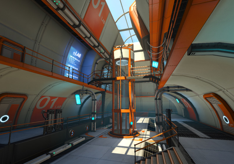
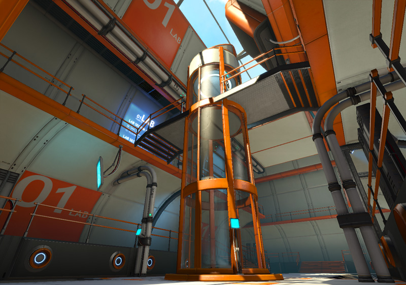
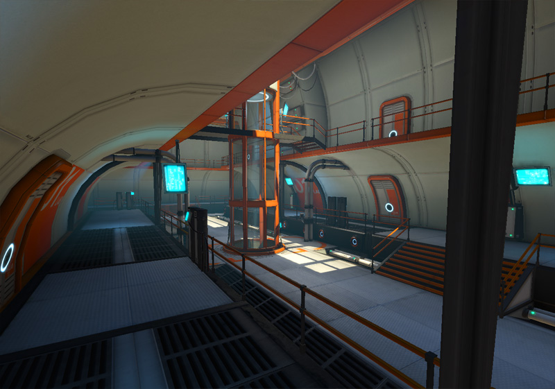
I'm also trying to finally finish up a small source scene I'm doing with an italian theme.
Anyway, sorry if the screens are a bit small, my computer suck so it can't really handle any nice resolutions...
SCREENS UPDATED SINCE THREAD START:
I focused the lighting more on the elevator and moved the actual elevator up to the second floor.
The bridge has the floor texture on the underside which looks really stupid so that will change.


I'm also trying to finally finish up a small source scene I'm doing with an italian theme.
Replies
but ya thats me nit picking an already awesome environment! great work
I'm glad you like the stuff on my site as well!
Can you post break downs of the modular assets used and stuff like that?
Cheers .... great work man !!
I uploaded some newer screens now and I took the liberty to change the ones in the top post. I hope noone who commented on the older ones will be pissed for that. Since it's changed quite some in terms of light and busyness I wanted to show the latest stuff at the top.
Textures are still very wip and spec is very flat. I will go on creating glossiness maps later as well.
I wanted to build an environment that didn't use any lightmaps and instead experiment with vertex colors a lot more. Also, this is my first scene in UDK really, I need to learn some lightmap stuff, tho it seems the UDK lightbakes are very good :P
Good work and excellent style. /thumbs-up
Nice modular pieces man, really smart modeling there.
I hope to get some more done on this when I come back from a trip
Thanks!
Yeah I totally agree, I've been thinking of breaking up the symmetry too, great ideas. I'd like to add small details that don't clutter the image and you don't really notice unless you were to remove them
It's going to be a material tutorial in general where you can click on step by step tutorials on each material section to get a deeper look into what I usually do when creating a particular material. So far I have 7 step by step tutorials. My aim is to have 10 when releasing this. So hopefully in a couple of days.
I thought it'd be somewhat relevant to this thread going into metal plates tutorials
I hope some people may find these useful when I release them. And I will be happy to edit them if stuff is unclear or weird. Some stuff is bound to be a bit strange after all pages written so
Looking ace!
-Tyler
Also, I'm really looking forward to seeing those tutorials. I'm loving your work.
it's pretty easy to spot your textures out of all my reference folders
is there any chance you could post some (or aaaaall) texture flats ?
or at least a close up shot of the texture work ?
i love to have such stuff in my reference folder, but it's so tiny on the screens
Thanks Acumen, happy to hear that
Sure thing, I'll post the flats asap. It's packed onto 2 x 1024x1024 textures.