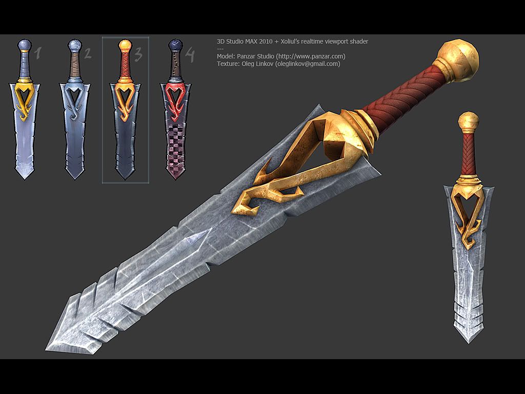
Some art test, need feedback...
Hey all,
made this a while ago actually, but never heard anything from the Company, so I figured maybe its a good idea to collect some additional feedback, and maybe do better next time
The model is NOT mine, it was provided as a download from their site, although I did some invisible changes, like UV mapping and smoothing groups to make normal map work correctly. (I think 3point studio shader wasn't yet released back then, and even if it was, most certainly I wasn't aware of that).
Now, the normal map was a little bit of pain, because they provided only lowpoly model, but required to texture it to meet modern day standards. Painting normals by hand (even B/W heightmap for later conversion to normals) wasn't really an option, because of the quality examples provided on their site.
Changing lowpoly model was too much, I figured they wanted texture artist, not someone who will be messing with their lowpoly models So basically I had to recreate that stylised look in highpoly, then took it to mudbox and messed with it a little bit. No huge alterations tho.
After baking normals, everything else was pretty straight forward, and now I'd like to hear some opinions. Mostly about what is bad and what could be done better. If you provide solutions or some visual samples, I'll be grateful.
Thanks in advance.

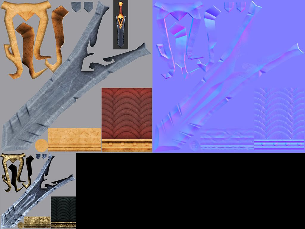
and texture flats (scaled down to 50%, 25% for spec)

I'm not posting wires, since thats irrelevant because lowpoly was provided to me as it is.
made this a while ago actually, but never heard anything from the Company, so I figured maybe its a good idea to collect some additional feedback, and maybe do better next time
The model is NOT mine, it was provided as a download from their site, although I did some invisible changes, like UV mapping and smoothing groups to make normal map work correctly. (I think 3point studio shader wasn't yet released back then, and even if it was, most certainly I wasn't aware of that).
Now, the normal map was a little bit of pain, because they provided only lowpoly model, but required to texture it to meet modern day standards. Painting normals by hand (even B/W heightmap for later conversion to normals) wasn't really an option, because of the quality examples provided on their site.
Changing lowpoly model was too much, I figured they wanted texture artist, not someone who will be messing with their lowpoly models
After baking normals, everything else was pretty straight forward, and now I'd like to hear some opinions. Mostly about what is bad and what could be done better. If you provide solutions or some visual samples, I'll be grateful.
Thanks in advance.

and texture flats (scaled down to 50%, 25% for spec)

I'm not posting wires, since thats irrelevant because lowpoly was provided to me as it is.
Replies
There are some gradients in the blade in the concepts that are more interesting than the flat metal on the texture. The materials look pretty decent, but it kind of feels like you just flooded each piece with the material it should be and didn't take it much further. It might add some interest if you exaggerated where it might be worn out (high points more prone to scuffs, low points subject to dirt accumulation, etc.). Considering what their game art direction seems to be, I suppose they might have been expecting a weapon with a lot more wear and an aged appearance.
Maybe the metal could be darker in the diffuse and rely more on specular for contrast and shine.
It looks pretty good though. I hope it works out for you next time.
haikai, snake85027, I'm afraid these 'concepts' are not concepts really. Its just quick overpaints I did to explore possible color schemes. I knew that the end result should be a little more 'realistic' rather than stylised.
anyway, thanks again, really appreciate it ))
The seam across the bottom sphere doesn't look so good. Yes there is something sort of loking like it on the concept but i think it looks plain bad so I would get rid of it anyway and come up with some detail of my own.
The concept has some thicker highlights on the edges(checkout heart shaped thingy for example) and the conccept jut look more stylized and you went for a more realstic approach.
But! That's just me being nitpicky. Judging by waht you did I would've hired you for exmaple=) I think it's quite obvious that with some(not so big) amount of direction you could do the right thing. But there's always a chance that there's someone who's done a better job, but from this point I'd rather judge by experince and personality if I was a company.
Hope that makes some sense.) Anyways cheer up - you've got yourself a nice portfolio piece! Hope to see you making one of this "I've got a job threads" soon.)
aesthetically: I think the blade it too grainy. your colors are great and the specular quality is also really nice.
d1ver, I'm kinda opposed to the notion of baking too much lighting information into diffuse. Its good for 'old school', but I strongly believe that now its a job for an engine to provide necessary lighting, based on materials. Having said so, I guess I'm also need to learn a lot about creating materials and tuning them
The seam on the sphere isn't actually a seam, it was meant to be an edge, but later, I realised that its indeed look like a seam.. But I sent renders already, so decided not to mess with it anymore :poly141:
And again, concepts are not really concepts, I guess my main mistake here is putting them there in the first place. Won't do it again, lesson learned
Nether the less, thanks. You confirmed some of my own suspicions, and thats good.
gochillis, technically I would also like to maximize usage of texture space, but in that case I found it somewhat complicated. Some models just don't want to fill up all UV space you've got.
I mean I already reworked UVs once. Initially, blade piece was oriented vertically, and was taking less texture space than it is now, and other pieces was just plain nightmare for texture artist. Sphere, for example, was broken into 4! pieces. No distortions, but texturing it that way is pretty uncomfortable, not to mention that normal maps don't do good with many seams.
Also, handle was unwrapped without distortions, but again, seams were curved, which is not good again.
Anyway, I figured I'll put biggest part to fill as much space as possible, and then match texel density for other pieces. One more thing to consider - handle is gonna be hidden anyway, most of the time, so making its resolution larger than blade itself won't do much good.
Of course I could scale up few smaller pieces - sphere cap and these blade bottom (top?) parts, but they're so tiny, that it won't make any sense really.
Overall, I think I did pretty good with UVs, but thats of course until someone will do it better
Shad0wForce, how so? I've used realtime shader to render this. While engine can provide some fun effects, I don't think its 'that' necessary for a single model. Nor there is a magic button - 'make it look metal'
achillesian, they didn't asked for anything. The brief was kinda simple - take this model and make it look like on our screenshots. While I understand that I haven't successeded to the letter, I also didn't had their technology or any clues how to simulate their render setup.
As for color picking, I actually did, but thought its needed to be more 'realistic' looking.
duxun, thanks. I've noticed that stone-ish feel myself, but literally had no idea how to avoid it.
none of the metal looks like metal, though. too much random noise. like others said, brings to mind concrete. what kind of surface are you trying to show with that gold? what are all those black dots all over it? dirt? stains? acid etchings? why is the normal map so noisy? was this crudely made?
i'm surprised at the size of the texture, too. seems way too big for the amount of information you're conveying.
the edge of the blade didn't turn out looking very sharp. generally the edge would be lighter, with more spec, and smooth, or at least with much more, smaller scratches.
those large scratches you've got going down the length of the blade are very uniform and look odd.
all in all, it's not a bad piece. but it could benefit from some love, too
Consoles will generally stream at 1000kb/s-1500kb/s (depending on how the engine manages its memory) which may seem like a lot, but that's for everything, considering one 512 texture will generally compress down to... 300kb? or is it 150kb? (alpha none alpha) Also 5000 triangles are equal to about 100kb?
These numbers are of the top of my head so could be slightly off but what I'm trying to say is the person recruiting you could be very critical of your UV layout. Here is an example of how I relaid your texture out, saving over 50% with no fidelity loss and proper UV layout.
- Repeat UV map anything you can get away with that won't be noticable to the eye
- Avoid having your UV's on diagonals, your pixel fidelity will be a lot better using verticals.
- Priorities your pixels giving elements which won't be seen less fidelity or even none.
EDIT: I know the UV layout I proposed would make it harder to texture, but I also know that from my experience my lead or anyone around me would have told me to do it the hard way :P
First of all, I've already failed that test, and no, they haven't said why. In fact, they didn't replied at all.
Second, they didn't gave me any technical details, and even more - they provided that model already with UVs. I wasn't supposed to rework UVs, but I did it because their version was not optimal, especially by your standards.
Now, I don't really understand how streaming is affected by UV layout. I mean you can argue whether UVs optimal or not, but in the end its just a texture. And I was given 1024*1024 sheet from the beginning, so I guess they were fine with these specs.
As for my layout, I've already explained it above.
Don't get me wrong, I'm actually very geeky when it comes to UV layouts, and unlike many people, I love doing them. Its like a puzzle and its calming
Sectaurs, rollin thanks, I'll keep in mind things you mentioned next time. Which is pretty soon I guess, since I'm in the process of making Ashbringer model just for myself.
/fail