Mass Effect Citadel environment
Hi everyone,
I´ve been lurking on Polycount for a while and after getting sufficient practise modeling and some experience with the UDK I think I´ve worked up the confidence to do my first portfolio scene.
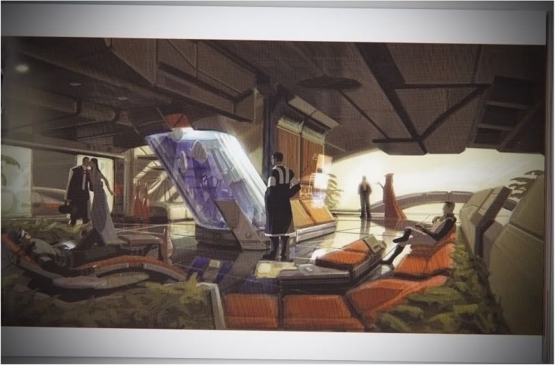
I´ve photocopied unused concept art for Mass Effect 1 from the artbook.
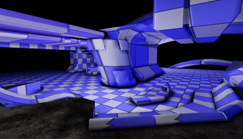
Also made a mockup scene to test out the scale. (the models being very rough)


I'm still thinking about what pieces I'd like to build in a modular fashion...
how would you tackle this scene?
I reckon for modularity atleast
I took a peek on the ME wiki and found some useful information:
"-Tayseri Ward
locations in the ward include a Museum of Galactic History,
Auxua School of the Arts,
Gaeron Botanical Gardens,
and Tayseri Point."
I´ve been lurking on Polycount for a while and after getting sufficient practise modeling and some experience with the UDK I think I´ve worked up the confidence to do my first portfolio scene.
I´ve photocopied unused concept art for Mass Effect 1 from the artbook.
Also made a mockup scene to test out the scale. (the models being very rough)


I'm still thinking about what pieces I'd like to build in a modular fashion...
how would you tackle this scene?
I reckon for modularity atleast
- 2 bench pieces (straight and bent)
- A modular wall section / Texture (behind the stairs)
- Panels next to the aquarium
- Silver/chrome trim beneath the Aquarium (again straight and bent)
- Stairpiece
- Plants ... ferns? grass?
I took a peek on the ME wiki and found some useful information:
"-Tayseri Ward
locations in the ward include a Museum of Galactic History,
Auxua School of the Arts,
Gaeron Botanical Gardens,
and Tayseri Point."
Replies
also, i agree with 'Dan' ceiling is higher.
If I import using the scale I'm using in Max (96 units for a character) the scale looks off. When I look at the "correct scale" the aquarium's really tiny.
So I scaled it up, it looks right when you stand next to it but it's way too high then.
Unreal and its weird Field of view keep playing tricks on you as well.
(C:\UDK\UDK-*version number*\Engine\Config)
Just search for fovangle. Default is 90 methinks, but about 45 should match the ref pic.
In the meantime, the first highpolies and their low poly counterparts.
40-48-120 triangles left to right. The straight piece top left will be used for a bent version as well.
I was thinking of doing the rest of the normal details in crazybump (if there are any, since Mass Effect has quite clean surfaces all round)
Any suggestions for improvements?
Also: there is HUGE potenial for lighting this scene, it should totally be one of the biggest challenges!
If there are other techniques or things you can tell me about, please do, because I find myself to be pretty new to this.
If you look at the edges on the box, I those are done by a highpoly bake right? you can see the UV seam where the box's bevel ends.
I think adding highlights to your specular will definitely help but it already bends according to the normal.
I would say that your scale is very off. A 96 unit character looks tiny in the scene. On the fish tank. the panel attached to it is up to the waste of the guy looking at it. in your scene its taller than the character.
Check the proportion of the bench to the 96 unit character as well, it looks waaay too big.
Ah and I had another problem with rendering normals that were skewed but was fortunately able to fix it using:
http://udn.epicgames.com/Three/ContentBlog.html >> "Processing Optimized Normals"
Finally understand the relevance of that piece.
Went from this:
To this:
http://www.philipk.net/tutorials/modular_sets/modular_sets.html
So I do encurage you to do highpoly models of the sofas/chairs/crates and the fish tank, but most wall panels would go really fast by going modular and not highpoly the sucka of every piece of wall.
Example shot of the wall job Im speaking off.