Home 3D Art Showcase & Critiques

Phil (amphibi-phil)

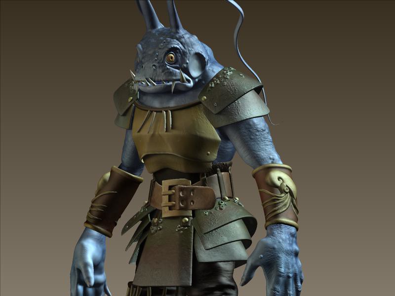
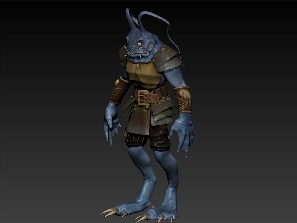
I've been meaning to model a frog slash angler fish like character for a while now. Big inspiration is Davy Jones and the idea is that this being lives as a sentinel guard for an ancient underwater civilization.

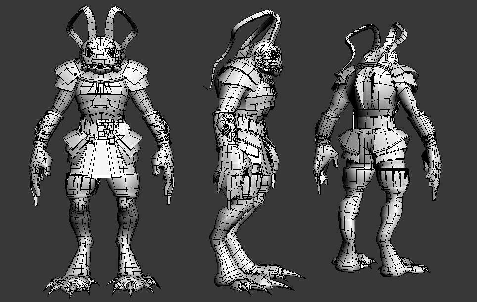
The armor I was going for is sort of a cross between Samurai and Roman with nautilus decorations and think leather. I haven't worked on the game mesh yet, the base mesh is at 15k Tris which I'm posting. Also I modeled the character in Max and and sculpt with polypaint in Zbrush.
4753776978_aa12df7d66_b.jpg
4753284879_9e4be7ef15_b.jpg4752846770_f28e09f9a7_b.jpg

Replies

  • Torrrtilla
  • raul
    Offline / Send Message
    raul polycounter lvl 11
    the textures and the sculpt look pretty good. One thing that bugs, is how the antennas are so flat looking. and that carried over to the low poly. Which looks like its just teh base mesh reduced. Got any texture sheets?

    Is all looking good! looking forward to see more! :)

    now...wtf is the second post with the thumb nails. lol, i just cant seem to make a connection.
  • Torrrtilla
    Ha, well I put up the initial silhouette concept thumbs, at the time I wasn't sure what I wanted to do so I changed it quite a but as I was working on the model. I totally understand why that would be confusing :/ but I thought I would put my process up there.
    Thanks for the crit! Right now I'm transferring the polypaint in xnormal. Some odd reason zbrush crashes when I try to extract texture with my current uvs even though they appear ok.
  • Torrrtilla
    Got a first pass at the normal diffuse maps from zbrush and thickened the antennas (although it bothers me greatly that he looks like an oddworld character which was not really my intention) Any suggestions on fixing this? . Definitely some cleaning up on the maps to do now.
    Cheers,
    -Neil
    4758282345_05bee84c0b_b.jpg4758920672_cdd3720c3e_b.jpg4758283179_def59b6111_b.jpg4758283081_d3932105c1_b.jpg4758283229_c038666232_b.jpg
  • Torrrtilla
    4770213795_4f821289ee_b.jpg

    Cleaned up the textures in PS a bit and added a spec map. Rendered in 3ds max w/ raytraced shadows and no gi. I think I'm going to do a bit more clean up and then call it good for this guy.
  • Steve Schulze
    Offline / Send Message
    Steve Schulze polycounter lvl 18
    (although it bothers me greatly that he looks like an oddworld character which was not really my intention) Any suggestions on fixing his?
    It's an amphibious character with a unique design and a whole lot of personality. I suppose you could make him more boring and generic if you wanted to avoid comparisons to Oddworld Inhabitants, but why would you ever desire that?
  • P442
    Offline / Send Message
    P442 polycounter lvl 8
    i like the character, but the armor feels unfinished and too random. I can't put my finger on it.
  • pliang
    Offline / Send Message
    pliang polycounter lvl 17
    It has pretty plain skin colors for an amphibious being, perhaps some color variations would make it pop more instead of making it deep blue.
  • Torrrtilla
    Thanks for the comments guys!

    I've been thinking about adding some patterns to the armor (perhaps Minoan?), and maybe some stripes or additional textures to the skin.

    Leopard-Shark-008.jpgminoan1big.jpg
  • bounchfx
    freaky. I like it. however, I can't say the same about the UV's... sorry! FIX ER UP! otherwise, good job so far.
  • Torrrtilla
    Oh man, I thought the uvs were fine (but it seems I've got a lot to learn) I'll do my best to optimize him, any suggestions?
    Thanks
  • n88tr
    To me it doesn't look like any of his clothes would stay on if he got into a scrap, it looks held together with string and glue or something. Make it more robust and I think it'd be a lot more solid.
  • Torch
    Offline / Send Message
    Torch polycounter
    I'd have to disagree, this might be the case for his pauldrons, but I think the rest of the armor fits together really well. Color scheme blends nicely together as well, nice work!
  • Torrrtilla
    n88tr, I totally agree and I think I may add some leather straps in the back to hold it together.

    4788842709_0e47efdbbe_b.jpg
    Just some more progress.
  • Highelf
    Offline / Send Message
    Highelf polycounter lvl 11
    I particularly like the hands and feet but the thing that, sadly, I don't like about it is the face. Overal it looks great - just the face bothers me. The silhouette is fine, I like the broad head and neck it has, but it's (probably) the eyes that bother me. I'd mess around with different eye designs, or facial expressions. He seems like a low-IQ zombie at the moment, staring into space like that. (Though that's probably a conscious decision, it being a fishmonster and all, but it still looks odd.) :P

    I took the liberty to try out different eyes visually:

    1-Copy-5.jpg?t=1279015477

    Nonetheless I still love it. I love everything oddworld and it being oddworld-y is in no way a bad thing. :)
Sign In or Register to comment.