Space Yacht/Sports Lounge - UDK Environment
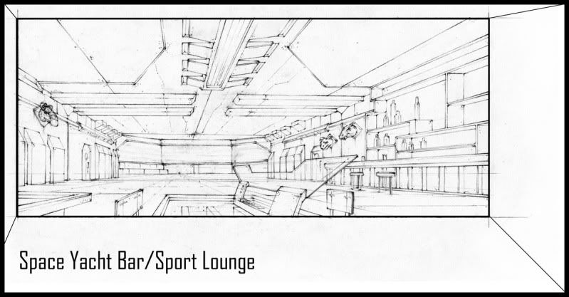
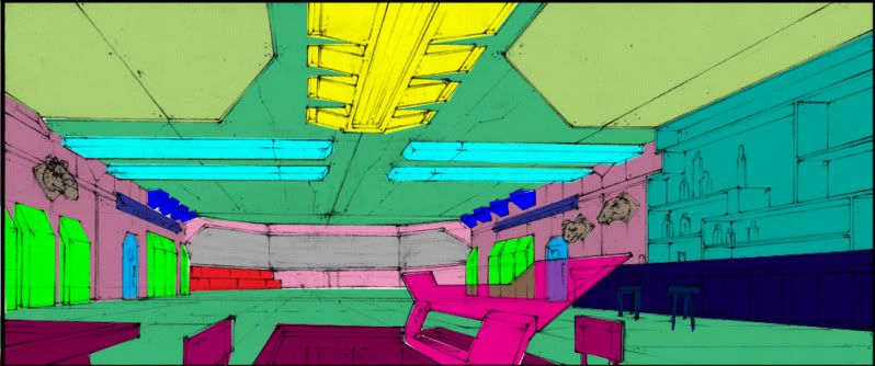
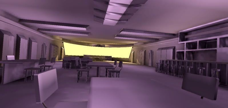
Hi all. I am currently taking a break form a large-ish scale environment and working on this. It's part of the interior of this model I made a little bit ago. (http://www.polycount.com/forum/showthread.php?t=73767&highlight=space+yacht) This interior will actually be scene in a few cut-scenes in a game prototype I am working on with some fellow students. Anways, enough explanation, on with the art! Here is the line art (by Tam Ngo) my color blockout, and a rough blockout in UDK. The blockout is missing a lot of the deco of course, I just wanted to get a slight feel for rough lighting and composition. C&C's welcomed. My goal is to finish this interior within 2 weeks.


Replies
Some other captures to see detail would be helpful. Some smoothing issues or AA problems exist I think.
Excellent modeling from concept though, that's spot on.
Yeah I am not an awesome lighting artist so most of the lighting I am sure will be swapped out after some more crits from fellow artists. Thee is too much purple right now for sure. As fas as other details, I will start posting the meshes I create in max to show off some of the hard surface modeling as I create them. And as fas as the smoothing group issued goes, thats because I actually wont be using any of these meshes. They are all quick dirty just to get a sense of proportion and composition. more to come and thanks again!
Now go! Make it!
http://www.polycount.com/forum/showthread.php?t=75561
@ajr2764: also thanks for watching he thread, I hopew you enjoy it's creation process! I have for sure been learning a bunch from the project.
@Minotaur0: Holy crap those lighting references are nice. I know have a much more distinct vision on how i'd like the lighting for this room to go. I especially like bottom picture.
Love the colours you've got so far though, feels very alive.
Like Myles mentioned, I think the tile needs some variation. Perhaps have a dance floor area and break it up a bit, maybe some different flooring around the bar and eating area too.
The other thing thats making this scene feel weird to me are the chairs. The thin legs and bulky seat/back are throwing me for a loop; weird contrast. Perhaps a bar stool type chair would be more fitting. http://www.google.ca/images?um=1&hl=en&client=firefox-a&rls=org.mozilla%3Aen-US%3Aofficial&biw=1680&bih=832&tbs=isch%3A1&sa=1&q=bar+stool&aq=f&aqi=g7g-m3&aql=&oq=&gs_rfai=
Its coming along nicely though
@brandoom: Thanks too for the compliment. Hope you like the different chair! I agreed with everything you said and this was my quick fix.
Thanks again guys. This project is pretty much done now with the head sin place and all. I am not responsible for the plants and the creatures heads in the scene (accept for the little blue workm thing, I did that haha).
I do still plan on breaking up the floor with some rugs/mats and then it'll be done finally!
the tiles aren't working for me at all, the reference shots posted above clearly show the distinctive feel of lounges, which is usually a very modern or high quality material, like waxed concrete, marble tiles or very modern parquetry.
you should have a look at mass effect for awesome sci fi cozy stuff also check the works of architects like Tadao Ando
using an aquarium a sindirect light source is very smart too
I'd also open the walls to see the outside of the ship, play with neons more, etc, fhloston paradise like
I would say that your alien heads may be reading a bit more humorous than they should. I do love them.
Though I suspect that one vaugely reminds me of Alf