Hey all,
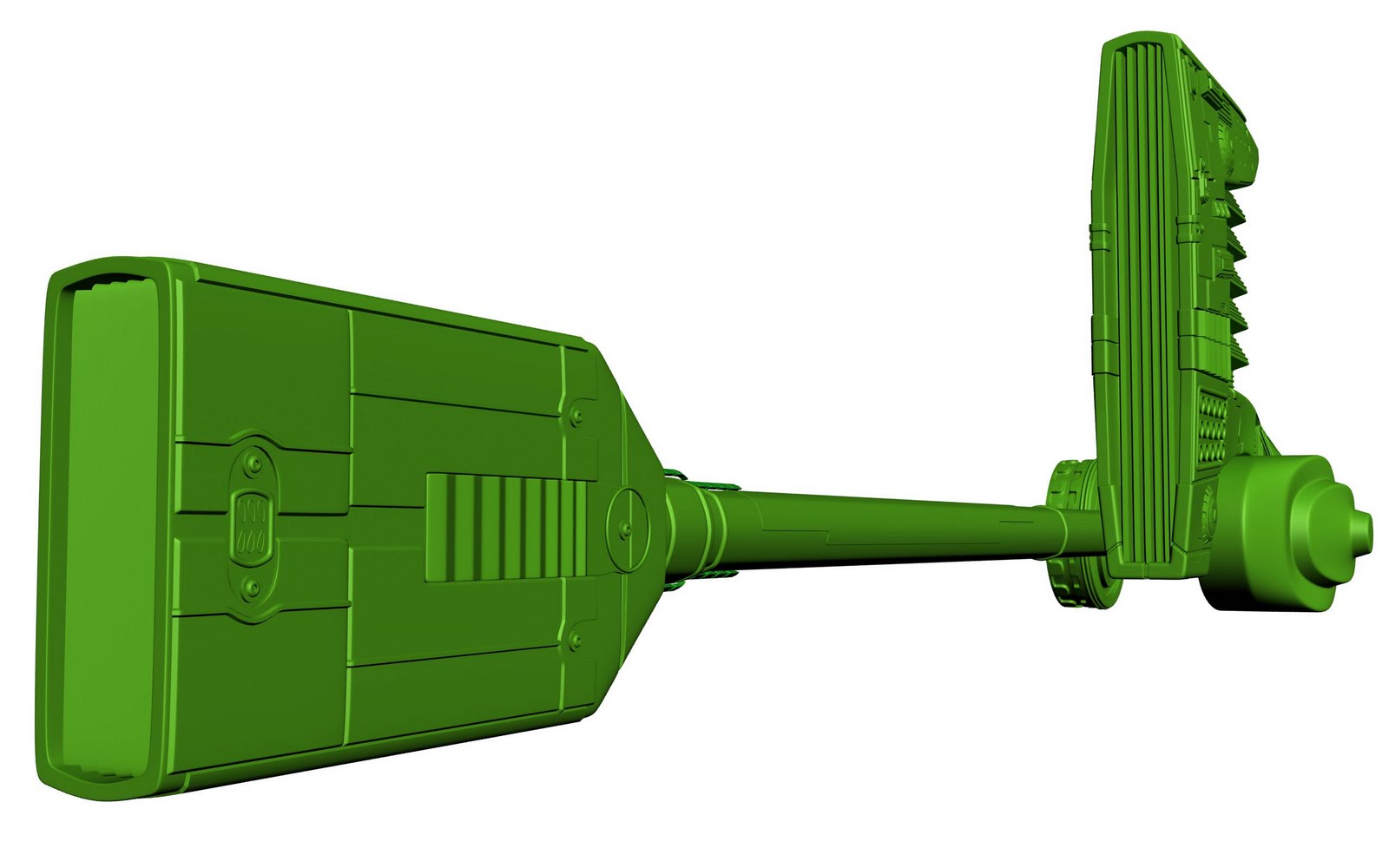
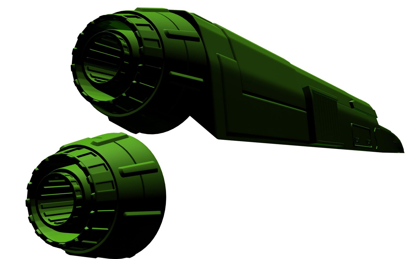
Started on this about a week ago. Was going to make an entry for the Accelerate competition on CGSociety, but didnt start on it soon enough to meet the deadline, so I decided I would try and make a vehicle that is comparable to the vehicles in 3pointstudios portfolio.
Its got a long way to go yet, but I am likeing how it is turning out so far. Any C&C would be helpful though.
Looks like a fair start. I'd suggest pictures that aren't so weird (white background, green default material, cropping cutting off pieces). The small widget details look good, interested in seeing more bigger shape detail.
Well got a break between clients to work on this again. Finished most of the engine piece. Still need a few handles plus some nuts and bolt. I will be putting those in as I complete them on the rest of the model.
Next is to make the under carriage of the train, want it to kind of look like a futuristic version of a steam train.
Any C&C welcome
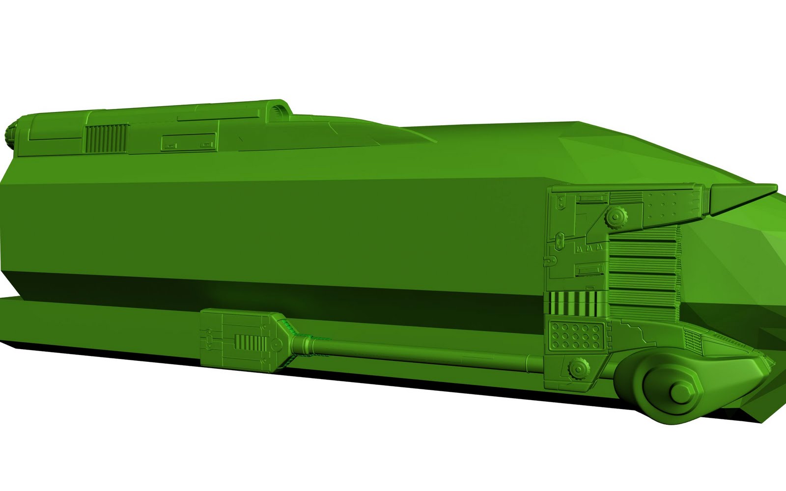
Well finally got some time to plug away and finish the train modeling. Next stage will be to design and model the train space depot, followed by lots of texture work.
C&C welcome.
Quite an improvement compared to the one that was textured green.
I really like what you're doing with he back of the train and how busy it looks, but the smoothness of the front of the train looks out of place. Maybe it's the two big objects on opposite sides of the front area? Then again, maybe it just needs a texture.
I think this can be realy good and i love the idea to keep the wheel technology of old trains but i think also that there is too much detail in the lower part of the train. Give our eyes place to "breath" and also i think the train is too short. Check this
In the reality the trains are longer and i guess in the future it's OK when they are longer then now.
p.s. and these "horns" in the front of the train doesn't support the aerodynamic shape of the train. I would make sure that the shape "flows" better.
those levers on the weels wont work that way, they need to be attached to the wheel somewhere else but the center, otherwise no moving and nothing fancy for the animation
I agree with simon. It's a little too much with details. Also it very obvious that allt he detail is copy and pasted. This isn't a bad thing but I this case each wheel element seems to repeat six times on each wagon. With serval wagons in a row the deatil elements tend to be quite repetitive.
So some times less is more if you know what I mean. If you focus the great details on some selected areas they will stick out and attract more attention.
Thanks all for the comments.
I think you might be right that it needs to be longer I think stretching it out will help a lot and will spread the details out a bit more.
As far as where the side arms are positioned, they aren't really intended to function exactly like a traditional steam train, they are largely intended to be just for the look. Each of the wheels do pivot about 20% to act as thrusters but the side arms aren't going to be chugging or anything.
Will work on stretching it out some and re-post soon. Thanks
i all ways thought the future of trains would be magnetism. I know your pretty far in the project but the bottom of the trains are so old school in comparison with the rest of the train. I'm thinking matrix
Just for the bottom of the train. the rest is fine
Well, ya the old school style is intended, but many of the pieces will glow such as the image you posted. So the old styled piece should look much more futuristic once materials are applied.
I'm loving the crazy detail, and mix of styles. I'd like to suggest that the top half of the train follow the style of the nose. Kept a bit more 'smooth', it might give the piece an interesting weight.
And please please please let the boxy stuff on the bottom function as rockets? Spacetrainship, yeah.
And yes the box/wheel things are directional thrusters. They each rotate 20% to the left or right to provide more control of the train for docking and such.
Replies
Next is to make the under carriage of the train, want it to kind of look like a futuristic version of a steam train.
Any C&C welcome
C&C welcome.
I really like what you're doing with he back of the train and how busy it looks, but the smoothness of the front of the train looks out of place. Maybe it's the two big objects on opposite sides of the front area? Then again, maybe it just needs a texture.
In the reality the trains are longer and i guess in the future it's OK when they are longer then now.
p.s. and these "horns" in the front of the train doesn't support the aerodynamic shape of the train. I would make sure that the shape "flows" better.
So some times less is more if you know what I mean. If you focus the great details on some selected areas they will stick out and attract more attention.
I think you might be right that it needs to be longer I think stretching it out will help a lot and will spread the details out a bit more.
As far as where the side arms are positioned, they aren't really intended to function exactly like a traditional steam train, they are largely intended to be just for the look. Each of the wheels do pivot about 20% to act as thrusters but the side arms aren't going to be chugging or anything.
Will work on stretching it out some and re-post soon. Thanks
Just for the bottom of the train. the rest is fine
And please please please let the boxy stuff on the bottom function as rockets? Spacetrainship, yeah.
Thanks bounchfx and throtlekitty
And yes the box/wheel things are directional thrusters. They each rotate 20% to the left or right to provide more control of the train for docking and such.