I'm far from an expert in charachters or anatomy, but the back of his neck (where it meets the skull) looks wrong. Also his waist is way to thin and from the side it looks like he has breasts.
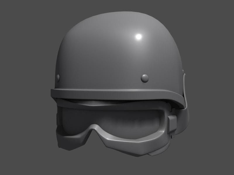
The attention to detail is fantastic, one major issue that I can see is that the helmet is way too small that it appears to be an extension of his head. I would scale it significantly.
His arms look way too thin atm. If he had a baggy shirt like that and his arms were in there, they would have to be like twigs. Also, it looks like you gave him an overbit (his lower lip is further out than his upper), and that his lips in general are not wrapping around his face enough, or pulled back far enough.
I would also pull the shoulders back more to give him a more natural relaxed looked. The clavical is too defined, and some of the folds look a bit weird along the bicep area from the front view.
I too really like the detailing though.
Great start, but be careful to not get caught up with detail too quickly. focus on the major forms, because that's what is most important.
Keep up the good work!
[edit] oh, and his skull is too small also. Like the way his head is currently with the helmet is about the proportions you need for just his head, Then you need to add a bulky looking hemet on top of that. Got any references? If not, that could be one of the reasons some of these proportions are off.
Thanks for the feedback guys! Good crits all around.
Arac: I think you're right about the back of the skull and waist thank you. I'll fix his vest so he doesn't seem to have boobage lol totally not the look i want for this guy.
ngs616: Thanks man! Actually you are right and he will be getting both those shortly, i just haven't gotten to it yet.
Allan-p: Good call! I'll be fixing that first. Thanks much!
BradMyers82: I actually scaled them up already but you're right he's supposed to be wearing a big jacket so it needs to be baggier... Thanks for the overbite tip i didn't even notice. Thanks a lot!
StealthSilver: Okay this is the one crit that confuses me... What exactly about him looks cartoony? I am going for realistic, so i don't want anything cartoony about him. And i have a lot of reference for this gear that i am giving him, so i don't see where it's not realistic...
It's because I don't recognize the vest / helmet he's wearing. It would be helpful if you posted some of your refs.
Update! Legs seem a little off length-wise to me but i haven't taken a minute to fix it lol lazy i know!
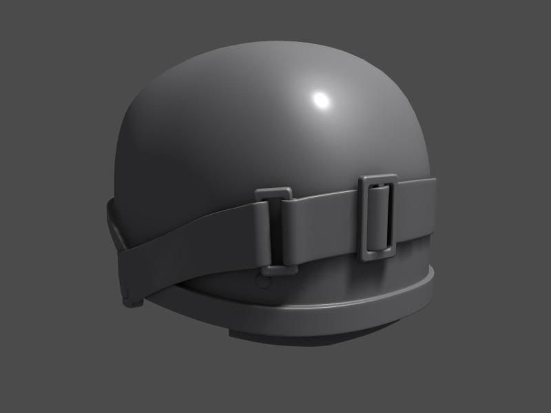
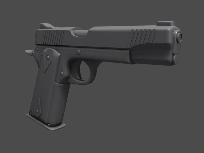
StealthSilver: Here is some reference. Its supposed to be hyper-realistic. Im taking pieces i like from these and kind of combining them into something i like. (Below)
If you're going for hyper realism, it's much better to base your gear off of actual (real-life) models of gear, especially for modern/historical concepts. Otherwise, it's not realistic, because it's a design that doesn't exist in reality.
I'm a bit of an army buff though, so I'm splitting hairs.
@ Mr. Bean: Thanks, Ha i would never insult you by telling you it was Zbrush that was the tool i used, although it would be pretty funny. I use a combination of the Standard, Clay, Pinch, and Mpolish brushes. And of course the Smooth brush.
@ conte: Thanks Conte! I've heard several different comments on the size of my head. I keep refining it but i feel like i push it too far one way and then over-correct the other way ha. I'll keep working it, thank you.
@ StealthSilve: Well it can be realistic without being real. Isn't that what a lot of games are about/going for these days? But i totally understand what you are saying, and appreciate the comments. It's good to have crits from somebody who knows what they are talking about when it comes to the subject im working on.
@ Mr. Bean: Thanks, Ha i would never insult you by telling you it was Zbrush that was the tool i used, although it would be pretty funny. I use a combination of the Standard, Clay, Pinch, and Mpolish brushes. And of course the Smooth brush.
Thanks for the info!
He's looking a little feminine due to legs that are too thin. His waist should be a little wider too, I think. Also in the side view his legs bend back too much.
Replies
The folds in the clothes are looking god tho.
I think he needs an undershirt. He also should have a chinstrap for the helmet i think.
http://www.securityandsafetysupply.com/media/Body-Armor/PB-nato-swat.jpg
All the best!
I would also pull the shoulders back more to give him a more natural relaxed looked. The clavical is too defined, and some of the folds look a bit weird along the bicep area from the front view.
I too really like the detailing though.
Great start, but be careful to not get caught up with detail too quickly. focus on the major forms, because that's what is most important.
Keep up the good work!
[edit] oh, and his skull is too small also. Like the way his head is currently with the helmet is about the proportions you need for just his head, Then you need to add a bulky looking hemet on top of that. Got any references? If not, that could be one of the reasons some of these proportions are off.
Arac: I think you're right about the back of the skull and waist thank you. I'll fix his vest so he doesn't seem to have boobage lol totally not the look i want for this guy.
ngs616: Thanks man! Actually you are right and he will be getting both those shortly, i just haven't gotten to it yet.
Allan-p: Good call! I'll be fixing that first. Thanks much!
BradMyers82: I actually scaled them up already but you're right he's supposed to be wearing a big jacket so it needs to be baggier... Thanks for the overbite tip i didn't even notice. Thanks a lot!
StealthSilver: Okay this is the one crit that confuses me... What exactly about him looks cartoony? I am going for realistic, so i don't want anything cartoony about him. And i have a lot of reference for this gear that i am giving him, so i don't see where it's not realistic...
It's because I don't recognize the vest / helmet he's wearing. It would be helpful if you posted some of your refs.
StealthSilver: Here is some reference. Its supposed to be hyper-realistic. Im taking pieces i like from these and kind of combining them into something i like. (Below)
May I ask what tool you used to get the wrinkles? (I know you're using Zbrush)
Clintus, look ok so far, check out the size of his head tho, it look a bit too big compared to the body.
If you're going for hyper realism, it's much better to base your gear off of actual (real-life) models of gear, especially for modern/historical concepts. Otherwise, it's not realistic, because it's a design that doesn't exist in reality.
I'm a bit of an army buff though, so I'm splitting hairs.
@ conte: Thanks Conte! I've heard several different comments on the size of my head. I keep refining it but i feel like i push it too far one way and then over-correct the other way ha. I'll keep working it, thank you.
@ StealthSilve: Well it can be realistic without being real. Isn't that what a lot of games are about/going for these days? But i totally understand what you are saying, and appreciate the comments. It's good to have crits from somebody who knows what they are talking about when it comes to the subject im working on.
Thanks for the info!
He's looking a little feminine due to legs that are too thin. His waist should be a little wider too, I think. Also in the side view his legs bend back too much.