Home 3D Art Showcase & Critiques

Bowman SciFi Rifle (Concept by dfacto)

polycounter lvl 12
Offline / Send Message
Piflik polycounter lvl 12
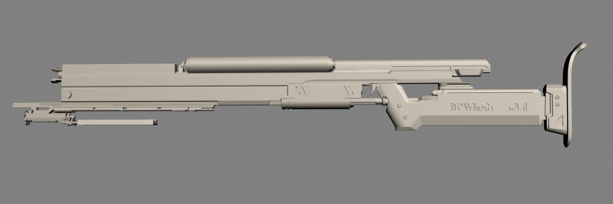
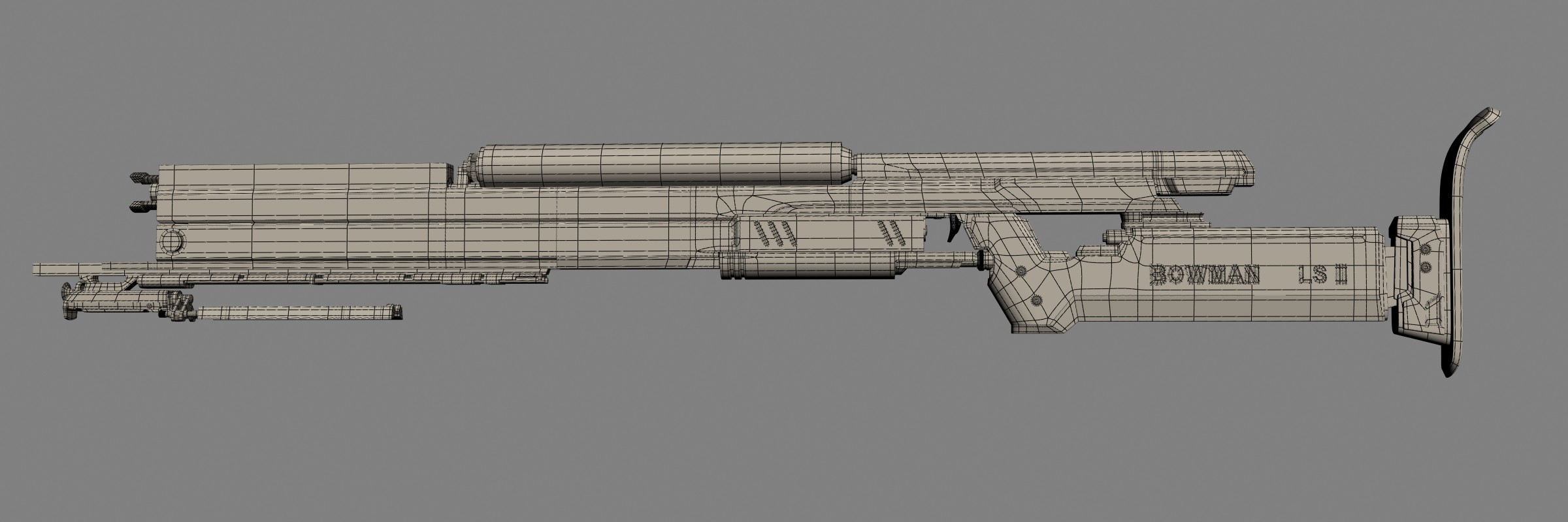
Following one of dfacto's designs found in the WAYWO Thread I modeled this rifle...highpoly almost done...the muzzle still needs work and overall it misses some high frequency detail...and I think I made the whole rifle a little bit too slim...not visible on the images ;)

Concept:
bowman4.jpg

Model:
Bowman.jpg

Wire:
Bowman_Wire.jpg

Replies

  • dfacto
    Offline / Send Message
    dfacto polycounter lvl 18
    Looking good so far, but it's a bit hard to read the shapes with that lighting and angle. Maybe a three fourths view?
  • Lonewolf
    Offline / Send Message
    Lonewolf polycounter lvl 18
    looking good but ya're trigger looks funny :P

    he have some nice concepts
  • Piflik
    Offline / Send Message
    Piflik polycounter lvl 12
    Here are some (hopefully) better views :poy121:

    BowmanA.jpg

    BowmanB.jpg
  • dfacto
    Offline / Send Message
    dfacto polycounter lvl 18
    Looks good! Exactly the form and feel I was aiming for. :D

    Two things bug me though. The first is that you excluded the triangular piece in front of the trigger. The lower part of the barrel extends back and then bends towards the midline, creating a wedge right in front of the trigger.

    Also, I don't really think the bulging magazine works. Either thicken the body, or slim it down and make it a half-cylinder like in the concept. It kind of just hangs out there right now.
  • Piflik
    Offline / Send Message
    Piflik polycounter lvl 12
    Ahh...now I get it...so this is a real edge...I first didn't know what to make of it...then I thought it to maybe be a shadow and since I wanted to try and thicken the whole gun quite a bit I tried to incorporate that...let me just show you what I did...

    Bowman_FatA.jpg

    Bowman_FatB.jpg

    The thicker body does look good, leaves more room for the mag and a big muzzle...but I'll have to correct the distorted curves on the top and bottom...also the body being thicker than the handle looks a bit uncomfortable...

    I'll definitely redo the lower part of the body to create that diagonal edge...leaving that eyecatcher out would be lame :D
  • dfacto
    Offline / Send Message
    dfacto polycounter lvl 18
    Yeah, that looks much better. Increase the diagonal a bit more and maybe bevel the bottom edge of the top section so that it's not so obvious.
  • Piflik
    Offline / Send Message
    Piflik polycounter lvl 12
    Next try...I redid most of the body...still very rough blocking to just get the forms right...added a curve to the top at the front, too...still not exactly sure what to do with the mag, though...

    Bowman_FatC.jpg

    Bowman_FatD.jpg
  • gauss
    Offline / Send Message
    gauss polycounter lvl 18
    looks pretty spicey so far, keep up the good work.
  • wi_2
    Offline / Send Message
    wi_2 polycounter lvl 10
    Bowman_FatB.jpg
    loving these details!.. also a very cool slick design!.. great work! :)
  • n88tr
    It looks super uncomfortable to shoot but it does follow that ref image

    Interested to see it textured with that red/blue camo
  • Piflik
    Offline / Send Message
    Piflik polycounter lvl 12
    I think I finished the High...hadn't much time lately, so it tokk it's time...I included the little wheel-thingy in front of the trigger from the updated concept...and I hope I got that portion right this time... :D

    Bowman_FatE.jpg

    Bowman_FatF.jpg
  • Piflik
    Offline / Send Message
    Piflik polycounter lvl 12
    Since I needed a brak from UV maping (and for teh lolz), i colorized the High...just some quick colors, no spec or anything whatsoever...I think I'll baek a diffuse, too...that way I'll have a completely seamless basecolor I can use...

    Bowman_ColorA.jpg

    Bowman_ColorB.jpg

    Finished the low and unwrapped it today...oh how I hate unwrapping...about 5.1k triangles...no picture... :p
  • sampson
    Offline / Send Message
    sampson polycounter lvl 9
    i would've gone a bit further with this so that it would look more interesting in first person view... adding some shapes on the side and such.
  • Piflik
    Offline / Send Message
    Piflik polycounter lvl 12
    Lowpoly...

    Bowman_LowD.jpg

    Bowman_LowC.jpg

    I suck at texturing...NOT DONE YET ;)

    Bowman_LowA.jpg

    Bowman_LowB.jpg
  • Piflik
    Offline / Send Message
    Piflik polycounter lvl 12
    I still suck at texturing...

    Bowman_LowE.jpg

    Bowman_LowF.jpg

    Bowman_LowG.jpg
  • Uly
    Offline / Send Message
    Uly polycounter lvl 17
    remember to work in big steps man. it's important to see the forest through the trees and approach texturing in some reasonable steps. metal is particularly easy to get frustrated with while texturing, because so much of the final result lies in its specular. the one way ticket to working in circles on a tricky texture is to try and jump to another step when you're not having luck on the most basic aspects.

    I'd recommend starting off with your base colours and values, baking out an AO map from your high poly to multiply over your diffuse, and then moving onto creating a simple, good looking metal base. here's a good example:

    pior_snake_gun_001.png

    If you take a look at his diffuse, it's really simple and very effective. (I don't think he ever completely finished it, but you can get the idea.) Keep it simple and clean. Keep posting your progress and remember to tackle the hurdles one step at a time. Also, I've never done it yet, but a lot of people swear by racer's AK tutorial. Always good to watch someone else's workflow to pick up good tips.

    http://racer445.com/pages/tutorials/ak-tutorial.php
  • Piflik
    Offline / Send Message
    Piflik polycounter lvl 12
    Flats...I think I suck at unwrpping, too... :D

    Bowman_Diffuse.jpg
    Bowman_Spec.jpg
    Bowman_Normals.jpg
  • dfacto
    Offline / Send Message
    dfacto polycounter lvl 18
    Well at least part of the reason your texture doesn't really work is because you've gone for classic woodland/desert camo pattern, while my original concept goes with something close to dazzel camo. (http://en.wikipedia.org/wiki/Dazzle_camouflage) One is blobby and looks terrible even on fatigues, the other is weird and cool. Additionally you've made the blue all one color when it should range in transparency. You need to do something to the blue to make it more visually appealing because it is pretty much the saving grace in what would otherwise be an incredibly tacky camo scheme.
  • Piflik
    Offline / Send Message
    Piflik polycounter lvl 12
    Update...now with an angular camo pattern (not Dazzle, but a modified Swedish M90)...also more than two colors :D

    Bowman_LowH.jpg

    I really have to do something about the muzzle...looks terrible...
  • vofff
    Offline / Send Message
    vofff polycounter lvl 10
    I want you to put some more love into diff,spec and plz render them out in different angles and in BIG size!!
  • Jesse Moody
    Offline / Send Message
    Jesse Moody polycounter lvl 18
    Piflik... if those are your flats posted above then a majority of your problem is coming from you spec map. It is so dark for the main body of the gun. Like pitch black so its not going to have much spec to it.

    Take a look at the one Uly posted. See how the spec map is brighter then the diffuse. Metal gets its shine from the reflecting light and not the actual diffuse.

    I suck at this to so I understand the frustration but I've had a lot of help lately and the same things were told to me and it helps a lot.
  • Piflik
    Offline / Send Message
    Piflik polycounter lvl 12
    Yeah...the Spec is really dark for the main body...but being painted metal I wanted it to have a high contrast to the blank metal underneath...but I'll see how it looks with higher Spec for the body...
  • Piflik
    Offline / Send Message
    Piflik polycounter lvl 12
    Higher spec for the body (and stronger lighting)...also higher res images :D

    Bowman_LowI.jpg
    Bowman_LowJ.jpg

    that last one is rendered with MRay, the ones above (and earlier posts) are grabed from the Viewport using a Standard DirectX Material...Max Realtime Display would not do my textures justise, no matter how crappy they are :D
    Bowman_LowK.jpg

    If I'd do it again, I'd split the UVs for the body instead of fitting it across the texture and then use a full 2k Map...I have clearly visible resolution problems with the smaller details...

    ...actually I am tempted to really do it and not just phantaazise about it...
  • dfacto
    Offline / Send Message
    dfacto polycounter lvl 18
    Your light is too bright; it's washing everything out. You need dimmer light so that you can accurately judge the specular effect. Like this everything is so illuminated that if you added bloom you would get one giant lens flare.
  • Piflik
    Offline / Send Message
    Piflik polycounter lvl 12
    Liek this? :D

    Bowman_Glare.jpg
    (had to increase the light by a factor of 2 to get the effect right... :D)

    Jokes aside...I updated the last images with dimmer lighting...
Sign In or Register to comment.