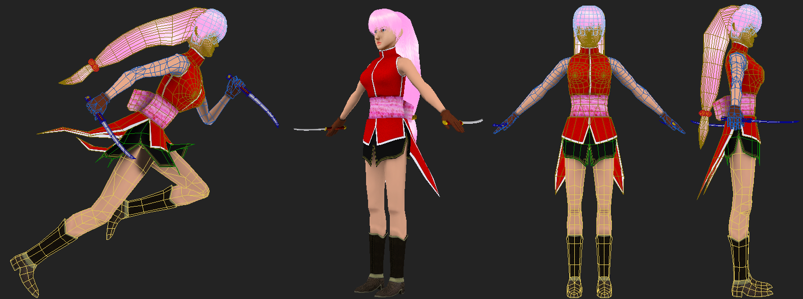
Female Character - Crits 'n Tips Please
Heya guys, first post, I've been lurkin' these forums since 2007 and I have no idea why I haven't joined any sooner. *shrug*
Anyways, enough with the life story.

I did this model for a 'any visual medium' contest and I would like your thoughts on it. I'll crit myself first, the hair has too many polys, I got a bit extrude happy and didn't notice till the end. I need to improve on my texturing, particularly the torso, this model is a bit hand painted and mostly photosource.
This was also the first time I rigged and skinned a character, so I've probably done something wrong and haven't noticed haha. I used Dead or Alive and Final Fantasy as my inspiration.
The tricount is 7966 (most of it is from the hair and head)
So crit away , I probably won't work on this character anymore, but I would like to improve for my next model. I'll probably get into sculpting for my next model, anyone have any tips/workflow for a normal mapped character?
Thanks, hopefully I'll be a frequent poster
Anyways, enough with the life story.

I did this model for a 'any visual medium' contest and I would like your thoughts on it. I'll crit myself first, the hair has too many polys, I got a bit extrude happy and didn't notice till the end. I need to improve on my texturing, particularly the torso, this model is a bit hand painted and mostly photosource.
This was also the first time I rigged and skinned a character, so I've probably done something wrong and haven't noticed haha. I used Dead or Alive and Final Fantasy as my inspiration.
The tricount is 7966 (most of it is from the hair and head)
So crit away
Thanks, hopefully I'll be a frequent poster

Replies
For sculpting you're going to want to use a mesh with even quads throughout the body. That way when your mesh subdivides you won't have exceptionaly dense spots and not enough points to work with in another. I'm not sure how mudbox takes 5 and 6 point stars but try not to have more then absolutely necessary.
When I do characters I try to get my main edge loops for deformation set first before sculpting but that's just personal preference. After you sculpt kick out your mesh in division 1 or 2 and retopologize and UV. Then you can use xnormal or whatever tools your 3d package has built in to transfer the maps.
Hope this helps
Just to comment about the pose, its totally impossible to pose like that, people will have the left leg AND the right hand forward at the same time to counter balance the pose otherwise she will fall down for sure.
_Revel
As far as the body goes, if this character is supposed to be quick on her feet, make her legs a little bit more muscular, but not "buff". Right now the legs look rather thin for a character that I assume would be running around frequently.
It's probably worth rethinking the colors a little. There's nothing wrong with light pink hair, but the way it's painted now makes it look like it's glowing. Some shadows can help ground the hair better and help contrast it from the face.
The clothing design is a little too simplistic. This isn't to say that you need to make it very complicated, but you could use some functional design elements such as buttons, ties, straps, etc., to make it look more naturally functional as well as adding some needed detail.
The skin is also basically just one shade throughout. Even in a stylized character, you'd want to add a little more shading in there (if for no other reason than to indicate the forms). When painting shadows, especially on skin, be careful not to use very dark and desaturated colors or it looks very "dead." Use more warm tones in the shadows.
@bhong: I guess the texturing is half/half then lol, the skin & face, skirt and torso were hand painted. Faces are hardest part of me to model so I guess more practicing is needed, and thanks for the tips.
@Revel: Crap, I like my anime, but I have never seen Naruto, and there are massive similarities, I hope no one thinks I copied her. Your right about the pose, I feel stupid not noticing earlier.
@Shad0wForce: Thanks. I need to work more on my faces then. For the legs, would I make the thighs and calves more larger?
@haikai: Yeah I went a bit crazy on the hair. For the breasts, if there was like DOA physics and I had to rigged them so they "bounce" then the concentric rings technique would suit it for that purpose, otherwise I would just model it with the torso? I think it's the highlights of the hair that's giving the glow, but I can see what you're saying. To be honest I don't know to to actually hand paint, most of it is just a solid colour with an AO over it. I would like to know how to hand paint but I just don't know how to and I don't have a tablet
Thanks again guys, from what I've gathered my faces need more work and most of my other mistakes was the result of me not paying attention. When sculpting, do you guys keep everything in one mesh or do you have certain parts separated, this is one of the things I have trouble understanding 'cause I don't know how these things work haha
Even though I'm a junior myself I do dabble in character art in my spare time, I did write a little tutorial thing about character art workflow and stuff over at 3d-for-games.com to try and help the guys there that was interested. Just trying to help like many others do around here.
You might want to check it out:
http://www.3d-for-games.com/forum/viewtopic.php?f=13&t=5541
Essentially low-poly art without normal maps is about distributing your polys efficiently and nailing the texturing to make it look interesting.
Thanks for the link man, it was a good read and I now have some idea on the workflow for normal mapped characters. As you said, I do need to improve in the concepting stages. What I usually do is I get an idea and I keep an image in my head of my ideas and just work off that, as I am a bad drawer also and can't get it as an actual concept in front of me haha
Also, I still need to get my hands on an anatomy book.
Starting a new character, I focused on the head a bit more this time and I'm pretty satisfied with it then the last model. I'm still texturing the head and making the fringe.
Well here's an update, I've started texturing the body now.
This was rendered with flat lightning.
Well this is my first sculpt, which is done in Mudbox. I'm also learning anatomy at the same time while I'm doing the sculpting. The character is supposed to be some urban type chick, but I'll see what it'll progress into.
Obviously this is WIP, I haven't touched the boots or her hands yet, I'm still working on the ears and the folds/creases on the cropped hoodie.