Home 3D Art Showcase & Critiques

UDK - Waterfall in Forrest

LMP
polycounter lvl 13
Offline / Send Message
LMP polycounter lvl 13
Over this summer I've gotten it into me to tackle what will be my first full exterior environment, I've done a few mini-environments before, I'm basing my environment on this concept from Star Wars: The Old Republic.
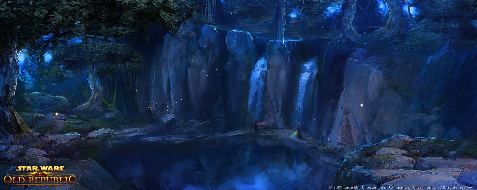
CA_20100108_DromundKaas01_full.jpg


Below is a quick terrain mesh blockout in UDK, the cliffs are mostly going to be replaced with static meshes, that I plan to sculpt in Mudbox.
In addition, I will be creating the following assets and texturing them. A few variations of tree, foliage, waterfalls, whatever else I need to help it feel alive.
blockout01.jpg
blockoutwire01.jpg

Replies

  • Sean VanGorder
    You should go back over your terrain with the smooth brush and get rid of some of the stretching. From the concept art though, it looks like it should be a sweet scene.
  • SaferDan
    Offline / Send Message
    SaferDan polycounter lvl 14
    yeah the concept looks awesome!

    im excited for this!
  • Lamont
    Offline / Send Message
    Lamont polycounter lvl 15
    Two things really quick: You're going to have to turn some tris at the cliff edges. That's not a good habit to have with terrain, your edges will look like poop. A good terrain board/segment/whatever will have a combination of prefabs and the terrain mesh.

    Looking at that concept, I'd use more hand-made rock structures than the UDK terrain.
  • SaferDan
    Offline / Send Message
    SaferDan polycounter lvl 14
    i thought the terrain he had was just a block out?and it was being replaced with static meshes?
  • Lamont
    Offline / Send Message
    Lamont polycounter lvl 15
    I assumed he was going to sculpt in some parts, and keep some of that terrain geo.
  • SaferDan
    Offline / Send Message
    SaferDan polycounter lvl 14
    hmmm i dont know, you might be right actually...we will have to wait and find out!
  • cholden
    Offline / Send Message
    cholden polycounter lvl 18
    Like the concept, and I can tell you making a waterfall is good fun with particles. :)
  • LMP
    Offline / Send Message
    LMP polycounter lvl 13
    cliffpreview.jpg

    This will be my central cliff, in the waterfall, and shall set the standard for all assets.
  • Illusive
    Offline / Send Message
    Illusive polycounter lvl 8
    awesome concept can't wait to see it in UDK
  • Khalamea
    As far as the cliff sculpt goes, the rock forms are looking a bit too soft and rounded. The sculpt itself feels more cartoony right now, while the diffuse and alpha treatments suggest you want to go for a more realistic feel. You may also want to revisit the crevices between the rocks, some of them have weird pinching issues going on.

    As for the diffuse map, it's looking good so far but personally I'd take down the highlights a bit. You might also try overlaying some mossy bits to break up the texture.

    It's a good start though, I'm looking forward to seeing the progression :)
  • Will Faucher
    Offline / Send Message
    Will Faucher polycounter lvl 12
    I agree with khalamea. You may want to work a little on the diffuse and add some color variation. Right now it looks like an awesome mound of chocolate which COULD be good, but I don't think that is what is intended with this :P

    Color variation, a little desaturation of that brown, along with dirt and moss will definitely help. Since this will be right in the middle of 2 waterfalls, I would suggest increasing the spec and gloss to make it look more wet.

    Nice start though! Keep it up!
  • LMP
    Offline / Send Message
    LMP polycounter lvl 13
    Redid my Cliff. Here's the result of today's work:
    I colors may still be tweaked.

    cliffpreview2.jpg
  • ZacD
    Offline / Send Message
    ZacD ngon master
    Definitely on the right track, those rocks look nice and rock-ish. Doesn't really look natural OR man-made, but I think it could work
  • PixelMasher
    Offline / Send Message
    PixelMasher veteran polycounter
    If you look at the concept, the cliffs seem to be made of tall jagged stones. right now your shapes are too uniform and evenly sized. I would recommend making 3-4 tall jagged stones and then simply crash them through each other to create the cliff faces. right now it would probably look too noisy with tons of small-medium sized forms all over the place.

    what you have looks pretty good but there is no color/hue variation on any of the rocks. if you made one rock thats as tall as the current one, one thats about half as tall and maybe a couple other tallish ones it would give you more unique detail when they are all places. plus you could tint each one either via shader work or simply a slight change to the diffuse.
Sign In or Register to comment.