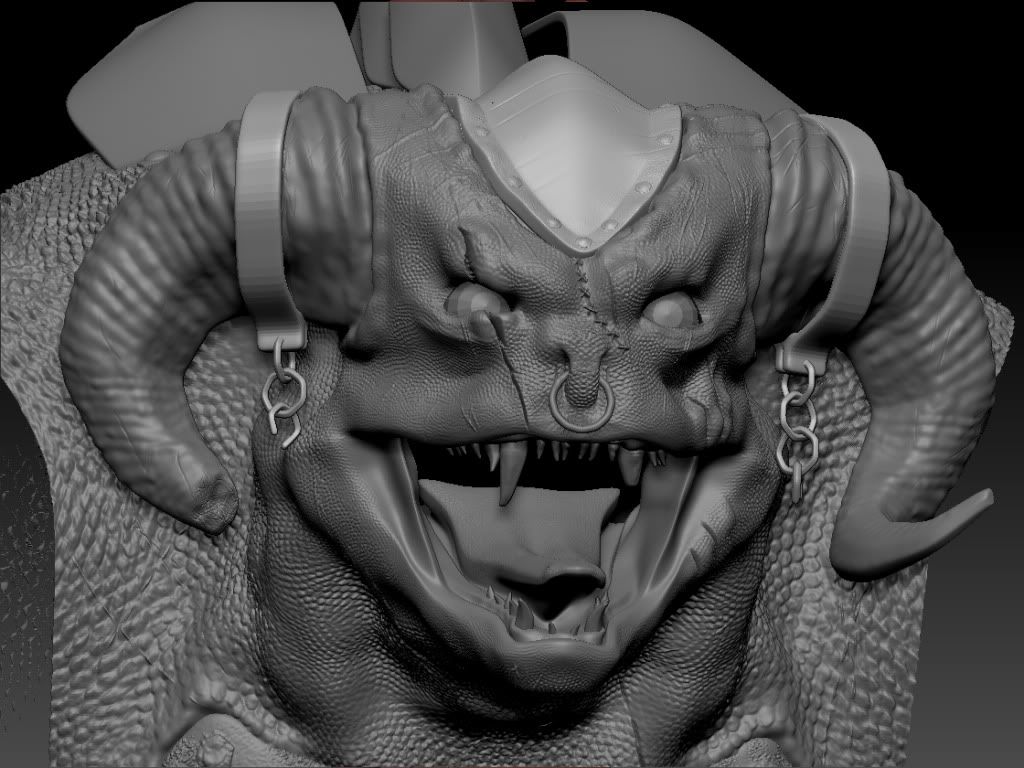
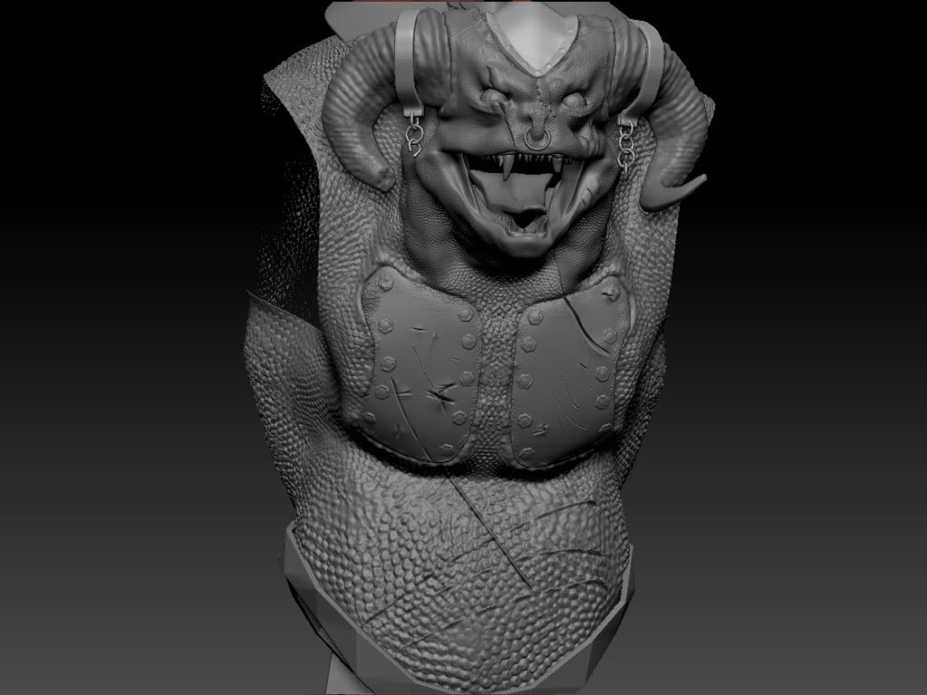
Here's A model I've been working on,
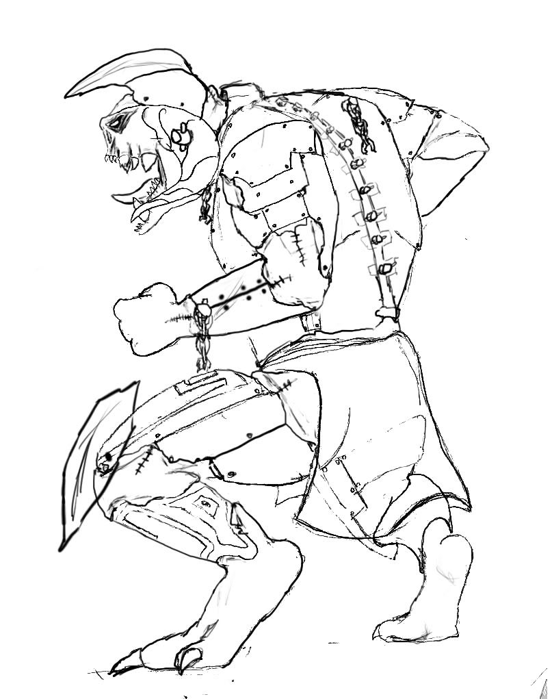
Basically my original idea was he was a pet of loki and loki tortured him and replaced some of his skin with armour, hes a head ramming type creature, pretty dumb but powerful.
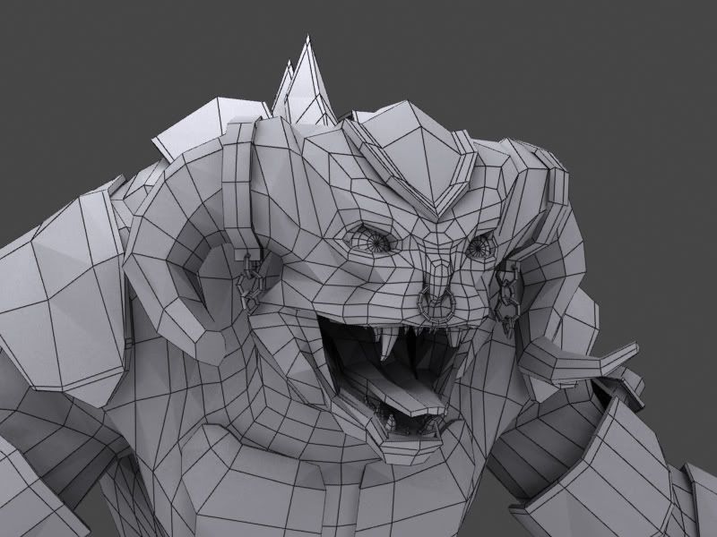
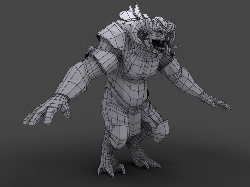
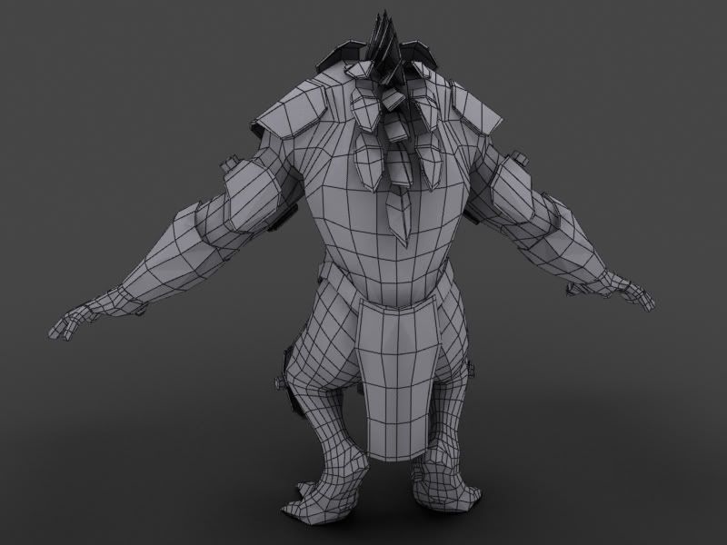
here are a couple concepts, wires and the start of the high poly
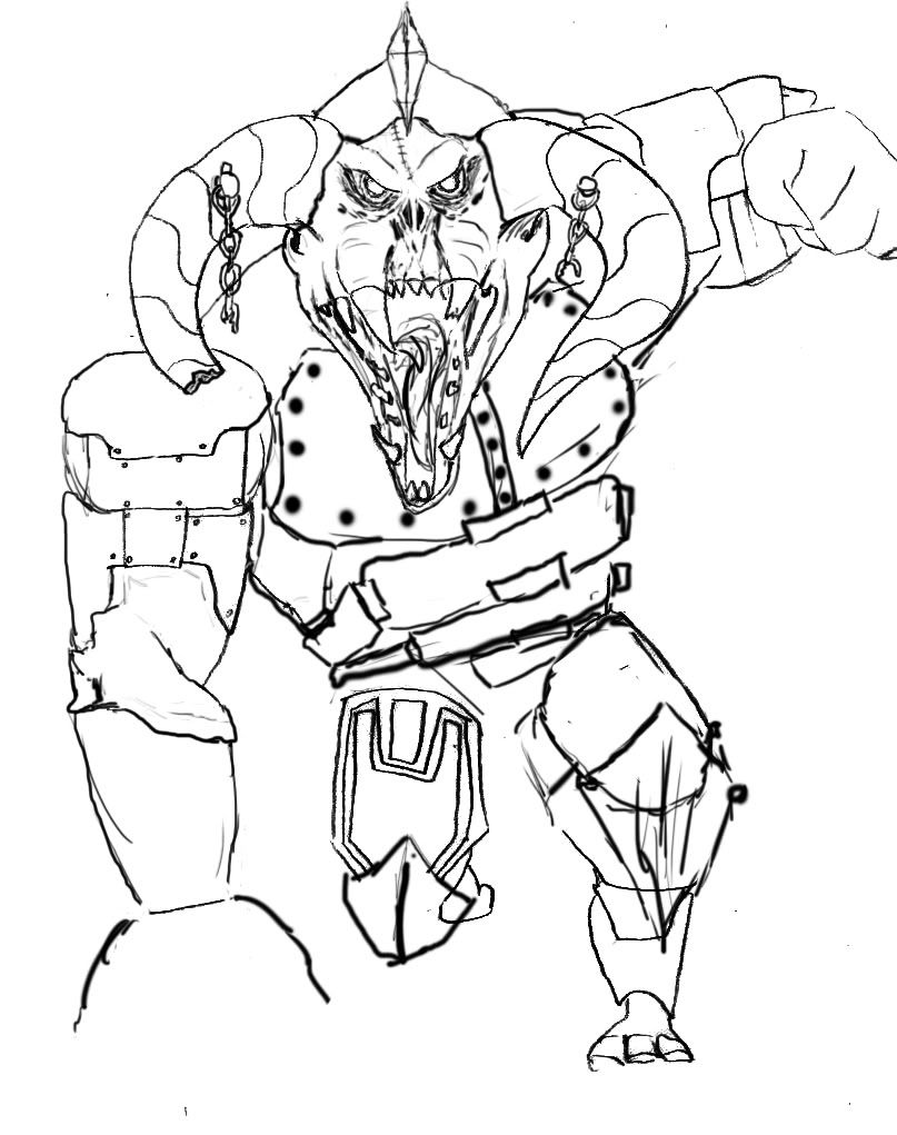
Its looking good, the eyes are a bit off in the LP. I like the ones on the concept because they are angled and look more sinister but on the LP they are rounded. Kind of remind me of a puppies eyes.
It's a good start! I would suggest you get a little more muscle definition in there. It just seems to me like you imported the base mesh and used alphas to make the microdetail. Look up some reptilian anatomy and really get those bulky muscles out before moving on to fine detail.
Also, most reptiles (if not all of them) don't have scales on their bellies. It is a smooth leathery skin. I really get the feeling that the scales are just too uniform.
With that said, it's a great start and this piece has alot of potential! Don't give up!
Whoah, slow down. You don't even have proper eye sockets or lids yet, and the basic shapes are very wobbly; texture detail like scales and scars should be the last thing on your mind now, if you ask me. You're better of going a ton of subdivisions back and solidifying the main shapes, keeping in mind that a bone structure should give shape to it all.
I agree with the above 2 posts. I know it's fun to add surface detail to a super high-res mesh, but I don't think you built up slowly enough. One of the biggest problems people have with digital sculpting is subdividing too much too soon or not defining major forms before going crazy with skin detail (those often go hand-in-hand, but not always).
I'd really step back a bit, find more reference for the type of anatomy you're going for, and try getting it to look as good as possible at each subdivision level before you step up to the next level.
It's clear you've spent time on this though, and I'm sure you'll be able to get it looking much better. I think if you take a few steps back and try again with some of the things mentioned in the previous posts you'll end up with a 10x better looking final product.
Something else that may help your out in the future, is ensuring that your polies (on your base mesh) flow better, and that the polies are evenly spaced, making nice squares everywhere. It will help you get better definition when you start sculpting. Right now the base mesh seems a little bit messy.
+1 to Stu/Zwebbie. Bumpy skin is fun and all but you'd gain more from nailing your major muscle forms. Generally you should only subdivide once your cant get anymore detail from your current level.
here is an update of the face
I worked on some of the muscles around the eyes and mouth
i used reference from frogs, lizards and a variety of dinosaurs
really like his skin, and the mouth is very lizardlike (although not necessarily super imposing). I feel like you could do a tonne more with the horns in particular though. Also, the feet are great, but the hands don't really feel like they're from the same creature, I would try to bring that hard, spikeyness of the feet to the hands.
And yeah, I would go way crazier with the horns, e.g.
nice work man. Don't be affraid to really take your time with this and work out the forms more. As I'm sure you have noticed, the more time you spend on this, the better he looks. The small details are far less important.
I agree about the hands, but also I wanted to add, the abs look very out of place as well. I would give him a belly in this case. I think it would suit him more being all hunched over like that. Keep up the good work!
I think this looks amazing though I think his skin could be a little duller color.
Also, you say this is supposed to be Loki's pet? I'd like to see more Norse influence in his design like maybe add some runes and some Norse symbols to his armor.
And I'm not sure how everyone else feels but I don't really like the human-like hands when his feet are definitely more monster-like. Maybe sharpen his nails and give him a little webbing in his hands
so as a rule all metal should have the wearing around the edges or whatever....but on yours the wear looks to uniform...i think the light areas are too thick...use a more scratchy looking brush maybe. right now your metal looks more like stone and that's what's bothering me.
looks better man.
do a level adjustment on your entire diffuse ( at the top of your diffuse group)
also render off a height map of your high poly zbrush brush model. put onto of ur diffuse and change it to soft light and do a levels adjustment.
looking better !
add those rim and fill lights !
re watch the nikon videos on the humber ftp bash thingy !!! and take notes !!!
add more polys to the rocks
Replies
it reminds me of the fire monster in the lord of the rings. lol
and ya the belrog was most of my reference for the face
I'm no 3D Artist OP, but it's coming along nicley.
heres a few updates
Also, most reptiles (if not all of them) don't have scales on their bellies. It is a smooth leathery skin. I really get the feeling that the scales are just too uniform.
With that said, it's a great start and this piece has alot of potential! Don't give up!
and hes right ^^
I'd really step back a bit, find more reference for the type of anatomy you're going for, and try getting it to look as good as possible at each subdivision level before you step up to the next level.
It's clear you've spent time on this though, and I'm sure you'll be able to get it looking much better. I think if you take a few steps back and try again with some of the things mentioned in the previous posts you'll end up with a 10x better looking final product.
ill go back and touch up the major muscle positions
ill have an update for you guys soon!
I worked on some of the muscles around the eyes and mouth
i used reference from frogs, lizards and a variety of dinosaurs
now lets see those textures !!
And yeah, I would go way crazier with the horns, e.g.
keep it up !
I agree about the hands, but also I wanted to add, the abs look very out of place as well. I would give him a belly in this case. I think it would suit him more being all hunched over like that. Keep up the good work!
I've done a little touch up ...
I plan to add an opacity map to the loin cloth
thoughts?
Also, you say this is supposed to be Loki's pet? I'd like to see more Norse influence in his design like maybe add some runes and some Norse symbols to his armor.
And I'm not sure how everyone else feels but I don't really like the human-like hands when his feet are definitely more monster-like. Maybe sharpen his nails and give him a little webbing in his hands
do a level adjustment on your entire diffuse ( at the top of your diffuse group)
also render off a height map of your high poly zbrush brush model. put onto of ur diffuse and change it to soft light and do a levels adjustment.
i think the metal looks like stone because i don't have a spec map done yet
still playing with colours
thoughts?
add those rim and fill lights !
re watch the nikon videos on the humber ftp bash thingy !!! and take notes !!!
add more polys to the rocks
this is my final
left side at the arm (top part) and left leg outside and inside.
here it is with some rim lights