Home 3D Art Showcase & Critiques

Space Yacht WIP

polycounter lvl 7
Offline / Send Message
SouthpawSid polycounter lvl 7
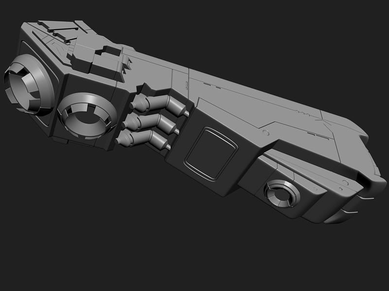
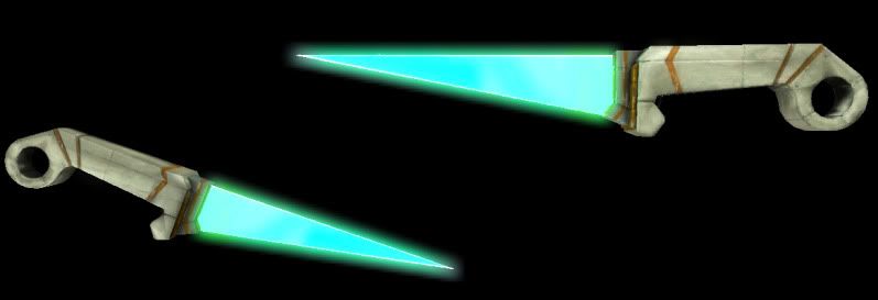
This asset is a large space yacht that will be floating around in a Game Prototype I am working on (http://quespeck.com/thehunt.html). Concept not by me, but by a fellow student on the project. My question to you my lovely poly counters is how I should go about when texturing and unwrapping it best. I am leaning towards maybe to two 2048's or maybe using multi subs. But I though maybe I should use symmetry an most of the large pieces of the ship since it's design is symmetrical. Although I don't really wan the diffuse to be, the ships usually only seen from one side at a time since it's so big. Also comments and crits welcomed! Also, I figured I'd pimp out another asset I just fished for the game as well. Th last pic is of a melee weapons that will be used but he player in-game called the Vibro Skinner!
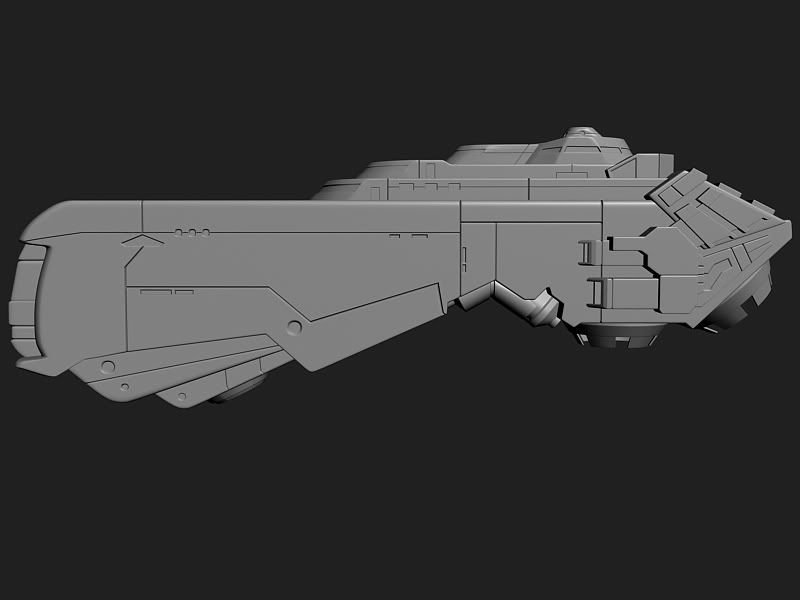
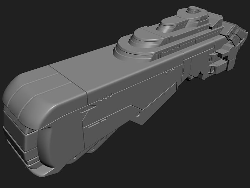
FinalHP5.jpg

FinalHP6.jpg

FinalHP7.jpg

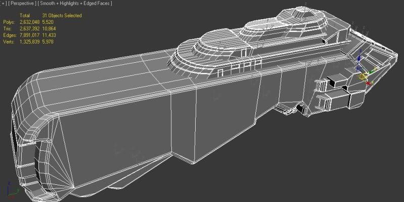
LPwires.jpg

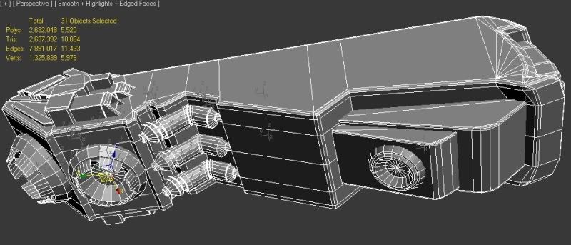
LPwires2.jpg

UDKglowyedit.jpg

Replies

  • Snader
    Offline / Send Message
    Snader polycounter lvl 15
    You'll need more thrusters. Currently it can only go up/forward, but not rotate or brake.

    Where do people go on board, I see no airlock? There are doors at the bridge, but regular ol' earth doors are sorta useless in space. Those doors might have use if it could enter the atmosphere, but I'm not seeing any landing gear. It might be possible to have people enter with a small craft, but there's no (clear) hangar.

    You have a biiig empty surface in front of the bridge, how about doing something cool there, like making a sun deck?
    sundeck.png
  • SouthpawSid
    Offline / Send Message
    SouthpawSid polycounter lvl 7
    Thanks for the reply and suggestions Snader! I actually had no say in the design of the asset. Here's is the reference. Unfortunately is concepts for this ship have been done for a while now and I am supposed to stick to it. I had a couple issued with it as well as far as the doors and open front. I really like the little detail you drew in and I will for sure at last emphasize on that area. I think my lead will let me chance it a a bit to make that look like some sort of large door that open from the floor. here's the reference. I did chance a couple small details from the reference just because I was having some sub d problems trying to follow his concept one hundred percent. I am still trying to better myself as a sub d modeler.

    spaceyachtcolor_BG_large.jpg
  • whats_true
    Offline / Send Message
    whats_true polycounter lvl 15
    I agree with Snader

    It seems a bit bland up their. Over all, it looks like the sides are to flat and becomes a bit boring in the 3 quarter view. The side profile is nice, but the creveses could be pushed a bit more to give it more definition. The side for instance seems to flat to me. Maybe pull a hull piece out more to break it up some. It could use more detail too; emissives and just random bits to make the large empty surfaces seem less boring. I mean, they didnt make that out of one giant piece of metal. Its broken up big time. Homeworld has some awesome degins for ships and im sure you could get some referance off of Star Trek to see what I mean

    I dont thing your quite on the money with the referance too. Try doing an overlay with your ref and render so you can see what i mean.

    Im also hopeing thats not your low poly in the wireframe. You have a lot of unneeded lines that could bring your tri count down considerably (try going half of what you have), and useing it else were.

    As for textures. I say do it on one 2048. It looks like you could get away with 2048*1024 possibly. It really depends on how close your gona get. To me, its an over kill if you do more than that.

    Your prop is cool. It has a Halo feel to it. Its a little bland, but Im not sure what your art team is going for.

    Hope this helps dude :]

    Keep pushing!
  • A-N-P
    Offline / Send Message
    A-N-P polycounter lvl 6
    You say its a yacht but I don't see no sail? I think a nice strong sail will be a nice touch to it, and also some more details on the sides as whats_true mentioned.. maybe some kind of air intake?
  • Mechadus
    I think this things pretty bad-ass. I agree that its a bit bland at the moment, but I think a lot of fine detail can be added with the textures. The overall shape is really cool imo, but theres just not much sense of scale to it... lots of little glowy windows, small imperfections like asteroid dings and such will add a lot to it. Really cool concept, and Im eager to see how this looks with some maps on it!
  • SouthpawSid
    Offline / Send Message
    SouthpawSid polycounter lvl 7
    @ Paul, thanks for the speedy crit man. Very much appreciated! About breaking up the mid piece, I think I will for sure add some detail in the HP on top. Hopefully the detail from t he normal maps as well as the emissives break it up enough. I think it will. I also might toy with a subtly tiling sci-fi type texture that look like panels to break it up as well. As far as the topology goes, It actually is my LP. haha. I originally had it a good bit more dense and triangulated to save buy I've had problems with smoothing group pinches in the back with big triangles so I figured I just had the room to spare on a polycount. Would 10864 Tris be too high for an asset this size? Also, I've heard some horror stories about using mirroring UVs in unreal leading to weird problems and seams in the normals. But as long as my second lightmap channel is flat with no overlap or inverted UVs it should bake out fine right? Thanks again man!

    @A-N-P: Thanks for the suggestion about the sails man. Unfortunately the overall design of the ship is already set in stone due to our deadlines.

    @Mechadus: haha, thanks! I will for sure rely on some good texturing to really push this asset. I look forward to more input during th e texturing stage!

    Lastly, again i'll iterate just because i am wondering: Symmetrical UVs on this bad boy? Good or no?
  • Snader
    Offline / Send Message
    Snader polycounter lvl 15
    A-N-P wrote: »
    You say its a yacht but I don't see no sail? I think a nice strong sail will be a nice touch to it, and also some more details on the sides as whats_true mentioned.. maybe some kind of air intake?

    You've got the wrong definition of a a yacht I'm afraid.

    @whats_true
    I disagree with your statement about the flat sides. This is supposed to be a luxury craft, and thus very sleek. In fact I think it could stand to be simplified a lot in the sides. If I were to change anything to the global shape it'd be tapering the front a bit to make it resemble the bow of a boat more. This also wouldn't affect the sideview.

    You're right about the wireframe though, hadn't even looked at that properly yet. Maybe he's using too much in places, but depending on the player's location he might also be spending too little in places. It's mostly inconsistent.

    @SouthpawSid
    I see you're often moving rectangles and circles that are located on the crevices ) to only one plate. If you have problems getting those in nicely with subD, just make a floater, the object seems flat enough.

    Compared to the concept, the model is elongated, which I personally prefer, but it does deviate from the concept.

    Your lowpoly shows inconsistency, and a lot of it. Assuming this is a sort of background object, you can normalmap stuff like the windows and whatnot, and you can remove about 80% of your chamfers. Could you give us one render of how big it would be ingame, at most? (if it's going above, say 1920x1080, just take a screenshot from where the characters eyes would be).

    Also: poly saver!
    topo_curvedextrusion.png

    I'd go for a tiling texture myself, and then having a blending map. Here's an example, using 4x 512²:
    material_detailmateralswithmasking.png

    The first UV channel would be to get all the pieces flat, and have the 3 materials get the same pixel density across the model, and then getting some basic materials in place, then use the blue channel (I drew it in but it turned out not to be needed) for a decal map (you can add some random cuts and damage stuff on here too by) with a separate UV channel
    The normal map would also be a separate channel.

    The sample materials would be tiled, and a 512² or even a 256² should suffice for background use. The normal map would be a lot larger, say 2048, to get nice detailed bumps. I'd make
  • r_fletch_r
    Offline / Send Message
    r_fletch_r polycounter lvl 9
    Concept not by but, but bu
    precisely!! Thanks like something I would type :)

    Looking good man, for some reason im put in mind of the vaygr from homeworld. i think its the stripe.

    Only thing thats standing out to me is the purple bits at the back of the intakes (what do they intake in space? :)) they seem the be extrudued a bit far and the bevel on them is round where the concept is a champfer
  • SouthpawSid
    Offline / Send Message
    SouthpawSid polycounter lvl 7
    r_fletch_r wrote: »
    precisely!! Thanks like something I would type :)

    Looking good man, for some reason im put in mind of the vaygr from homeworld. i think its the stripe.

    lol, oops. :poly136: Thanks man!
  • SouthpawSid
    Offline / Send Message
    SouthpawSid polycounter lvl 7
    @Snader! Dang man, thanks for the diagram! Unfortunately I am not the best at the material editor and what using a using 4x 512² means. And after looking at it for a bit, I think you are right. I must have accidentally scaled it a little to long when I was modeling off of a plan in max with the ship on it as ref. However the concept artist and my art lead didn't saying anything about the scale so i'll leave it, lol. I am working in cleaning up the LP right now.
  • SouthpawSid
    Offline / Send Message
    SouthpawSid polycounter lvl 7
    so I cleaned up the geometry on the top tiers. I feel silly for how I overlooked that mess. I asked our designer and there is going to be some in-game cinematic where the camera zooms into the ship and goes to a window on the top tier so yeah it'll be seen up close at times. But not super close. So I will keep the windows inset and all. Ok, off to the pub for a quick drinkski with some friends, then back at it. More updates to come!
    wiresfix.jpg
  • Justin Perreault
    Offline / Send Message
    Justin Perreault polycounter lvl 7
    I really like the concept for this piece. Looking forward to seeing it textured :)
  • Snader
    Offline / Send Message
    Snader polycounter lvl 15
    what using a 4x 512² means.
    4x 512² simply means this:
    4 separate textures, of 512x512 pixels, 1 cream, 1 blue, 1 grey, 1 with the blend map. Not a 1024x1024 (1024²) because then you could not tile the different materials which is what you want.

    so I cleaned up the geometry on the top tiers. I feel silly for how I overlooked that mess. I asked our designer and there is going to be some in-game cinematic where the camera zooms into the ship and goes to a window on the top tier so yeah it'll be seen up close at times. But not super close. So I will keep the windows inset and all.

    How about the bottom? I think you could easily knock off about 1000-2000 tris if you cut the chamfers on those 3 tubes of toothpaste in the middle. I just thought of something, which is pretty unsafe: there are no railing or whatever.

    You'll need to ask your whoeversincharge if you're allowed too, but you could do something like this, with indents so theres a sort of railing:
    spaceyaghtLP.png
    also shows what I mean with the tapering.
  • SHEPEIRO
    Offline / Send Message
    SHEPEIRO polycounter lvl 17
    tapering looks way better...and screams yacht
  • A-N-P
    Offline / Send Message
    A-N-P polycounter lvl 6
    I agree, the tapering does make it seem more yacht like and looks much streamlined. I'm looking forward to seeing this textured.

    @Snader I know yachts don't need to have sails but as the ship will be based in space I thought a nice sail would set it apart from the usual spaceships that will be floating around it. :)
  • SouthpawSid
    Offline / Send Message
    SouthpawSid polycounter lvl 7
    so at very least I can do the tapering idea. I do like it a lot better and seems so does everyone else. Snader you are the bomb. Here's the first pass on the diffuse rendered in Max.
    WIPColor2.jpg
  • hawken
    Offline / Send Message
    hawken polycounter lvl 19
    why are the paint stripes aged but the rest of the craft is in good condition?

    I'm also a fan of the railings idea. Overall fantasy yacht = inspiring. Good work, keep it up.
  • Electro
    Offline / Send Message
    Electro polycounter lvl 19
    Where's the handle/trigger?

    Actually... what I meant to say is... it just needs some kind of scale reference, so we can get an idea of how massive it is. Railings would definitely help!

    Too bad it's a space yacht, no pool on top with chicks in bikinis awwww

    Some kind of darker setting for presentations would be nice too, with the windows having glows. Keep goooooing
  • SouthpawSid
    Offline / Send Message
    SouthpawSid polycounter lvl 7
    well everyone, unfortunately do to my deadlines, this asset is DONE! :) I had fun and learned a lot from it. I didn't get tin implement all of the critiques I got in here like I wanted to, but thanks none-the-less. Also, enjoy some other artwork that is going to be featured in our game "The Hunt" http://quespeck.com/thehunt.html

    SpaceYachtArtSheet.jpg

    PuttPuttArtSheet.jpg

    VibroSkinnerArtSheet.jpg

    PistonCaneArtSheet.jpg
Sign In or Register to comment.