WIP Hand painted textures
hey guys
I've gone back to an old project I started when I was training which is an old water well. I originally had photographic based textures on it but the bucket was very painterly which my tutor thought was a good look .... ssoooo i'm hand painting the whole thing now.
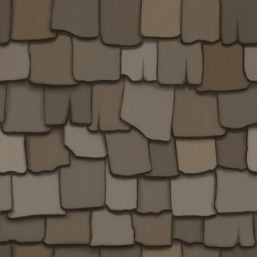
All has been going fine but i'm seriously struggling to get the shingle tiles for the roof looking good
any suggestions/general crit???
(it's kinda big bad planning on my part)
Thanks guys!
I've gone back to an old project I started when I was training which is an old water well. I originally had photographic based textures on it but the bucket was very painterly which my tutor thought was a good look .... ssoooo i'm hand painting the whole thing now.
All has been going fine but i'm seriously struggling to get the shingle tiles for the roof looking good
any suggestions/general crit???
(it's kinda big
Thanks guys!
Replies
get in there with a brush and actually paint what you want.
color variation looks pretty good shingle to shingle, but the actual shingle itself is one solid color with a texture overlay on it. is this old and dilapidated? would there be weathering, stains, cracks, sun bleaching? or maybe there'd be lichen and moss growing all over it? was it ever painted?
it's a fine start, but that's all it is. a start. get in there and make it awesome
edit: here's a super quick paintover. obviously, i'm not sure what kind of style you're going for, so i went with a more generic sort of 'painted' look. you can push the highlights a lot more if you want a more torchlight look, or get rid of them for a bit more realistic, etc etc
i think a lot of your shingles are a bit too haphazardly placed. generally i don't think they'd overlap too much horizontally. i tried to tone that down and make them sitting next to each other. i squared them up a bit more and added more vertical cracks. grabbed some random colors and laid them down - don't be afraid of color, it's easy to tone it back down. but even if you cover it back up 95%, it'll add a lot of subtle interest.
hope this sparks some ideas on what you could do with it!
but thanks for the heads up about the overlap, I didn't want it too look too pristine but I guess I went a litttttllleee over board =P
I've got a lot of learning about painting, use of colour etc to do
http://www.polycount.com/forum/showthread.php?t=71942&highlight=hand+painted+texture&page=3
Courtesy of JFletcher.
Also agree that needs some grit to it/variation. Looking forward to an update.
http://www.smileybones.com/?page_id=316
I feel I need to redeem myself a little so I'm giving everyone a quick update
Think I'm gonna take a crack or two out of the second tile but was just messing around to see how things would look
I'm also gonna reduce the canvas size down and making it for a higher amount of repetition, basically meaning less tiles for me to detail since the current size id going to take a LONG time since I'm a total slowpoke ^_^
well render by ballooncity247, on Flickr
A couple things jump out at me about the well. Firstly, and this is just a personal preference, i usually like to use almost 0 3d lighting on hand painted textures. Mostly because the geometry isn't dense enough to handle the lighting and the Gouraud shading. And it also takes away from the hand painted lighting. Example would be the shadows of the shingles. Usually people like to use a standard lambert with the texture plugged into diffuse, but cranking the self-illumination up to around 90% making the gouraud shading less intense.
Secondly, i would tighten up the rocks for the well. There shapes and and depth almost seem non existent. They look kind of "painted" on.
Here's a good ref: http://www.culver.lib.in.us/gallery_lake/other/stone_well_lake_photo_taber_1950s.jpg
Hope that helps.
New layer, paint with 20% opacity, set layer to overlay and use BRIGHT colors like: